Opened 10 years ago
Last modified 12 months ago
#10834 new enhancement
Slightly tweaked GUI colours
| Reported by: | humdinger | Owned by: | stippi |
|---|---|---|---|
| Priority: | low | Milestone: | Unscheduled |
| Component: | User Interface | Version: | R1/Development |
| Keywords: | Cc: | ||
| Blocked By: | Blocking: | ||
| Platform: | All |
Description
This is hrev47206.
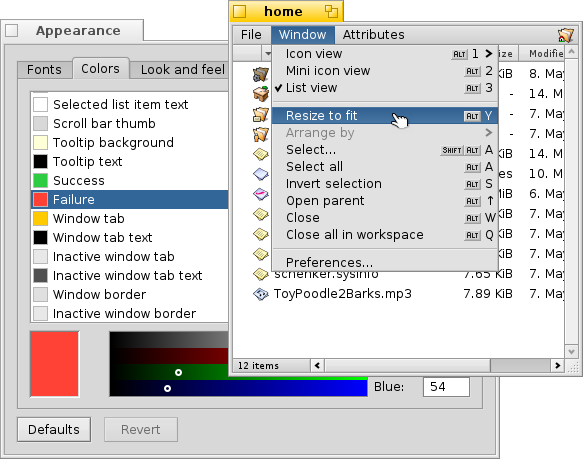
Attached is a patch to slightly tweak the GUI colours.
- Changes selected menu/list items to white on desktop-blue
- Changed success/failure colours to less stark green/red, as seen at http://clrs.cc/ suggested by John on the mailinglist:
I think it looks nice, the selected item is brighter and more visible that the black on grey. I hope it can be decided to go with it... :)
Attachments (8)
Change History (56)
by , 10 years ago
| Attachment: | before_screenshot.png added |
|---|
comment:1 by , 10 years ago
Hm. I'm not so sure about the changes to the "highlighted menuitem" color. The new red looks nice, but I like the menuitem colors the way they currently are...
comment:3 by , 10 years ago
I don't like the white-on-blue colors, either.
I'd suggest picking colors from our already existing palette instead (both for success/failure and the menu highlight): http://haiku-os.org/files/downloads/2007-03-20_haiku-color-palette.png
comment:4 by , 10 years ago
For what it's worth, I like the blue in the list view, but not so much in the menu.
Adrien, I am not a great fan of your taste in colors. :-)
follow-ups: 6 16 comment:5 by , 10 years ago
Maybe it's time we update our color palette then. I think having a defined set of colors for the user interface (and possibly using it in other places) is a good idea. This one I think was created from the leaves in the Haiku logo, but I don't mind going with something else.
In any case, check success/failure colors in real-world uses (Web+ downloads and the notification window are two places where they are used).
As far as my personal preferences in colors go, I don't mind the exact color, but I think the text should be black, and the background a light color. There isn't any place in Haiku where the text is white, and this makes this kind of highlight feel too much different.
comment:6 by , 10 years ago
Replying to pulkomandy:
As far as my personal preferences in colors go, I don't mind the exact color, but I think the text should be black, and the background a light color.
Personally, I find the high contrast of white text on dark blue very nice. And the blue isn't as gloomy as the dark grey. It also picks up the background/workspace colour and draws the eye (in case of the menu item) to the menu under your mouse pointer. Of course it's all very subjective...
There isn't any place in Haiku where the text is white, and this makes this kind of highlight feel too much different.
Of course, change is always change... Take comfort in the fact that after the change, it's perfectly normal. :)
follow-up: 8 comment:7 by , 10 years ago
Hi! I'd like to work on this enhancement. What are the specific changes that need to be made? And is the color palette supposed to be the one given in the description, or the one in comment 3.
comment:8 by , 10 years ago
Replying to TigerKid001:
Hi! I'd like to work on this enhancement.
The thing is, we apparently have no consensus on what colours to use, or if to change them at all... :)
Otherise we could just apply the attached patch (possibly after changing some colour values to something else).
comment:9 by , 10 years ago
Well actually there seem to be agreement on everything except the menu highlight change.
and while we're at it, an extra change which is rather popular for Haiku users:
- Make the active window border color the same as the active tab color (yellow)
TigerKid001, since you are interested in getting started with haiku development, I'll let you make these two changes (undo the menu color one, add the window border one) and submit an updated patch.
follow-up: 11 comment:10 by , 10 years ago
I don't think changing the window border color to yellow is good taste. The idea is that window content (such as graphics) should display against a neutral background, hence the neutral gray by default. Haiku is probably too colorful already compared to modern trends. Let's not make it a default recommendation to change the window border color to somthing glaring.
comment:11 by , 10 years ago
Replying to stippi:
Haiku is probably too colorful already compared to modern trends.
While you do have a point, there are arguments for active borders being coloured: The tab of a window could be outside the screen area, and the tab could be concealed by another window in focus-follows-mouse mode.
Personally, I can live without the coloured border, although I had that setting under BeOS...
I did hope to see the default selected menu colours changed, but oh well...
comment:12 by , 10 years ago
Looking at Windows 8 I'd say the modern trend is towards adding more colors. Moreover, the change to the border color is extending an existing color to more parts of the screen. On the other hand the other changes proposed here introduce entirely new colors, which I think can be considered even worse as far as good taste goes. But continuing to use greyscales only is cheating.
I find the different border color helpful as a focus-follow-mouse user as it helps me quickly identifying overlapping windows. But I agree that it is less useful for the other focus modes which always have the focused window frontmost.
So, let's keep that separate and start with the changes everyone agrees on: success/failure, and the list selection highlight.
comment:13 by , 10 years ago
Both you guys have good points. I have only one more argument: The yellow tabs as they are represent the signature BeOS/Haiku look. I think it looks more recognizable, simply better and it should not be changed...
comment:14 by , 10 years ago
Also, I am too lazy right now to go back through the comments, but if I was the only one against the active menu item change, I take it back, I'd be fine with the blue and it'd be more consistent, too.
comment:15 by , 10 years ago
So, the changes to be made are yellow border of the windows, removal of the blue selection highlight (comment 9) and change in success/failure colors (comment 12). Right?
comment:16 by , 10 years ago
Replying to pulkomandy:
There isn't any place in Haiku where the text is white, and this makes this kind of highlight feel too much different.
Not only is there white text, it's also on desktop blue - have a look at the desktop icons. :)
comment:17 by , 10 years ago
FWIW, I agree with stippi. I also don't find the FFM argument very convincing. The active window is usually the one under the mouse in this case. It may not be only when you switch windows via keyboard.
comment:18 by , 10 years ago
Yes, please don't change the default border color. However, we do support changing the decorator, in any case (3rd party opportunity).
follow-up: 20 comment:19 by , 10 years ago
Hi again, I'm still unsure what exact changes are to be made. Please specify :)
comment:20 by , 10 years ago
Replying to TigerKid001:
Hi again, I'm still unsure what exact changes are to be made. Please specify :)
Perhaps just make each change into a separate patch. The selected patches can be committed in one go, and if one of the changes needs to be undo, can just revert the individual patch.
Replying to stippi:
re. active window border: I think it looks more recognizable, simply better and it should not be changed [to yellow]...
FWIW, I use the yellow active window border, and the white on blue selected menu items. The active window border I find helps distinguish it from other windows on a cluttered desktop, and it blends beautifully into the window tab colour.
by , 10 years ago
| Attachment: | 0001-window-border-color.patch added |
|---|
Patch 1 for bug #10834 - GUI tweak - Window border color changed to yellow
comment:21 by , 10 years ago
| patch: | 0 → 1 |
|---|
by , 10 years ago
| Attachment: | 0002-menu-selection-colors.patch added |
|---|
Patch 2 for bug #10834 - GUI tweak - Selected menu item color and text color
by , 10 years ago
| Attachment: | 0003-success-failure-colors.patch added |
|---|
Patch 3 for bug #10834 - GUI tweak - change in success/failure colors
comment:22 by , 10 years ago
While we all have opinions and I generally find that Humdinger and stippi have good taste, what we really need is a graphical designer to come up with a nice color palette and a new GUI design for Haiku. I know a lot of us are attached to the current look but it is quite dated. But as we always say this is really something for R2 but I don't think it would hurt to experiment some now.
But to add my opinion to the mix in regards to this ticket I like all the changes except the default border color being yellow. I think it is a bit too bright and is easy to change anyhow. I'll add that I really like the selected menu item change and I'm pretty sure that was something I wanted to change before but never got around to. But I recall doing some work a while ago to make it so that an inverted color scheme at least looked right...
comment:23 by , 10 years ago
I don't agree that our look is "dated". During the 2000s everyone used round corners, gradients and mostly monochromatic schemes. Then everyone got bored with that and switched to plain squares, plain colors, and more colorful themes (look at iOS 6 vs iOS 7 to see what I mean).
I think the Haiku look is quite close to the perfect balance between these two extremes. As an evidence, after getting a lot of requests for more round corners and gradients in the UI for 10 years, we are now getting requests for more colors instead (such as this new blue highlight for menu items).
My opinion on this:
- We can leave the border color change out for now, there are too much people not wanting it, and the very bright yellow color may distract the eye from the more important parts (what's inside the window).
- The success/failure colors are ok for everyone.
- The menu highlight change is ok, but we should try to match other shades of blue used in the system (mainly the keyboard focus indicator). It might make sense to use the blue from http://clrs.cc/ (this is where success and failure comes from).
comment:24 by , 10 years ago
Hi, I have applied the patch to change success and failure colors.
I'm still not happy with the white text in menu selection, so I tried something else. I've set the color to tle "blue" from http://clrs.cc (0,116,217). I use this color for all the blueish things in the preference panel: the navigation base, control point, control highlight, as well as list and menu selections.
This color is lighter and allows to keep good readability even with white text, and is strong enough to serve as the highlight for list focus, etc. It may, however, be too strong for menu/list background. Or maybe it just needs some time to get used to.
This color is also close to the one we use for BStatusBar. You can see where I'm going: I'm trying to make the UI look more uniform by using the same color in several places, and using a good set of colors (clrs.cc in this case, but there are several other choices available on the net).
follow-ups: 26 29 comment:25 by , 10 years ago
I'm afraid, I still prefer the darker blue with white text... Your blue is a bit too garish for my taste. :)
I've attached the /boot/home/config/settings/system/app_server/appearance settings more in line of the original proposal. Maybe you could add yours, so people can more easily compare. (BTW, simply exchanging the file won't show the new settings in the Appearance prefs. A reboot seems to be in needed.)
follow-up: 27 comment:26 by , 10 years ago
Replying to humdinger:
I've attached the
/boot/home/config/settings/system/app_server/appearancesettings more in line of the original proposal. Maybe you could add yours, so people can more easily compare. (BTW, simply exchanging the file won't show the new settings in the Appearance prefs. A reboot seems to be in needed.)
AFAIK Appearance asks the app_server itself for the current color settings, not the file. The latter is just used for persistent storage, and isn't monitored for changes since it's not generally expected that you'd alter your colors that way behind the system's back.
follow-up: 28 comment:27 by , 10 years ago
Replying to anevilyak:The latter is just used for persistent storage, and isn't monitored for changes since it's not generally expected that you'd alter your colors that way behind the system's back.
Stupid system; should know my conniving ways by now... :)
Monitoring wouldn't be necessary, reading the setings file on launch of the Appearance panel would do. Anyway, no biggie.
comment:28 by , 10 years ago
Replying to humdinger:
Monitoring wouldn't be necessary, reading the setings file on launch of the Appearance panel would do. Anyway, no biggie.
Except that wouldn't really be correct, as what's in the file wouldn't necessarily match what's currently active in app_server. Bear in mind, it's not the appearance preflet that controls that file, app_server does. Appearance just tells app_server to change colors when you make selections in it, it doesn't in any way touch that file itself.
comment:29 by , 9 years ago
Replying to humdinger:
I've attached the
/boot/home/config/settings/system/app_server/appearancesettings more in line of the original proposal. Maybe you could add yours, so people can more easily compare. (BTW, simply exchanging the file won't show the new settings in the Appearance prefs. A reboot seems to be in needed.)
We could use Haiku Theme Manager (https://github.com/HaikuArchives/HaikuThemeManager) to exchange colors configuration. In ticket:10840#comment:9 I explain that the current selection color of BColumnListView is different from the BListView grey. I would like to uniform the two color. I think the (190,190,190) is more readable.
follow-ups: 31 32 comment:30 by , 9 years ago
Shouldn't the BColumnListView use simply the same colour as BListView, i.e.
	{255, 255, 255, 255},	// B_LIST_BACKGROUND_COLOR
	{153, 153, 153, 255},	// B_LIST_SELECTED_BACKGROUND_COLOR
	{0, 0, 0, 255},			// B_LIST_ITEM_TEXT_COLOR
	{0, 0, 0, 255},			// B_LIST_SELECTED_ITEM_TEXT_COLOR
Maybe with 190,190,190,255 for B_LIST_SELECTED_BACKGROUND_COLOR as you suggest, though personally, I still prefer white on blue... :)
follow-up: 33 comment:31 by , 9 years ago
Replying to humdinger:
Shouldn't the BColumnListView use simply the same color as BListView, i.e.
As you can see in ticket:10840#comment:10, I'm working on it ;-)
But there are some problems:
1) The grey B_LIST_SELECTED_BACKGROUND_COLOR is too dark, there is a selection rectangle that is darker than then selection box (StrokeRect not FillRect). This is used with the keyboard.
2) When the window lost focus, the BColumnListView selection is lighter this is a different behavior from the BListView.
A possible solution is to remove this functionality from the BColumListView.
3) The edit colors.
comment:32 by , 9 years ago
Replying to humdinger:
Maybe with 190,190,190,255 for B_LIST_SELECTED_BACKGROUND_COLOR as you suggest, though personally, I still prefer white on blue... :)
When I finished you can use the blue and white and create a theme to exchange with others.
comment:33 by , 9 years ago
OK, I see. I'd say either it's lightening of the selection colour in inactive windows everywhere or nowhere. I'm not sure I see the point in this lightening in the first place...
comment:34 by , 9 years ago
| Milestone: | R1 → Unscheduled |
|---|---|
| Priority: | normal → low |
comment:35 by , 6 years ago
| patch: | 1 → 0 |
|---|
comment:36 by , 6 years ago
Remaining patches migrated to Gerrit: https://review.haiku-os.org/#/c/haiku/+/332 and https://review.haiku-os.org/#/c/haiku/+/333
comment:37 by , 6 years ago
Is this inspired by master-of-design on deviantart: https://www.deviantart.com/master-of-design/art/Haiku-API-283726334 ?
comment:38 by , 6 years ago
Nope, inspired by https://discuss.haiku-os.org/t/haiku-ui-mockup/1492/60
comment:39 by , 6 years ago
When I first implemented these color constants in Haiku I was thinking of going with white on purple like in BeOS Dan0 and Zeta: [0] but blue is probably more in-line with Haiku's current color palette and is more widely acceptable. I also experimented with adding a splash of color to some other places: [1] and [2]
[0] https://78.media.tumblr.com/tumblr_m2lm2o1oNW1r0f0hfo1_500.png [1] https://78.media.tumblr.com/tumblr_m2llzi80rV1r0f0hfo1_250.png [2] https://78.media.tumblr.com/tumblr_mcoipfh5BN1r0f0hfo1_500.png
comment:40 by , 6 years ago
... too bad the dark blue variant of Haiku UI Mockup seems to be lost to the dustbin of history
comment:41 by , 6 years ago
I prefer text to be darker than its background color. Pretty sure it's a better choice for the eyes (better readability), something that becomes more evident in large amounts of texts. But... the dark grey could be made a bit lighter to deal with the urge of wanting to be more modern, while it -more importantly- would also improve the contrast between text and background, which is a bit limited with this current dark grey.
follow-up: 43 comment:42 by , 6 years ago
White text on a dark background for the selected item increases the contrast making it easier to see the selected item. Then again BeOS apps may hardcode black text as their menu selection color ignoring the setting.
comment:43 by , 6 years ago
Replying to jscipione:
White text on a dark background for the selected item increases the contrast
Not in all cases; you can easily use black text on a light background with just as much -or even more- contrast.
Imagine a user having to do serious work for hours on end that involves lots of menu-use.
It helps this user's (tired) eyes if the selected item differs from the un-selected items in just one way (which happens to be enough to indicate difference), i.e. by only changing the background color and leaving the color of the text unchanged: that leads to 50% less blink, is more consistent with the other items, gives enough change to be effective, and leads to a more relaxed workflow.
With this in mind you can still depart from grey as background color and use (for selected items) a shade of background blue that's light enough to form sufficient contrast with black text.
comment:45 by , 12 months ago
Is the mentioned color palette here still used?
I did not know about this at all, also not when creating all the dark mode versions of our pages...
Perhaps if it is still used there should be a dark variant too?
I do like Ubuntus palette of having 10 shades to use a bit :)
comment:46 by , 12 months ago
Can you quote the comment mentioning the palette you refer to? There are 45 comments in this ticket and I'm a slow reader... :)
comment:47 by , 12 months ago
I don't think it ever really was used, but we don't have a better one. Want to make a new one?


.png)
old colours