

#13165 closed bug (fixed)
[WebPositive] align menus to the right size in Settings window (easy)
| Reported by: | diver | Owned by: | pulkomandy |
|---|---|---|---|
| Priority: | normal | Milestone: | R1/beta2 |
| Component: | Applications/WebPositive | Version: | R1/Development |
| Keywords: | Cc: | ||
| Blocked By: | Blocking: | ||
| Platform: | All |
Description
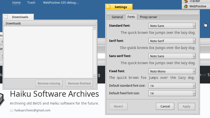
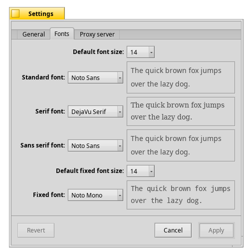
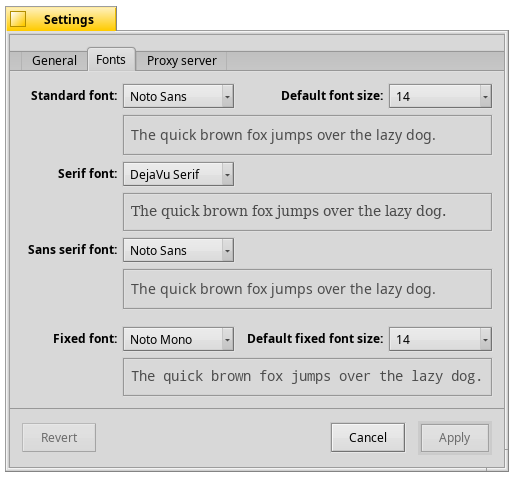
Menus in fonts tab of Settings window should align to the right side
Attachments (10)
Change History (34)
by , 6 years ago
| Attachment: | VirtualBox_Haiku_25_03_2018_14_12_36.png added |
|---|
comment:1 by , 6 years ago
I want to work on this ticket.
I see that the Settings window has the extra space which is not the same for the Downloads window. I have to fix that. I attached the snapshot of the Settings window and Downloads window, above.
Kindly tell me if I am wrong.
comment:2 by , 6 years ago
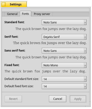
Ask humdinger on the IRC channel about the spacing rules, because I'm not sure what should be done. For this ticket, just align the label of the menu fields to the right instead of to the left as they are now.
comment:3 by , 6 years ago
| Summary: | [WebPositive] align menus to the right size in Settings window → [WebPositive] align menus to the right size in Settings window (easy) |
|---|
by , 6 years ago
| Attachment: | before.png added |
|---|
by , 6 years ago


comment:5 by , 6 years ago
Not sure I like that too much, tbh.
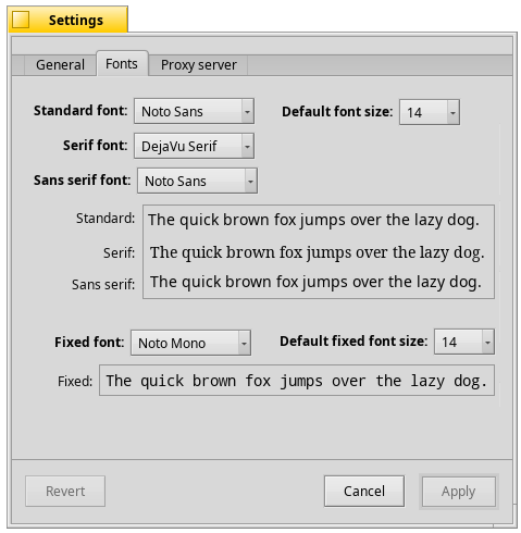
Could it be more like the Appearance prefs, with the size options to the rigt of the font pop-ups?
comment:6 by , 6 years ago
In Appearance each font type has its size. There is only one size for the font standard/serif/sans... what is your idea?
by , 6 years ago
| Attachment: | border.png added |
|---|
by , 6 years ago
| Attachment: | noborder.png added |
|---|


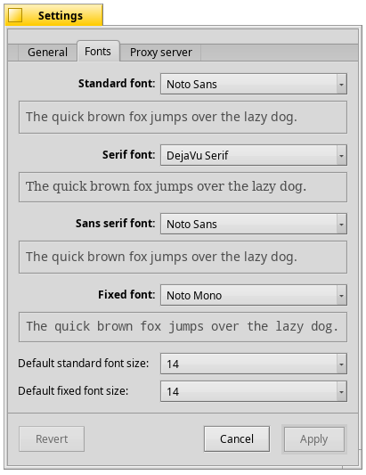
comment:8 by , 6 years ago
I think the label "Default standard font size:" should be "Default font size:" because it applies to standard/serif/sans. In the mockup the size PopUpMenu should look smaller in both cases.
by , 6 years ago
| Attachment: | experiment.png added |
|---|


comment:11 by , 6 years ago
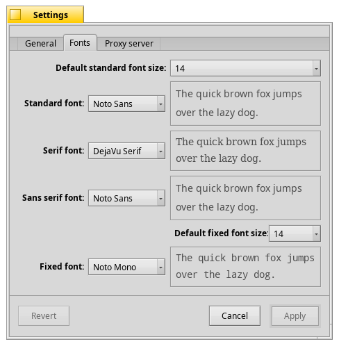
I personally don't like the "legend" effect. Repeat the information with a sort of *.
And using the grid I don't think the BBox will align with the 3 labels.

by , 6 years ago
| Attachment: | after2.png added |
|---|
comment:13 by , 6 years ago
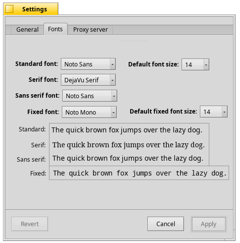
The original 'after.png' added boxes around the example sentences, making a comparison with 'before.png' harder and diverting from the original issue.

by , 6 years ago
| Attachment: | mockup2413.png added |
|---|

comment:17 by , 6 years ago
Yep, the last one's best. Maybe don't use bold for the labels. The Appearance fonts tab looks very nice without it. Also, how about removing the labels of the sizes or do it like Appearance and just name them "Size:"?
follow-up: 20 comment:19 by , 6 years ago
In line with appearances/fonts the labels shouldn't have to be bold.
If 'Default font size' would change into 'Size' (preferable over 'Font size'; again for consistency with appearances/fonts), then the user may get the idea that only 'Standard fonts' have different sizes to choose from. The indication 'default' is needed to avoid that idea. So the word 'default' is needed to indicate that the 'Serif' and 'Sans-serif' fonts will follow the size selected for 'Standard font'.
For consistency within this settings window, the word 'default' is better also used for the 'Fixed font' category. So: 'Standard font' gets 'Default font size' and 'Fixed font' gets 'Default fixed font size'.
You could shorten 'Default font size' into 'Default size' but then you'd have to shorten the label for 'Fixed font' as well (again to be consistent) and that doesn't work ('Default fixed size' is confusing), so the longer versions have to be used, just like they already are in mockup2413.png.
comment:20 by , 6 years ago
Replying to -Meanwhile-:
In line with appearances/fonts the labels shouldn't have to be bold.
If 'Default font size' would change into 'Size' (preferable over 'Font size'; again for consistency with appearances/fonts), then the user may get the idea that only 'Standard fonts' have different sizes to choose from. The indication 'default' is needed to avoid that idea and indicate that the 'Serif' and 'Sans-serif' fonts will follow the size selected for 'Standard font'.
The initial string was "Default standard font size" confusing as well.
comment:22 by , 6 years ago
I leave the original labels as they are, because other browsers use the same strings.
Pulkomandy will have the final word...
comment:24 by , 4 years ago
| Milestone: | Unscheduled → R1/beta2 |
|---|
Assign tickets with status=closed and resolution=fixed within the R1/beta2 development window to the R1/beta2 Milestone
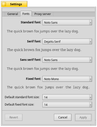
snapshot of the settings window