Opened 6 years ago
Last modified 18 months ago
#14947 new enhancement
Change menu scrolling from vertical to horizontal — at Version 1
| Reported by: | humdinger | Owned by: | nobody |
|---|---|---|---|
| Priority: | normal | Milestone: | Unscheduled |
| Component: | Kits/Interface Kit/BMenu | Version: | R1/Development |
| Keywords: | Cc: | ||
| Blocked By: | Blocking: | ||
| Platform: | All |
Description (last modified by )
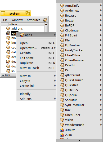
The following idea is for all menus, not just the drill-down navigational ones used as an example. Currently, if a menu has more items that fit in the screen's vertical resolution, scroll arrows appear at the top and bottom:
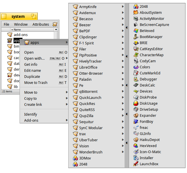
Wouldn't it be much better if instead of the arrows at the top/bottom, they'd be at the right (or left, depending on the position on screen) of the menu:
When the mouse pointer touches the arrow-bar at the right (or the selection is moved beyond the last entry via cursor key), the next batch of entries appear:
If there are more entries still, there'd be another arrow-bar on that new menu area. If the mouse leaves that new menu area it'll get folded back, just like the current drill-down navigation.
The advantages:
- you quickly seen many more/all menu entries
- much quicker than the current vertical scrolling
- makes use of todays wide screens


current menu