

Opened 12 years ago
Closed 11 years ago
#8747 closed enhancement (no change required)
New "Action Stop" icon for WebPositive with better perspective.
| Reported by: | jstressman | Owned by: | leavengood |
|---|---|---|---|
| Priority: | normal | Milestone: | R1 |
| Component: | Applications/WebPositive | Version: | R1/Development |
| Keywords: | Cc: | ||
| Blocked By: | Blocking: | ||
| Platform: | All |
Description
I noticed that the current "Action Stop" icon for WebPositive looked skewed a lot compared to what the proper perspective should be.
I tried to fix it up to more closely match the rest of the icons.
This is for the build of Web+ that comes with hrev44335
Attachments (9)
Change History (23)
by , 12 years ago
| Attachment: | Action_Stop7 added |
|---|
comment:1 by , 12 years ago
| patch: | 0 → 1 |
|---|
by , 12 years ago
| Attachment: | NewActionStopPreview1.png added |
|---|
preview of the new icon along with the current ones
comment:2 by , 12 years ago
I think it definitely looks better, though I still have my reservations about using perspective in toolbar icons. Though these have that "stippi touch" that a lot of us like.
BTW if you are motivated to create a reload icon in this same style it would help me out as I intend to add a feature to have the combination stop/reload button like most modern browsers. Though don't stress about it or feel obligated as I'm decent with Icon-O-Matic.
comment:3 by , 12 years ago
Already done in fact. :) I just didn't include it because it wasn't currently needed. :)
Updated the Stop one a bit as well.
by , 12 years ago
by , 12 years ago
| Attachment: | Action_Stop8 added |
|---|
by , 12 years ago
| Attachment: | NewActionStopPreview2.png added |
|---|
comment:4 by , 12 years ago
That's really great, thanks! Looks like I have a nice little weekend project for Haiku and WebPositive :)
comment:5 by , 12 years ago
Actually, I think the new "stop" icon has a wrong perspective, at least it differs from the rest of all the icons. There is a specific perspective to use which the old icon adhered to, but the suggested one doesn't, see https://www.haiku-os.org/development/icon-guidelines.
That being said, I'm not sure I'm fond of 3d icons for toolbars either.
comment:6 by , 12 years ago
I beg to differ.
While I didn't get mine quite right by just eyeballing it in Icon-O-Matic, I most certainly got it a heck of a lot closer to correct than the original.
I'm also very familiar with the icon guidelines, having read them over many times now... like when I worked on the USB Floppy icon previously. (See #6677, which you saw in the past.)
You can have your issues with 3d toolbar icons if you want, but please don't incorrectly imply that I'm that ignorant and incompetent. Thanks.
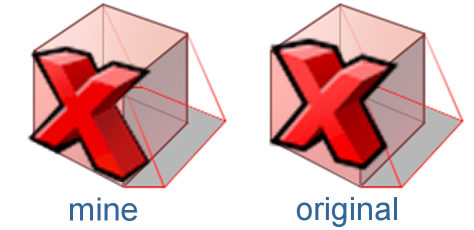
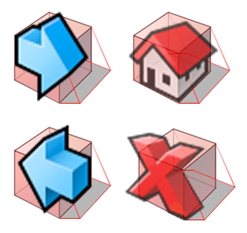
I'm attaching two images to illustrate my point quite clearly. While the arrows are pretty close to spot on, the Home icon is really not much better than mine and actually pretty closely matches the perspective I used, in part because I was looking to match the X to those specific icons in particular... so I was following that perspective and not the reference box in the guidelines, which I don't have a nice reference of to use as guidelines in Icon-O-Matic.
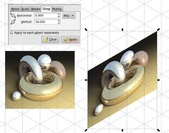
That said, I'll go ahead and redo the icon again to get it even closer to the guidelines. It's just difficult because I'm not only still new to the tools, but the tools themselves are a bit lacking compared to what I'm used to. An apparent lack of "skew" is one that I've run into a few times so far. Something like this: http://i32.photobucket.com/albums/d12/phreadom/skewed_bitmap.jpg But I digress...
by , 12 years ago
| Attachment: | xperspective3.png added |
|---|
my fixed X along with the other 3 icons, notably the perspective on the Home icon.
follow-up: 9 comment:7 by , 12 years ago
Again, it only ticked me off because not only have I been a graphic designer for decades, but when I'm specifically told that not only was mine wrong... which I don't have a problem with... but that the original was correct and I was the one who screwed up... that is what steams my britches.
There is a specific perspective to use which the old icon adhered to, but the suggested one doesn't
If you can correctly critique mine for being a bit off, you should surely be able to see how wildly off the original was.
Hopefully I've made my point clear now. Now I'll be happy to go back and tweak the X and the Home icon to actually adhere to the guidelines. I'll update the ticket when they're ready.
comment:8 by , 12 years ago
To use a terrible pun with your name, don't get so "stressed man" :)
I agree that Axel is probably wrong in this case, but I also don't think he meant to insult you.
Also if you have reasonable feature requests for Icon-O-Matic which would make your life (and other icon designer's lives) easier, please feel free to add enhancement or bug tickets here. I agree that it is difficult trying to match the icon guidelines perspective grid without having any reference to it in Icon-O-Matic. So adding some sort of toggled overlay for that would be useful, and probably fairly easy to implement.
Also adding a skew function might not be too hard. If you can explain what you need in more detail that would help in someone implementing it.
Lastly I think Haiku could use as many graphics designers as we can get, so please continue to do this work, as it is appreciated very much. And generally try to view any criticism as constructive, even if the style of communication seems abrupt in your view.
comment:9 by , 12 years ago
Replying to jstressman:
Again, it only ticked me off because not only have I been a graphic designer for decades, but when I'm specifically told that not only was mine wrong... which I don't have a problem with... but that the original was correct and I was the one who screwed up... that is what steams my britches.
Hey, please calm down, I really didn't mean to offend you.
Anyway, I only looked at 45 degree angle of the X thanks for the perspective - and that's where the original icon comes closer to the standard than yours does. Thanks for your overlay graphic - this makes it clear that the original has another problem I didn't immediately could put my finger on.
comment:10 by , 12 years ago
Sorry for getting steamed guys. It's a character flaw on my part.
I'll try to be better about constructive criticism going forward. :)
Like I said, I'll try fixing up on the perspective on those 2 and perhaps filing an enhancement ticket for Icon-O-Matic about the features I'm missing.
comment:11 by , 12 years ago
Filed a ticket (#8758) about the possible Icon-O-Matic perspective overlay. It raised a few more questions in the process.
comment:12 by , 12 years ago
OK, this is it for me on this one. I redid the X and the house icons a bit to be a little closer to the "standard" perspective. They're still not perfect, but I'm not putting any more time into them. ;) The reload icon could also probably use a little perspective tweak, but I'll leave that up to Ryan if he wants to nudge things around a bit if/when he decides to add the reload function. :)
comment:13 by , 12 years ago
They all look really good to me. I think the reload one is fine. I'll see about working on the combined reload/stop button soon, though I could at least update these icons in WebPositive in about 10 minutes.
comment:14 by , 11 years ago
| Resolution: | → no change required |
|---|---|
| Status: | new → closed |
new Action Stop hvif icon