

Opened 11 years ago
Closed 9 years ago
#9519 closed enhancement (fixed)
Mail: update icons on the buttons
| Reported by: | dsjonny | Owned by: | waddlesplash |
|---|---|---|---|
| Priority: | normal | Milestone: | R1 |
| Component: | Applications/Mail | Version: | R1/Development |
| Keywords: | Cc: | ||
| Blocked By: | Blocking: | #9588 | |
| Platform: | All |
Description
It would be nice if the Mail app's buttons image would be updated. The icons should use from http://zumi.xoom.it/myhaiku/btoolbar/index.html
I have made an image what did I think for:

Unformtunatelly I am unable to make these changes.
Attachments (6)
Change History (20)
by , 11 years ago
| Attachment: | mail-fake.png added |
|---|
comment:1 by , 11 years ago
comment:2 by , 11 years ago
Zumi Never created a "new message" icon, so dsjonny is using an unmodified "unread message" icon in its place. I'm sure you could just whack a + sign on there and people will get the idea.
Zumi made a few different versions of the icons, some with equal sized mail symbols and a some without mail symbols altogether.


comment:3 by , 11 years ago
I like those without the mail best, although it would be okay for the new mail case. Still, I think they are pretty colorful.
comment:4 by , 11 years ago
I have darkened them a bit to see what they look like. I have reduced the brightness by 20% on all but the last icon (it's at 15%), as I don't think the alternative "new message" icon looks that great when as dark as the other icons.


 And here the alternative new mail icon:

by , 11 years ago
| Attachment: | mail-fake2.pdn added |
|---|
by , 11 years ago
| Attachment: | mail-fake2.png added |
|---|
comment:6 by , 11 years ago
Here is the mock up again, but with darken icons.

comment:7 by , 11 years ago
If the trash can is too ambiguous, you could always go with some type of shredder icon, such as: 
by , 11 years ago
| Attachment: | Haikumail2.png added |
|---|
comment:8 by , 11 years ago
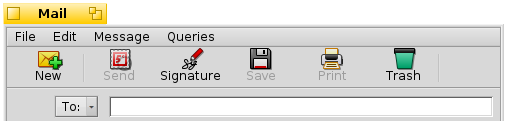
Here is the 2nd mock up:

Edit: Ignore the greyed out Send, Save & Print titles.
comment:9 by , 11 years ago
| Blocking: | 9588 added |
|---|
comment:10 by , 10 years ago
It is not possible inside of haiku; i suppose you will need to contact the developer of the app for this change
comment:11 by , 10 years ago
| patch: | 0 → 1 |
|---|
by , 10 years ago
| Attachment: | Bitmap Clip.jpg added |
|---|

comment:13 by , 9 years ago
| Owner: | changed from to |
|---|---|
| Status: | new → assigned |
I'm not too fond of the current icons either, but I don't really think those are an improvement. They are much too colorful for my taste, and I also don't like the differently sized mail symbol.
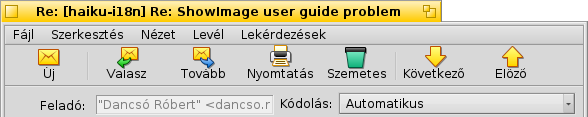
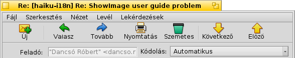
Also, it's nice that you used Hungarian for the screen shot, as I could not really tell what the first button does. The second and third are probably reply, and forward respectively.