

Opened 11 years ago
Closed 11 years ago
#9758 closed enhancement (fixed)
Debugger: Add optional command line output capture
| Reported by: | stippi | Owned by: | anevilyak |
|---|---|---|---|
| Priority: | low | Milestone: | Unscheduled |
| Component: | Applications/Debugger | Version: | R1/Development |
| Keywords: | Cc: | ||
| Blocked By: | Blocking: | ||
| Platform: | All |
Description
This is really low on the list of needed features, I mainly wanted to record the idea.
Debugger could detect whether or not the user sees the command line output of the debugged team (assuming that's possible somehow). If the user would not otherwise see it, there could be another view for the debugged team's stdout and stderr streams. I would place that in another tab with the variables/registers group. Just because Eclipse puts it there by default. Along the bottom would be another option.
Attachments (2)
Change History (17)
comment:1 by , 11 years ago
| Status: | new → in-progress |
|---|---|
| Version: | R1/alpha4.1 → R1/Development |
comment:2 by , 11 years ago
comment:3 by , 11 years ago
Since you ask: The streams should be unified with the option to toggle either (well, could be tri-state). Using different colors (e.g. black for stdout, red for stderr) would be nice, too.
comment:4 by , 11 years ago
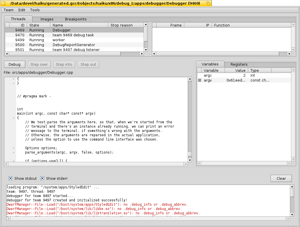
Attached a screenshot of the UI as initially implemented for feedback. Let me know what you think.
by , 11 years ago
| Attachment: | console.png added |
|---|
follow-up: 9 comment:5 by , 11 years ago
Looks nice. There's some extra spacing around the view though.
comment:6 by , 11 years ago
I'd use blue for stdout :) Do you define somewhere the tabulation size? Also a scroll lock could be useful.
comment:7 by , 11 years ago
Looks nice. I would place the check-marks and the button to the right of the output. Scroll-lock should work automatically, I think: If the output is already scrolled to the bottom, then it should automatically follow, if it's scrolled up, it should lock on to that view portion. But I would vote to keep stdout black. :-)
comment:8 by , 11 years ago
You can probably also remove the "Show " portion of the check-mark labels, so it's even less waste of width if you move the controls to the right.
follow-up: 10 comment:9 by , 11 years ago
Replying to bonefish:
Looks nice. There's some extra spacing around the view though.
That should just be a matter of insets, will deal with that.
Replying to korli:
I'd use blue for stdout :) Do you define somewhere the tabulation size? Also a scroll lock could be useful.
The color seems to be a topic of some contention :-) As far as tabulation/scroll lock goes, that view is currently just a BTextView, so it follows the behavior of the latter in that sense.
Replying to stippi:
Looks nice. I would place the check-marks and the button to the right of the output. [...] You can probably also remove the "Show " portion of the check-mark labels, so it's even less waste of width if you move the controls to the right.
Will try that and see how it looks, I'd actually put them across the top in order to try to make more real estate available for the textview itself.
follow-up: 11 comment:10 by , 11 years ago
Replying to anevilyak:
Replying to stippi:
Looks nice. I would place the check-marks and the button to the right of the output. [...] You can probably also remove the "Show " portion of the check-mark labels, so it's even less waste of width if you move the controls to the right.
Will try that and see how it looks, I'd actually put them across the top in order to try to make more real estate available for the textview itself.
But isn't it more annoying to be able to read fewer lines? As it is, the lines in your screen shot already appear to be wide enough.
comment:11 by , 11 years ago
Replying to stippi:
But isn't it more annoying to be able to read fewer lines? As it is, the lines in your screen shot already appear to be wide enough.
Indeed, my initial thought was just that the amount of vertical real estate it takes to pack them into a single row is less than the number of horizontal pixels they'd absorb by putting them on the side, but I guess in this case the vertical is more valuable. As I said, I'll give it a try along with the inset adjustments and see how it looks, shortening the checkbox names helps already.
comment:12 by , 11 years ago
If horizontal space is a concern, icon buttons could be used. E.g. ones depicting ">" and "2>" for stdout respectively stderr and something recognizable for the "Clear" button (IIRC in eclipse a broom is used).
comment:14 by , 11 years ago
Implemented in hrev45797. Leaving ticket open pending feedback on the adjusted UI. Personally, I like the new layout better.
comment:15 by , 11 years ago
| Resolution: | → fixed |
|---|---|
| Status: | in-progress → closed |
I'm leaning towards along the bottom myself (as a split, so collapsible), so it can be viewed concurrently with everything else. The question that remains is if it'd be preferred to have the output of the streams separated or unified, as they'd typically be the latter on the actual Terminal itself. Thoughts?