

Opened 15 years ago
Last modified 4 years ago
#4591 new enhancement
Highlight active button
| Reported by: | humdinger | Owned by: | stippi |
|---|---|---|---|
| Priority: | normal | Milestone: | R1.1 |
| Component: | User Interface | Version: | R1/Development |
| Keywords: | Cc: | ||
| Blocked By: | Blocking: | ||
| Platform: | All |
Description
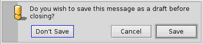
I'm having trouble discerning the active button on an alert. The small blue outline looks nice and all, but it doesn't really catch your eye. Using much keyboard navigation, I need an unnecessary long time to figure out which but will take my return/space and "format c:\" or "cancel"...
I think, highlighting the active button would help with that.
See the alert now:

and highlighted:

Just keep it subtle enough.
Attachments (2)
Change History (10)
by , 15 years ago
| Attachment: | alert-now.png added |
|---|
comment:2 by , 15 years ago
You're definitely right you can't tell very well the active button, but your solution doesn't help much either. Maybe it's just me getting old, but I had to keep looking at the two images for a couple of minutes before finding out what was different :-)
comment:3 by , 15 years ago
Maybe my highlighting was _too_ subtle. :)
The right level has to be tested. I imagine that when using it, i.e. pressing tab or cursor keys, it's more visible when the highlighted button changes.
BTW, right now, the default button doesn't have a blue outline when the alert pops up. I think it should.
comment:4 by , 14 years ago
Actually I like this. It could indeed be experimented to find the right level. While experimenting, we could also experiment with subtle highlighting when the mouse hovers over a control.
comment:5 by , 14 years ago
Mouseovers may be neat, too. Though I've always wondered if tinting or "lowdarking" instead of "highlighting" would be better. A currently active control, like the button above, would already be highlighted.
follow-up: 7 comment:6 by , 9 years ago
We have mouseover highlight now. Should the same highlight be used for this?
comment:7 by , 9 years ago
Replying to pulkomandy:
We have mouseover highlight now. Should the same highlight be used for this?
Yes, please.
comment:8 by , 4 years ago
| Milestone: | R1 → R1.1 |
|---|
alert now