Opened 10 years ago
Closed 10 years ago
#11528 closed enhancement (fixed)
Mouse layout optimization (easy)
| Reported by: | humdinger | Owned by: | axeld |
|---|---|---|---|
| Priority: | normal | Milestone: | R1 |
| Component: | Preferences/Mouse | Version: | R1/Development |
| Keywords: | Cc: | ||
| Blocked By: | #8391 | Blocking: | |
| Platform: | All |
Description
This is hrev48403.
My skills with the layout management are apparently too weak, but generally, this ticket can be considered "easy"...
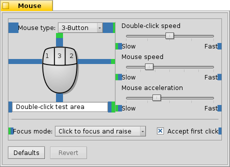
The GUI elements in the Mouse preferences aren't pixel perfectly aligned. Here's a screenshot where I marked where the left/right distance to the next element isn't quite right:
The green areas are the differences that make the distance to the left/right bigger than on the other side of the element.
Besides, I think making the text "Double-click test area" center aligned would look nicer. And there could be a little more vertical space between the slider settings, i.e. between the "Double-click speed", "Mouse speed" and "Mouse acceleration" sections.
Attachments (5)
Change History (17)
by , 10 years ago
| Attachment: | mouse_layout.png added |
|---|
comment:1 by , 10 years ago
This could be useful to find the right spacing constants for everything: http://pulkomandy.tk/drop/haiku_spacing.png
comment:2 by , 10 years ago
I've started checking the source code, the part about centering "Double-click test area" is correct (SetAlignment is called with the good B_CENTER flag).
There might be an issue with BTextControl class.
comment:3 by , 10 years ago
| Blocked By: | 8391 added |
|---|
comment:4 by , 10 years ago
by , 10 years ago
| Attachment: | mouse_layout_fix.png added |
|---|
comment:5 by , 10 years ago
You'll find in attached files "mouse_layout_fix.png".
Will it be enough ? Note : in the french version, the translation of "click to focus and raise" is huge, and it makes the application window width pretty big (at least 1.5x of the english version), not a problem though.
comment:6 by , 10 years ago
For a reason I ignore, the image is not viewable online. But once downloaded it's ok. Can someone fix this issue please ?
comment:7 by , 10 years ago
The vertical space between the three sliders seems a bit much. Is it possible that the middle one has 2 * B_USE_DEFAULT_SPACING to the one above/below?
You're uploaded PNG isn't displayed, bacause it's not a PNG, but a WonderBrush file. Apparently you have saved, not exported it. :) Now, if Web+ would use Translators...
by , 10 years ago
| Attachment: | mouse_layout_fix2.png added |
|---|
Vertical space between sliders with B_USE_DEFAULT_SPACING
comment:8 by , 10 years ago
In fact, the original vertical spacing was set to 5 (first screenshot). Then, in my version, I tried an arbitrary value of 27, waiting for your opinion.
In those two versions, the spacing was equal, the sensation of a different spacing could be some kind of "optical illusion" (different text, etc).
In mouse_layout_fix2.png, I set the spacing to B_USE_DEFAULT_SPACING, it's like 1px more between each slider, which imho is enough to be seem less "compact" than the first one, and less "space-wasting" than the second.
What I think would help the most, is to be able to define different fonts for the BSliders widgets (font size, font weight), etc. But I haven't seen anything for it in Slider.h.
comment:9 by , 10 years ago
| patch: | 0 → 1 |
|---|
comment:10 by , 10 years ago
Please note that the screenshot you saw have been using the patched version of libbe.so I provided for #8391.
by , 10 years ago
| Attachment: | 0001-SettingsView-Layout-update-fixes-11528.patch added |
|---|
Layout update (sliders label commented out, insets more homogeneous)
comment:11 by , 10 years ago
I replaced the patch, this one removes the label definition lines instead of commenting them out.
comment:12 by , 10 years ago
| Resolution: | → fixed |
|---|---|
| Status: | new → closed |
... and I forgot to close this when I made the changes a few weeks ago.


mouse screenshot