#13943 closed bug (invalid)
[BColumnListView] StatusView offsetBy 1 pixel vertically when border are set to B_FANCY_BORDER
| Reported by: | Janus | Owned by: | stippi |
|---|---|---|---|
| Priority: | normal | Milestone: | Unscheduled |
| Component: | User Interface | Version: | R1/Development |
| Keywords: | Cc: | ||
| Blocked By: | Blocking: | ||
| Platform: | All |
Description (last modified by )
Attachments (3)
Change History (12)
by , 7 years ago
by , 7 years ago
comment:1 by , 7 years ago
| Component: | - General → User Interface |
|---|---|
| Description: | modified (diff) |
| Owner: | changed from to |
comment:2 by , 7 years ago
| Resolution: | → invalid |
|---|---|
| Status: | new → closed |
comment:4 by , 7 years ago
I disalignement between the scrollbar an the view is fine? WTF
comment:5 by , 7 years ago
And why is the scrollbar not offsetBy 1? And If you hide the horizontal scrollbar why you have a glitch... no need for discussion just perfect solution.
comment:6 by , 7 years ago
Can you please calm down? If you want to discuss things, please adopt a neutral tone, you will get much better results. I want to discuss arguments based, not on emotional level influenced by imagined things.
I already gave an explanation why I think it is the correct behavior, see comment:2, have you looked at my explanation closer? When the border is set to the "fancy" look, it is two pixels thick. If you look closely at the scrollbar then you will see that below the scrollbar, there is an extra line that is missing in your other screenshot. The "fancy look" (i.e. edged in look) is continued below the scrollbar. That is because the scrollbar itself is not adopting just one side of it's border based on how it is used in a composite view. Regarding the status view on the other hand, the fancy look is continued above the status view, where the direct border of the listview continues. The status view itself is not contributing to the border of the listview and is not integrated with it. That is why it needs to be moved two pixels down, otherwise there would not be enough room for the fancy border.
I would have thought that my original comment already gave enough information to point out this reasoning. You are of course free to disagree and convince me (or someone else) otherwise. I closed this ticket because I thought there would be no disagreement after I pointed out the reason. It may have been premature. I do have an open mind, so please feel encouraged to explain to me why you think I am wrong. (And by the way: I cannot tell whether something looks "shit" from a red rectangle. I may need other examples demonstrating the shittiness.)
by , 7 years ago
| Attachment: | Fancy_border.png added |
|---|
comment:7 by , 7 years ago
I want to discuss arguments based, not on emotional level influenced by imagined things.
Yes, you want to discuss the issue closing the ticket a few minutes after I open it. I'm very open to any comment and suggestion, what made me mad was the invalid ticket "This looks absolutely correct to me" without any further discussion.
doesn't look good to me. I found strange that a view that works perfectly with one setting doesn't work with another the statusView should be independent. I'm updating some applications on HaikuArchive and I found this problem very often. I think that an option should be an insetBy 1 vertically. The extra space under the level of the scrollbar cannot be used without an ugly unalignment.
Another problem with this AddStatusView is that the view can grow or shrink... I saw that in Haikudepot the problem is solved with a dolayout, but with a columnlistview in the layout this is very expensive. So in the applications, I try to do the resizing manually because is much more performant.
Sorry if you think I was rude, but from my side close the ticket in that way was worst.
comment:8 by , 7 years ago
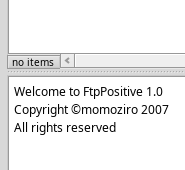
Thank you for the screenshot of FtpPositive. Sorry for closing the ticket so early, I figured you just stumbled across something in your own application (since you provided a screenshot of an app you could compile with either B_FANCY_BORDER or B_PLAIN_BORDER), thinking this is simply misbehavior that has no reasoning. Then I gave the reasoning and closed the ticket.
If you look at your FtpPositive screenshot, I hope you realize that the problem is actually worse. If the status view was moved down only one pixel instead of two, it would give an ugly double thick horizontal dark line. The actual fix would be in FtpPositive to not draw a border around the status view at all. You can also see that the left border of the status view is misaligned with the left border of the list view. And would the status view be offset only one pixel to the left relative to the list view to fix this, then it would still look bad, since the border there is the wrong way around. The original implementation probably didn't offset the status view at all, and the fancy border went around the status view instead of excluding it. I thought it looked nicer to exclude it. I didn't realize there would be apps out there which draw the border themselves, even when it just reproduces what the default implementation did.
OK, how do we proceed from here? I would prefer to fix it in the applications. Otherwise we can never update any aspects of the Haiku look if applications are to rely on it being the same for ever.
comment:9 by , 7 years ago
I have no idea. I think at this point the B_FANCY_BORDER became useless when a statusView is needed.


This looks absolutely correct to me. The fancy border is one pixel wider in each direction and the status view is offset not to overlap with the border.