Opened 2 months ago
Last modified 2 months ago
#19092 closed bug
HaikuDepot's strange bullet list rendering in one case — at Version 1
| Reported by: | humdinger | Owned by: | apl-haiku |
|---|---|---|---|
| Priority: | normal | Milestone: | Unscheduled |
| Component: | Applications/HaikuDepot | Version: | R1/beta5 |
| Keywords: | Cc: | ||
| Blocked By: | Blocking: | ||
| Platform: | All |
Description (last modified by )
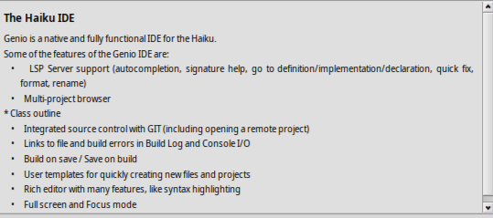
I haven't found another example for this yet, but have a look at the current Genio entry:
The first bullet items is kinda center aligned. It gets even more pronounced when you make window narrower.
Maybe something to do with the long non-breakable "definition/implementation/declaration" in there?
[The unformatted "* Class outline" farther down is due to using a tab there instead of spaces. Maybe tabs should be treated like spaces there.]
I also attach the current Genio recipe, just in case.
Change History (3)
by , 2 months ago
by , 2 months ago
| Attachment: | genio-3.0.recipe added |
|---|
comment:1 by , 2 months ago
| Description: | modified (diff) |
|---|
Note:
See TracTickets
for help on using tickets.


