Opened 15 years ago
Last modified 6 years ago
#5140 new enhancement
Mail GUI enhancements — at Initial Version
| Reported by: | humdinger | Owned by: | bga |
|---|---|---|---|
| Priority: | normal | Milestone: | R1 |
| Component: | Applications/Mail | Version: | |
| Keywords: | mockup | Cc: | |
| Blocked By: | Blocking: | ||
| Platform: | All |
Description
This ticket is the result of discussions on the [http://www.freelists.org/post/haiku-development/Working-on-Haikus-Mail-app dev mailing list] and [http://www.freelists.org/post/haiku-cdt/Mail-GUI-and-Queries-was-haikudevelopment-Re-Working-on-Haikus-Mail-app cdt mailing list].
Mail's current GUI is wasting space by using disabled text boxes and unnecessary labels and a "To" field that isn't normally needed. It all looks a bit untidy. Also, attachments are hidden in the text at the end of the mail.
Since reading and writing mails have slightly different requirements, the interface will reflect that.
Reading mails
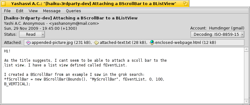
- Labels aren't needed - besides the "Account" info, as that isn't immediately obvious. This, too, can be omitted if there's just one mail account set up.
- Right-clicking a field highlights it and produces a context menu for "Copy to Clipboard", "New Mail to {sender name}", "Add {sender name} to People" etc.
- The status pop-up let's you set a (custom) status, as it's also available from the menu "File | Close and | Set to...".
- The "CC" button only appears if there's a CC set (and also the "To" button when "To" and the receiving account differ, think mailing lists). The pop-up menu offers all entries in a list, choosing one will open a reply-to-mail-window with that recipient filled in.
- The pop-up menu for the decoding setting will provide the current elaborate items, e.g. "ISO West European (ISO-8859-1)", but is shortened as shown when it's selected. At the top of that menu should be a 3-item history of the last used codepages for quicker access. Plus the default "Auto" on top.
Writing mails
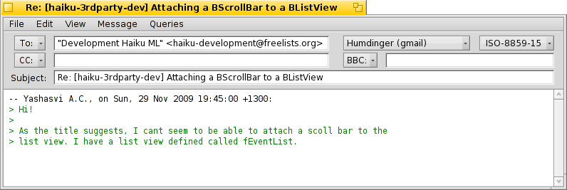
- The "To:" text box is not as wide. Some may see this as a problem. It isn't: if you put more that one contact in, it gets quickly too small anyway. Add to that resizing of the window.... Plus:
- Text boxes with truncated contents get a bubble help showing the list of recipients.
- The account and encoding info are shortened.
Attachments
Instead of hiding an attachment in the text at the end of an email body, an attachment bar is displayed above the message body.
Proposed GUI (reading, one line attachments):

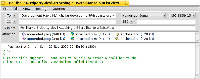
- The normal context menu on files: "Open With...", "Save As...", "Save All..." (when writing a mail, also "Delete", "Delete All")
- If there are more attachments that won't fit in one line, automatically extend the bar vertically. Max. 3 lines of attachments, then add a vertical scrollbar.
- In the read-mail GUI the attachment bar background is gray, as it's read-only. When writing, it's the usual white signaling editability.
Change History (6)
by , 15 years ago
| Attachment: | Mail-reading-original.png added |
|---|
by , 15 years ago
| Attachment: | Mail-reading-4-attach-below.png added |
|---|
Mail reading (with attachments), proposed GUI
by , 15 years ago
| Attachment: | Mail-writing-3-1-attach-below.png added |
|---|
Mail writing (with attachments), proposed GUI


Mail reading, current GUI