#8581 closed enhancement (fixed)
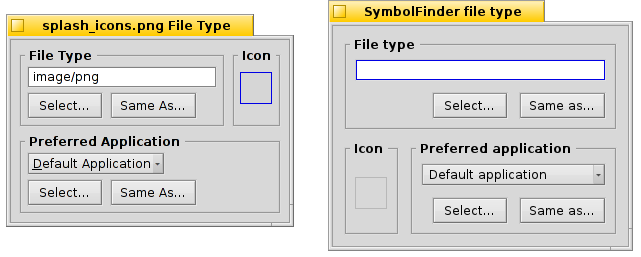
Unintended layout change in Filetype add-on
| Reported by: | humdinger | Owned by: | yourpalal |
|---|---|---|---|
| Priority: | normal | Milestone: | R1 |
| Component: | Add-Ons/Tracker | Version: | R1/Development |
| Keywords: | Cc: | ||
| Blocked By: | Blocking: | ||
| Platform: | All |
Attachments (4)
Change History (16)
by , 13 years ago
| Attachment: | filetypes-old-new.png added |
|---|
comment:1 by , 13 years ago
I'm not so sure it was unintentional ; the new layout allows the file's mimetype more space so it's less likely to be truncated by default for some of the longer ones. The new layout certainly doesn't cause any usability issues so categorizing this as a bug seems to be overdoing it IMHO.
comment:2 by , 13 years ago
If it was intentional, I should've said so in the commit. Otherwise the GUI will change willy-nilly without anyone noticing at once. I see that now you'd have more width for the mimetype, but has that been an issue in the past? Making the default window a bit wider or auto-sizing the window to fit the string would be elegant as well (with limits).
Optically I like the old layout better. Smaller spacing and left aligned controls.
Bug or enhancement, hard to tell...
comment:3 by , 13 years ago
The window is resizable, so I guess it has been unintentional.
At least I think the icon view makes more sense together with the file type rather than the preferred application.
comment:4 by , 13 years ago
Yup, this was intentional. Although I agree the icon view is more related to the file type than it is to the preferred application, I set it up this way so that the mime type string has plenty of space, as before the preferred app menu was getting lots of space it didn't use. As for the right-aligned controls, these are done that way so that the buttons line up nicely with each other. I guess to achieve left-aligned controls, you could swap the icon view and the preferred app box.
Also, this window wasn't resizing, according to #6449, which is the bug I was fixing (referenced in the commit). In fact, the layout before this commit was not even the one that you have in the 'before' picture, it was a bit different, and can be seen in #6449.
follow-up: 6 comment:5 by , 13 years ago
| Type: | bug → enhancement |
|---|
Yes, maybe it's just a matter of taste and what one is used to. Though axeld has a point seeing the connection between file type/icon and not icon/preferred-app.
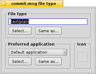
Anyway, I attached a patch that makes the window a bit wider and pulls the icon back to the right of the file type. Unfortunatley resizing the window truncates buttons. I'd be interested to see how to solve that. Also, smaller vertical padding of the buttons would be nice... Can't seem to achieve that easily either. :}
by , 13 years ago
| Attachment: | filetypes-new.png added |
|---|
follow-up: 7 comment:6 by , 13 years ago
Replying to humdinger:
Yes, maybe it's just a matter of taste and what one is used to. Though axeld has a point seeing the connection between file type/icon and not icon/preferred-app.
It's true that there's some connection, but I think (could be wrong) that the icon is just for the specific file, not for all files of that type, so maybe it's good to downplay that connection ;) If it's a global change, then I would either move the icon view into the FileType box, or remove it from the window altogether
Anyway, I attached a patch that makes the window a bit wider and pulls the icon back to the right of the file type. Unfortunatley resizing the window truncates buttons.
I'm not sure, but you might need to set the last column to have infinite max width.
I'd be interested to see how to solve that. Also, smaller vertical padding of the buttons would be nice... Can't seem to achieve that easily either. :}
-  BLayoutBuilder::Grid<>(fileTypeBox)
+  BLayoutBuilder::Grid<>(fileTypeBox, padding, padding / 2)
...
-  BLayoutBuilder::Grid<>(preferredBox, padding, padding)
+  BLayoutBuilder::Grid<>(preferredBox, padding, padding / 2)
should do the trick :)
follow-up: 9 comment:7 by , 13 years ago
Replying to yourpalal:
It's true that there's some connection, but I think (could be wrong) that the icon is just for the specific file, not for all files of that type, so maybe it's good to downplay that connection ;) If it's a global change, then I would either move the icon view into the FileType box, or remove it from the window altogether
You're right, actually. All three settings are file specific and not global. So, where the icon well appears doesn't really matter after all. I think having it to the right of the preferred app looks best as all buttons are then left aligned.
Anyway, I attached a patch that makes the window a bit wider and pulls the icon back to the right of the file type. Unfortunatley resizing the window truncates buttons.
I'm not sure, but you might need to set the last column to have infinite max width.
How's that done? Your padding hint did the trick. Anyway, not to draw this thing out any longer, I updated the FileTypeWindow.diff. Can be applied if there's consensus on this bikeshed...
comment:8 by , 13 years ago
| patch: | 0 → 1 |
|---|
follow-up: 12 comment:9 by , 13 years ago
Replying to humdinger:
Replying to yourpalal:
It's true that there's some connection, but I think (could be wrong) that the icon is just for the specific file, not for all files of that type, so maybe it's good to downplay that connection ;) If it's a global change, then I would either move the icon view into the FileType box, or remove it from the window altogether
You're right, actually. All three settings are file specific and not global. So, where the icon well appears doesn't really matter after all. I think having it to the right of the preferred app looks best as all buttons are then left aligned.
Yeah, that looks better!
Anyway, I attached a patch that makes the window a bit wider and pulls the icon back to the right of the file type. Unfortunatley resizing the window truncates buttons.
I'm not sure, but you might need to set the last column to have infinite max width.
How's that done? Your padding hint did the trick. Anyway, not to draw this thing out any longer, I updated the FileTypeWindow.diff. Can be applied if there's consensus on this bikeshed...
BGridLayout has SetColumnMinWidth() and SetColumnMaxWidth() methods, which is what I was referring to, but it didn't really make sense, as a solution, probably.
Looks nice :)
follow-up: 11 comment:10 by , 13 years ago
| Resolution: | → fixed |
|---|---|
| Status: | new → closed |
Applied with hrev44184. Making the window narrower can still truncate the "Same as..." button, but that's another issue. Maybe even a general layout kit issue? After all, when is truncating the contents of a BBox wanted?
comment:11 by , 13 years ago
comment:12 by , 13 years ago
Replying to yourpalal:
Replying to humdinger:
Replying to yourpalal:
It's true that there's some connection, but I think (could be wrong) that the icon is just for the specific file, not for all files of that type, so maybe it's good to downplay that connection ;) If it's a global change, then I would either move the icon view into the FileType box, or remove it from the window altogether
When you change the file type, the icon will be changed to the one of the new MIME type, unless the file in particular already has a different one. So there is a connection, but it might be weak :-)
In any case, I'm fine with humdinger's version, too.


left: old layout, right: new layout