#10359 closed bug (fixed)
Layout problem in add-on (easy)
| Reported by: | humdinger | Owned by: | axeld |
|---|---|---|---|
| Priority: | normal | Milestone: | R1 |
| Component: | Preferences/FileTypes | Version: | R1/Development |
| Keywords: | Cc: | ||
| Blocked By: | Blocking: | ||
| Platform: | All |
Description (last modified by )
This is hrev46610.
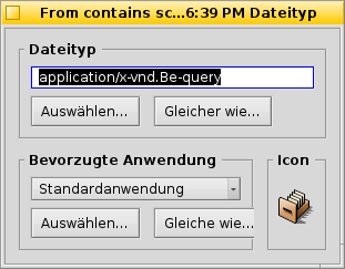
The FileType Add-on shows a layouting issue (here with the German localization):
[Hope this isn't a duplicate again... I try to have a more thorough look through the tracker from now on...]
Attachments (3)
Change History (15)
by , 11 years ago
| Attachment: | localized_FileType_addon.png added |
|---|
comment:1 by , 11 years ago
| Description: | modified (diff) |
|---|
comment:2 by , 10 years ago
| Summary: | Layout problem in add-on → Layout problem in add-on (easy) |
|---|
comment:3 by , 10 years ago
I've succesfully jammed the file, but I don't know how to test it.
I tried to copy "FileType" into /system/non-packaged/add-ons/Tracker, and to restart Tracker, but it didn't change anything.
What's the process of testing for the add-ons ?
by , 10 years ago
| Attachment: | localized_filetype_window_fix.png added |
|---|
Localized filetype window fixed
by , 10 years ago
| Attachment: | 0001-Fixed-overlapping-layouts-due-to-wrong-column-spanin.patch added |
|---|
comment:4 by , 10 years ago
| patch: | 0 → 1 |
|---|
comment:6 by , 10 years ago
I think the text field should still be on 3 columns so it can expand further than the buttons size.
comment:7 by , 10 years ago
Than is this case, it's not a grid layout that should be used. I could update them as simple GroupLayout.
comment:8 by , 10 years ago
Wait, I need enlightenments first.
Do we agree that the GridLayout's grids used for "FileType", and "Preferred Application" are completely independent ?
If I put the column spaning value for FileType's textfield to 3, it does work, but in my opinion, it shouldn't : filetype's grid has only elements on two columns.
What seems to be happening is :
- the spaning is correct for FileType BBox
- the width of the content evaluation is incorrect
comment:9 by , 10 years ago
The grids are independant as far as I can see. It is allowed to have "holes" in a BGridLayout, which is what will happen if the textfield spans 3 columns. It is forced to be at least as wide as the buttons, but can be wider.
comment:10 by , 10 years ago
I understand the colspan part, but imho the grid is supposed to take the whole width inside the BBox.
What I want to say is :
- FileType BBox is declared with an initial width w1, and its content is declared as a grid (grid A)
- This grid A does take the whole width possible in w1
- Main layout grid (grid B) is declared, and order the cell with FileType BBox to span on two columns
- FileType BBox has its width updated to w2
- issue : grid A's width should be updated to w2, it does not happen
comment:11 by , 10 years ago
| Resolution: | → fixed |
|---|---|
| Status: | new → closed |
I don't undersand what you mean, I changed the colspan of just the preferred app ppopup menu (hrev48466) and this works just fine, the filetype text control extends in the empty space as expected.
Our layouts always go for "as small as possible", unless you use SetExplicitAlignment(B_ALIGN_USE_FULL_WIDTH, B_ALIGN_USE_FULL_HEIGHT) to force them to fill the empty space. However in this case I think it is better to keep the buttons from the two boxes at the same (minimal) size so they stay aligned.
comment:12 by , 10 years ago
You answered the question :) I didn't know the options USE_FULL_WIDTH and HEIGHT. Now I understand and it's ok for me too.
Thanks.


cut off labels