Opened 11 years ago
Closed 10 years ago
#10840 closed bug (fixed)
Apps not abiding GUI colour definitions
| Reported by: | humdinger | Owned by: | Janus |
|---|---|---|---|
| Priority: | normal | Milestone: | R1 |
| Component: | Applications | Version: | R1/Development |
| Keywords: | Cc: | ||
| Blocked By: | Blocking: | ||
| Platform: | All |
Description (last modified by )
Attachments (23)
Change History (44)
by , 11 years ago
| Attachment: | Debugger.png added |
|---|
comment:1 by , 11 years ago
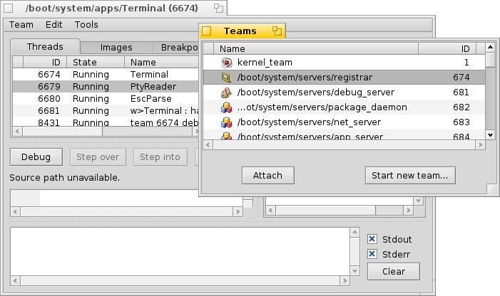
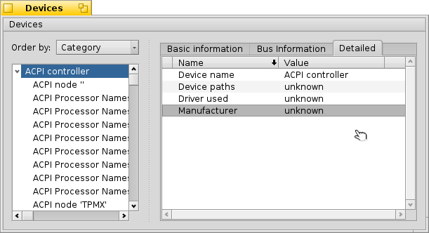
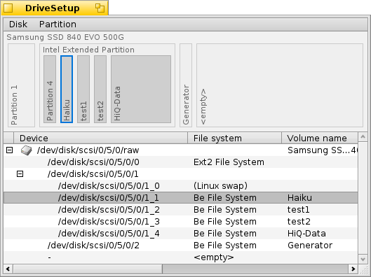
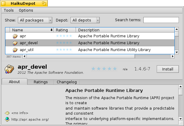
The one for Web+ looks correct to me; as for most of the others, it looks like problems in the ColumnListView and TreeView implementations.
comment:2 by , 11 years ago
Web+ seems to be using the menu selection color for this highlight, which is a bit unexpected. But I think our color constant list doesn't have a better choice...
comment:3 by , 11 years ago
| Description: | modified (diff) |
|---|
comment:4 by , 11 years ago
| Owner: | changed from to |
|---|---|
| Status: | new → assigned |
by , 10 years ago
| Attachment: | 0001-Use-user-color-for-selected-listItem-in-FileTypes-Me.patch added |
|---|
by , 10 years ago
| Attachment: | 0001-Use-user-color-for-selected-menuItem-in-ProcessContr.patch added |
|---|
comment:6 by , 10 years ago
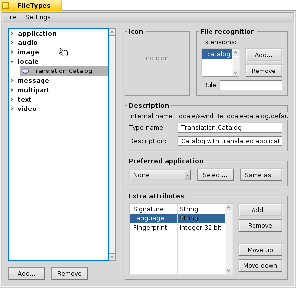
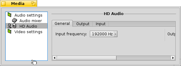
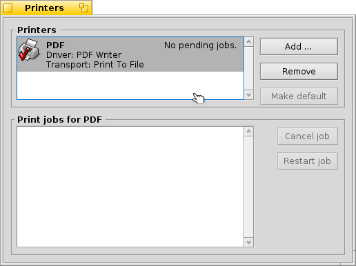
hrev49002 fixes the listItems in:
- FileTypes
- Media
- Printers
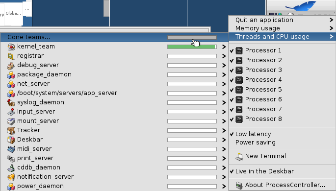
menuItems in:
- ProcessController
BColumnListView needs more thoughts.
comment:7 by , 10 years ago
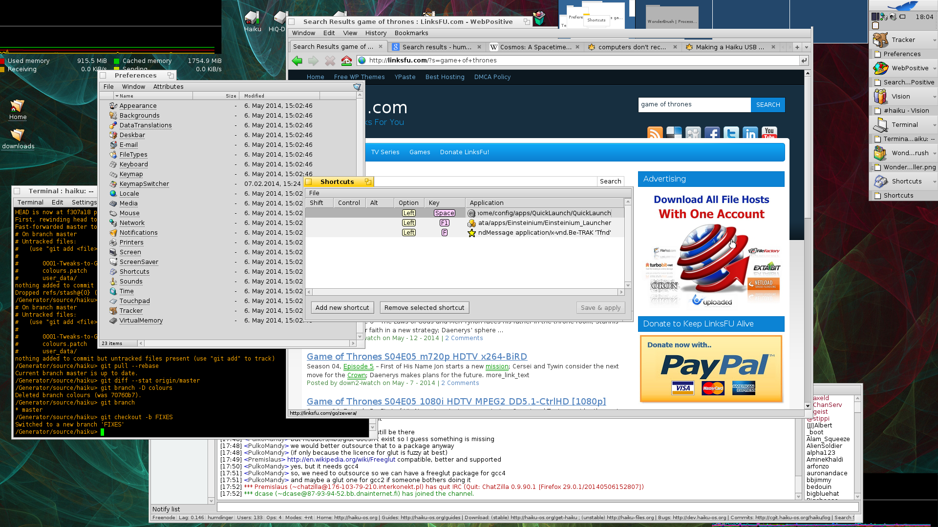
hrev49053 fixes the WebPositive AdressBar.
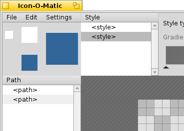
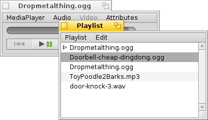
Still to Fix BColumnListView, MediaPlayer and Icon-O-Matic Lists. For Time I don't know which color we should use.
follow-up: 13 comment:8 by , 10 years ago
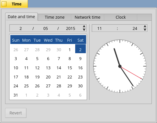
I'd say using B_LIST_SELECTED_BACKGROUND_COLOR and B_LIST_SELECTED_ITEM_TEXT_COLOR for the selected day/month/year/time in the first tab would be adequate.
by , 10 years ago
| Attachment: | Default.png added |
|---|
comment:9 by , 10 years ago
This is the current status the B_LIST_SELECTED_BACKGROUND_COLOR is darker (153, 153, 153) the BColumnListView selection is hardcoded (190, 190, 190).
by , 10 years ago
| Attachment: | BColumnListView with user color support.png added |
|---|
comment:10 by , 10 years ago
This is the BColumnListView using the B_LIST_SELECTED_BACKGROUND_COLOR choose by the user.
by , 10 years ago
| Attachment: | BColumnListView with user color support (Window without focus).png added |
|---|
comment:11 by , 10 years ago
In BColumnListView when the window lost focus the selected item is rendered with a lighter tint. This doesn't happen with list item.
by , 10 years ago
| Attachment: | BColumnListView with keyboard selection.png added |
|---|
by , 10 years ago
| Attachment: | Time.2.png added |
|---|
comment:13 by , 10 years ago
Replying to humdinger:
I'd say using B_LIST_SELECTED_BACKGROUND_COLOR and B_LIST_SELECTED_ITEM_TEXT_COLOR for the selected day/month/year/time in the first tab would be adequate.
If you want to use the B_LIST_SELECTED_BACKGROUND_COLOR in the spinners I think is inappropriate. Maybe we should use the B_MENU_SELECTED_BACKGROUND_COLOR. (Not sure)
comment:14 by , 10 years ago
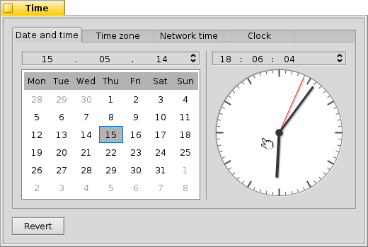
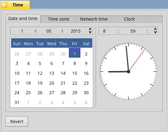
Yep, Time looks good. Not sure B_MENU_*_*_COLOR would be be more appropriate for the date spinner row on top than B_LIST_*_*_COLOR. It is a bit like a horizontal list, so one could argue for the latter...
BTW, have you noticed that the spinner row on top of the clock let's you also select the delimiters ":"? There's also another ":" to separate the seconds. But seconds aren't displayed, because that's not needed. Should I open another ticket for that or do you see a quick fix, while you're in that corner of the code anyway?
by , 10 years ago
| Attachment: | Time without seconds delimiter.png added |
|---|
comment:15 by , 10 years ago
I keep the spinners as they are for now, probably the best fit would be B_CONTROL_* unused at the moment in the UI. I suggested B_MENU_* not for a functional prospective but for a better color mix. The B_MENU_* grey should be darker than the B_LIST_* (the brain perceives difference). A grey on white look darker than the same grey on a lighter grey.
Without the delimiter the view look very ugly :-( What do you think?
by , 10 years ago
| Attachment: | Time with seconds.png added |
|---|
comment:16 by , 10 years ago
With seconds looks good. I cannot find in the history why they were removed.
comment:17 by , 10 years ago
You're right. Reintroduce the seconds to make it look better, though it probably isn't used other than by extreme cases of OCD... :) I'd say with network time, all these settings aren't really used much anyway...
comment:20 by , 10 years ago
| Owner: | changed from to |
|---|



Debugger.png