Opened 10 years ago
Closed 10 years ago
#11924 closed enhancement (fixed)
Small GUI improvement to "DNS settings" view
| Reported by: | humdinger | Owned by: | axeld |
|---|---|---|---|
| Priority: | normal | Milestone: | Unscheduled |
| Component: | Preferences/Network | Version: | R1/Development |
| Keywords: | Cc: | ||
| Blocked By: | Blocking: | ||
| Platform: | All |
Description
This is hrev48942.
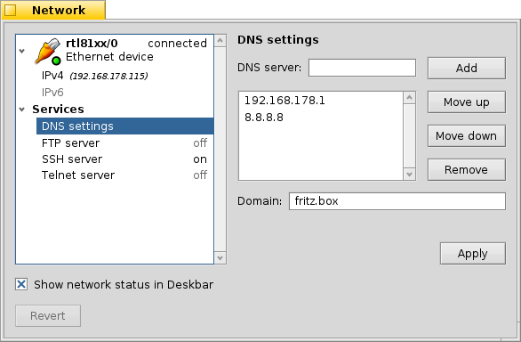
- Remove the "DNS servers" box and only use a horizontal separator above the "Domain" text field. Matches better the apparance of the FTP, SSH, Telnet views.
- Don't resize the buttons when horizontally resizing the window.
See attached screep capture.
Attachments (4)
Change History (14)
by , 10 years ago
| Attachment: | capture_1.mkv added |
|---|
comment:2 by , 10 years ago
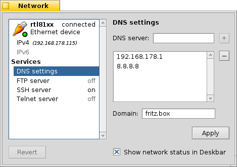
I changed the layout accordingly:
I though I could just replace the BBox with a BView, but that didn't work...
I'd appreciate if anyone could have a quick look at the attached diff, before I commit.
comment:3 by , 10 years ago
by , 10 years ago
| Attachment: | Network.png added |
|---|
follow-up: 7 comment:4 by , 10 years ago
If there were only the buttons "Add" and "Remove" it might be a good idea. But there's also "Move up" and "Move down". Currently it looks nice with four equally sized buttons. Making two of them smaller or only having miniscule labels +/- doesn't look that good, IMO. One could argue to use arrows instead of "Move up/down", but personally, I'd prefer clearly labeled buttons, esp. if there is no pressing need to save space.
Also, do not fret, we're still consistent: The FileTypes preflet also sports "Move up/down" buttons. :)
follow-up: 6 comment:5 by , 10 years ago
From the mockup, I would remove the "DNS Settings" header (that's why I mentioned adding DNS to "Server").
Also, there still should be a horizontal separator between the DNS server, and the domain settings.
comment:6 by , 10 years ago
Replying to axeld:
From the mockup, I would remove the "DNS Settings" header (that's why I mentioned adding DNS to "Server").
It's a screenshot, not a mockup. :) I kept the header, because it's also on all other services (ftp, ssh, telnet). Remove them all?
Also, there still should be a horizontal separator between the DNS server, and the domain settings.
Could be done. Though that would kinda imply that the "Apply" button is only for the domain setting, when it's also for the DNS settings above. Or am I too anal about that?
comment:7 by , 10 years ago
Replying to humdinger:
If there were only the buttons "Add" and "Remove" it might be a good idea. But there's also "Move up" and "Move down".
List items could be done draggable like it's done in Locale preflet so there would be no need for "Move up" and "Move down" buttons :)
comment:8 by , 10 years ago
Alright, then keep the header, and remove the "DNS" again from "DNS server" :-)
I don't think that a separator would affect the 'reach' of the apply button. The server and domain settings are just two separate things; the host name should be somewhere there, too, along with an option not to clobber any of those values by DHCP.
comment:9 by , 10 years ago
OK then. I'll make it so...
When we get the host name into the Network panel, it'd be nice to also get the last remaining setting in: the 'hosts' file. I'll add an enhancement ticket for that.
@diver: The drag&drop-to-sort feature will have to wait for a more capable developer. :)
Also, drag&drop is less discoverable than buttons. But I see the convenience.


capture of superfluous box and resizing buttons