#13808 closed enhancement (fixed)
HaikuDepot: Status/progress indicator
| Reported by: | humdinger | Owned by: | stippi |
|---|---|---|---|
| Priority: | normal | Milestone: | R1/beta2 |
| Component: | Applications/HaikuDepot | Version: | R1/Development |
| Keywords: | Cc: | ||
| Blocked By: | Blocking: | ||
| Platform: | All |
Description
This is hrev51614.
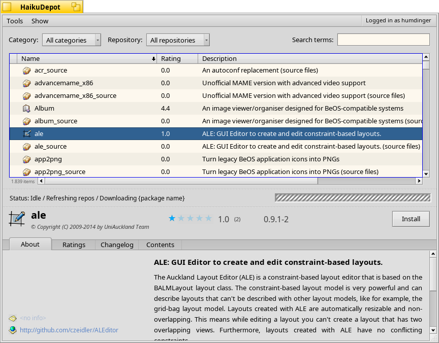
The progress indictator of HaikuDepot's main window is a bit on the huge side.
How about making it a less fancy and use only a very small status bar, like it's done in WebPositive, including the progress bar itself?
Attachments (3)
Change History (36)
comment:1 by , 7 years ago
comment:2 by , 7 years ago
That's probably true, but no argument against making it smaller and more visually pleasing. :)
I expect people's eyes are drawn to it even if it's as small as Web+'s status bar, when there is actual movement in the progress bar. That's usually the case in an otherwise static GUI.
comment:3 by , 7 years ago
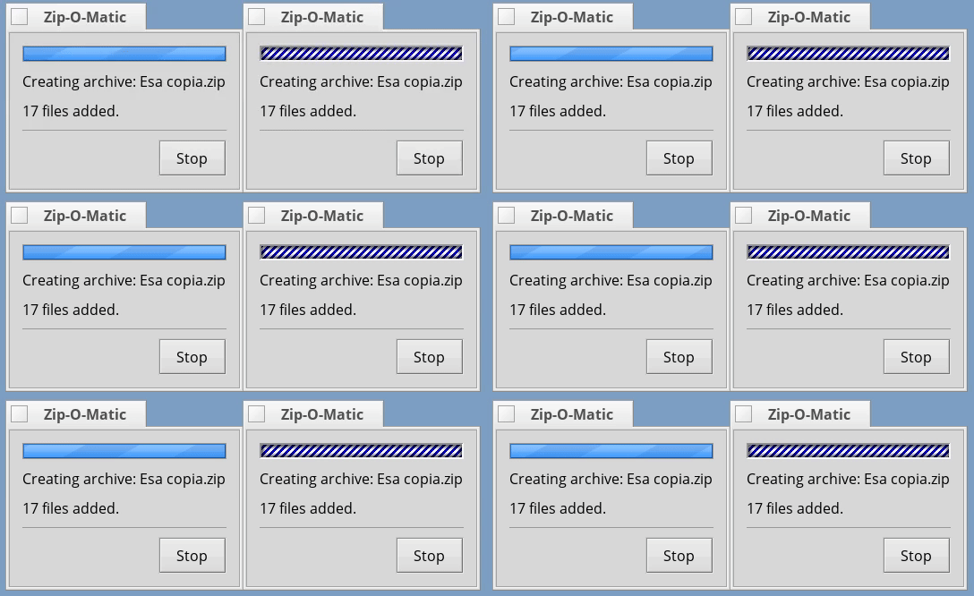
Yeah, I also noticed that the barber pole is way to large. I'm with humdinger here. How about using 3d-ish barber pole from Zip-O-Matic btw?
follow-up: 7 comment:4 by , 7 years ago
Yeah, I'd like to have it smaller too. Still need to find a way to coax the layout APIs to make it smaller, it's the size it is pretty much because the layouting thinks that it's a good size ;-)
comment:5 by , 7 years ago
How about using 3d-ish barber pole from Zip-O-Matic btw?
I find that one not very nice looking, hence created a new one. It's a matter of taste I guess.
comment:6 by , 7 years ago
comment:7 by , 7 years ago
Replying to jua:
Yeah, I'd like to have it smaller too. Still need to find a way to coax the layout APIs to make it smaller, it's the size it is pretty much because the layouting thinks that it's a good size ;-)
The BarberPole is in a LayoutCard with the fProgressBar you can change both size with fProgressBar->SetBarHeight(smallValue);
Personally I like my bar with some substance.
Great job by the way.
comment:8 by , 7 years ago
I guess either BarberPole from ZIp-O-Matic should be used (a nice touch from BeOS days) or replaced there as well with a new one.
comment:9 by , 7 years ago
comment:10 by , 7 years ago
| patch: | 0 → 1 |
|---|
by , 7 years ago
| Attachment: | zipomatic.gif added |
|---|
follow-up: 18 comment:12 by , 7 years ago
Replying to jua:
How about using 3d-ish barber pole from Zip-O-Matic btw?
I find that one not very nice looking, hence created a new one. It's a matter of taste I guess.
I feel your pain.
I hate the zip-o-matic barberpole is why my friends find Haiku so old... I think the system should be consistent a barberpole is a progressbar with time indeterminate. The transition between progress bar and barber pole is seamless. To my eyes the first look more modern and use the Haiku palette. My opinion...
follow-ups: 14 15 comment:13 by , 7 years ago
The one from Zip-O-Matic looks quite "outdated" IMO. Not against a 3D'ish look, a more modern version of it would be nice. I like Janus' suggestion based on the progress bar look, although it might need a little more colour contrast. So if someone implements a nice 3D look, I'd gladly accept the patch(es)... :-)
For now I'll look into making the bar smaller as requested and then focus on a few other, more pressing issues in HaikuDepot...
The BarberPole is in a LayoutCard with the fProgressBar you can change both size with
Ah, thanks for the tip. That could be it indeed. Will try out later.
comment:14 by , 7 years ago
Replying to jua:
The one from Zip-O-Matic looks quite "outdated" IMO. Not against a 3D'ish look, a more modern version of it would be nice. I like Janus' suggestion based on the progress bar look, although it might need a little more colour contrast. So if someone implements a nice 3D look, I'd gladly accept the patch(es)... :-)
For now I'll look into making the bar smaller as requested and then focus on a few other, more pressing issues in HaikuDepot...
My mockup is only a suggestion, but I really think the progressbar and polebar should look very similar... if used in all the os a statusbar can change in a polebar and the other way around based on the current action. We live in a flat world (UI speaking) using too much 3D make the os look outdated.
The BarberPole is in a LayoutCard with the fProgressBar you can change both size with
Ah, thanks for the tip. That could be it indeed. Will try out later.
Choose the size wisely or the progress bar will look too small
comment:15 by , 7 years ago
Replying to jua:
The one from Zip-O-Matic looks quite "outdated" IMO. Not against a 3D'ish look, a more modern version of it would be nice. I like Janus' suggestion based on the progress bar look, although it might need a little more colour contrast. So if someone implements a nice 3D look, I'd gladly accept the patch(es)... :-)
Your barberpole is very configurable I hope someone with good design skill can achieve a very good result.
comment:17 by , 7 years ago
+1 on new barbar pole, the Zip-O-Matic one fits in a lot better on BeOS than it does on Haiku.
The status bar on WebPositive fits in the area between the bottom border and the top of the window resize notch, the Haiku Depot one should ideally also fit in this space, at least at the default font size.
in hrev51622 what is the significance of font size * 0.9? At default the 12pt font size that gives 10.8pt... you didn't even round to an integer value. In Tracker we have used font size * 0.75 in places (e.g. title view in list mode). At default 12pt font size at gives you a value of 9pt. All that said I think the text will fit even at 12pt font size so I'm not sure lowering the font size is needed.
comment:18 by , 7 years ago
Replying to Janus:
The new one on the left looks very nice. To me it feels like what I would have come up with myself.
follow-up: 20 comment:19 by , 7 years ago
Agreed, yeah the left mockup looks excellent. (Perhaps we could even extend BStatusBar to have a mode like that, rather than creating an entirely new control?)
comment:20 by , 7 years ago
Replying to waddlesplash:
Agreed, yeah the left mockup looks excellent.
I have replaced the ZipOMaticActivity class with the jua's BarberPole class from Haikudepot. I have changed the colors and set the background to be_control_look->DrawStatusBar.
(Perhaps we could even extend BStatusBar to have a mode like that, rather than creating an entirely new control?)
+1. Consistency is the key.
follow-up: 25 comment:21 by , 7 years ago
I agree it looks great. Janus: do you want to commit your change to the BarberPole? Otherwise I can implement it, maybe on the weekend, the change should indeed be fairly easy.
However I still think that the colour contrast should be a bit bigger (i.e. the colour of the stripes vs. the colour of the bar behind it).
follow-up: 23 comment:22 by , 7 years ago
I like the new barber pole, too. I'd prefer the nicer be_control_look->DrawTextControlBorder() over the plain be_control_look->DrawBorder(), though.
You all think moving the status bar up under the list view is a bad idea? It's more in the center of attention there and also near the "Install" button. Just saying...
comment:23 by , 7 years ago
Replying to humdinger:
I like the new barber pole, too. I'd prefer the nicer be_control_look->DrawTextControlBorder() over the plain be_control_look->DrawBorder(), though.
You all think moving the status bar up under the list view is a bad idea? It's more in the center of attention there and also near the "Install" button. Just saying...
As far as UI structure is concerned, I think there is the general information of ongoing jobs, which is not specific to the selected package and thus should not be inside the package view. And then there is the case that the selected package happens to be the one being currently downloaded, which then justifies the progress bar within the package view. I can live with the bar where it is right now, since that doesn't conflict with the selected package even when it's the one being downloaded. Another solution is to have two progress bars, one for all jobs and one in the package when it's being downloaded.
You could also view it that you clicked Install in the package and dependencies being downloaded belong to that job as a whole. But when you look at another package, why would the progress bar then remain inside that unrelated package's view? The bottom location doesn't introduce such conflicts.
follow-up: 28 comment:24 by , 7 years ago
Oh... sorry, I just now took a look at the enlarged mockup you did further up. So it's just about moving the status group between the list view and the package view, not inside the package view. That is fine as well. Maybe even better since it doesn't mess with the resize handle how it fits with just the vertical scrollbar.
comment:25 by , 7 years ago
Replying to jua:
I agree it looks great. Janus: do you want to commit your change to the BarberPole? Otherwise I can implement it, maybe on the weekend, the change should indeed be fairly easy.
I will commit the changes asap.
comment:26 by , 7 years ago
I change the barberpole colors in hrev51626. Please let me know what do you think. Feel free to play with the tint and parameters to achieve a better result.
comment:28 by , 7 years ago
Replying to Stephan Aßmus:
Oh... sorry, I just now took a look at the enlarged mockup you did further up. So it's just about moving the status group between the list view and the package view, not inside the package view. That is fine as well. Maybe even better since it doesn't mess with the resize handle how it fits with just the vertical scrollbar.
This would also solve a problem that installing a local package currently doesn't show an overall progress for its deps.
comment:29 by , 7 years ago
comment:30 by , 7 years ago
In hrev51627 I have changed the barberpole of zipomatic. Let me know what you think...
comment:31 by , 7 years ago
| patch: | 1 → 0 |
|---|
comment:32 by , 6 years ago
| Resolution: | → fixed |
|---|---|
| Status: | new → closed |
More improvements to progress indication done in hrev52660, so I think we can safely close this now.
comment:33 by , 5 years ago
| Milestone: | Unscheduled → R1/beta2 |
|---|
Assign tickets with status=closed and resolution=fixed within the R1/beta2 development window to the R1/beta2 Milestone


Well, in this case I think the "app is doing stuff, please wait" part is quite important to the user experience. Much more than in Web+, I'd say.