#13812 closed bug (fixed)
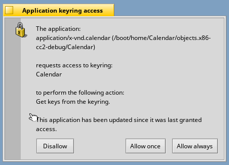
[keystore_server] With big font authorization window is useless
| Reported by: | Janus | Owned by: | mmlr |
|---|---|---|---|
| Priority: | normal | Milestone: | Unscheduled |
| Component: | Servers/keystore_server | Version: | R1/Development |
| Keywords: | Cc: | ||
| Blocked By: | Blocking: | ||
| Platform: | All |
Description (last modified by )
Attachments (2)
Change History (12)
by , 7 years ago
| Attachment: | keystore_server.png added |
|---|
comment:1 by , 7 years ago
| patch: | 0 → 1 |
|---|
comment:2 by , 7 years ago
| Description: | modified (diff) |
|---|
follow-up: 5 comment:3 by , 7 years ago
by , 7 years ago
| Attachment: | Reworked.png added |
|---|
comment:5 by , 7 years ago
Replying to PulkoMandy:
The wording in this window sounds very programmer-ish. What about "The application X wants to {add;remove;access} keys from keyring Y" ? It would waste a lot less space.
I like your idea, but the wording is very problematic, the action string from the server are not internationalized. And with different languages can be difficult to compose a correct sentence.
The problem in the ticket is solved, I think some change in the TextView.
Replying to diver:
From #11315 "I think this window would look better with an icon. Also, maybe make an app path clickable?"
I don't find particularly useful make the app path clickable is the path of the app that has opened this window. I miss something?
I have cleaned up the code and added the server icon.
I think the problem of the wording need a different approach. Thoughts?
follow-up: 7 comment:6 by , 7 years ago
We have BMessageFormat which is designed to make such complex strings localizable. However, it currently only accepts one variable, so we would need to extend the API (the ICU backend handles multiple variables fine).
comment:8 by , 7 years ago
| Resolution: | → fixed |
|---|---|
| Status: | new → closed |
This is solved with some commit in the BTextView area... There is a ticket for the i18n issue discussed in this thicket here #13815.
comment:9 by , 7 years ago
Does it use an app icon or keystore_server icon? IMO it should be the former.
comment:10 by , 7 years ago
This ticket is for the big fonts problem. The ticket for the icon is still open. The window need improvements (#13815, #11315), but because I rewrote the layout I added an icon as a placeholder.
In my opinion it should use the icon of the app with a overlay of a lockpad, but the overlay lockpad icon in the folder artwork is too different from the haiku style that could be very confusing.


The wording in this window sounds very programmer-ish. What about "The application X wants to {add;remove;access} keys from keyring Y" ? It would waste a lot less space.
As for the problem, it is probably the same as in FirstBootPrompt and Locale: one needs to call ResizeToPreferred after setting the text in a BTextView, and a reasonable minimal width should be forced on it so that GetHeightForWidth gives meaningful results.