

Opened 6 years ago
Closed 6 years ago
#14779 closed enhancement (fixed)
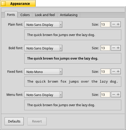
Switch default UI font to Noto Sans Display
| Reported by: | waddlesplash | Owned by: | stippi |
|---|---|---|---|
| Priority: | normal | Milestone: | R1/beta2 |
| Component: | User Interface | Version: | R1/beta1 |
| Keywords: | Cc: | ||
| Blocked By: | Blocking: | ||
| Platform: | All |
Description
This one is more optimized for UIs than Noto Sans is; it has slightly narrower metrics on both width and height, so it's easier on the eyes (at least for me.)
(It's already included in the package, so you can already switch manually if you want to see what it looks like.)
Attachments (2)
Change History (8)
comment:1 by , 6 years ago
comment:2 by , 6 years ago
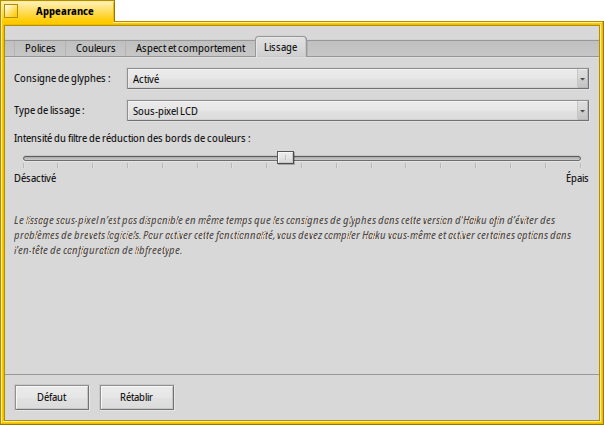
It isn't clear to me what exactly is the optimization for displays. I would think "optimized for displays" means it fits the pixel grid to minimize anti-aliasing artifacts, but neither version seems to be optimized in that way. I would be OK with the change though. Perhaps the optimization becomes apparent with other font-rendering options. At least it's not worse than before.
comment:3 by , 6 years ago
Noto Sans seems wider: https://github.com/googlei18n/noto-fonts/issues/1056
There is also a Noto Sans UI which is more compact vertically, but it is not recommended for body text, only for constrained UI's, so probably not useful.
comment:4 by , 6 years ago
Perhaps the optimization becomes apparent with other font-rendering options. At least it's not worse than before.
Yes, we should enable sub-pixel glyph hinting for FreeType at this point; that seems to make it look markedly better.
comment:5 by , 6 years ago
http://pulkomandy.tk/drop/lcd.png
Well, subpixel still does not work well enough for me.
+1, it does look better (best seen when downloading both images and flipping between them in ShowImage):
Noto Sans - 13pt
Noto Display - 13pt