Opened 6 years ago
Closed 20 months ago
#14782 closed bug (fixed)
Mail: Attachment view too tall
| Reported by: | humdinger | Owned by: | czeidler |
|---|---|---|---|
| Priority: | normal | Milestone: | R1/beta5 |
| Component: | Applications/Mail | Version: | R1/Development |
| Keywords: | Cc: | ||
| Blocked By: | Blocking: | #16800 | |
| Platform: | All |
Description
This is hrev52663.
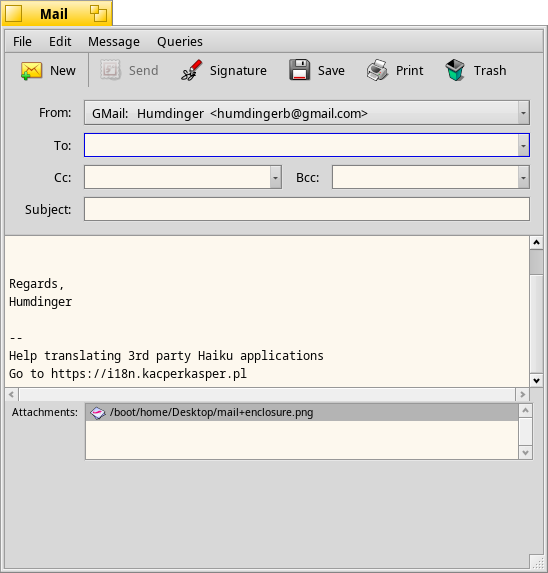
Adding an attachment adds a view with a list of the attached files at the bottom of the Mail window. It's much taller that is needs to be:
Attachments (2)
Change History (18)
by , 6 years ago
| Attachment: | mail+enclosure.png added |
|---|
comment:2 by , 6 years ago
Nope. If a mail has an attachment, you don't see a special attachment view. You just get a clickable blue link as text at the bottom of the mail body like:
<Enclosure: mail+enclosure.png (Type: PNG image)>
comment:3 by , 4 years ago
| Blocking: | 16800 added |
|---|
comment:4 by , 2 years ago
After reading through the code, it looks like the intent was for the message text view to be moved down and the enclosures view to be added above it.
I've attached a proof-of-concept screen shot generated from layout modifications to the Mail application that does this. If this overall design is acceptable, I'll clean it up and open a patchset for it on Gerrit.
comment:5 by , 2 years ago
Personally I'd like it to remain below prefferably a BSplitter.
Also this should always be visible as a drag and drop target, if it is open the UI to drag stuff is soooo much easier to use than having to select every file on it's own.
comment:6 by , 2 years ago
Ideally I'd like to just do a basic fix for the layout issue first. A ticket can then be opened to discuss improvements to how attachments are handled.
comment:7 by , 2 years ago
adding a splitter and using the correct weight would fix it directly. The code to hide the view can be removed then.
comment:8 by , 2 years ago
Maybe I'm misunderstanding what you're suggesting, but dragging-and-dropping attachments already works in the current Mail application. It's how I've been testing my layout changes.
There is no code to hide the enclosures view; it's only added to the window once an attachment is added.
comment:9 by , 2 years ago
Yes, it should be there all the time imo so dragging and dropping works even if no attachment is added yet.
comment:10 by , 2 years ago
Dragging and dropping already works if an attachment isn't added. Just drag a file to the message body and it's added as an attachment.
comment:11 by , 2 years ago
IIRc this does not do what is expected, it tries to inline the data even if you dropped a file. That's mostly not what is wanted and is a bit disastrous for stuff like html.
comment:12 by , 2 years ago
It tries to inline text, everything else is added as an attachment. But again, that's a different discussion that should happen in a new ticket because it fundamentally changes the behavior of the Mail application - maybe people rely on that, maybe they don't.
This visual bug has been here for four years - I have it fixed right now with out any really invasive changes. I think we should just get that done as a first step.
comment:13 by , 2 years ago
changing the location is much more invasive than having it visible by default. If you only want to fix the visual bug only without changing anything else you can do that, but if we do add a BSplitter the specific bug would be gone either way and make this fix obsolete. :)
comment:14 by , 2 years ago
Well, we can discuss it over and over, I think your argument that we should add a splitter has been understood now.
If no one plans to work on it in the short term, let's at least fix the bug that was initially reported here: this view just looks bad.
comment:15 by , 2 years ago
Views refactored to use layouts in hrev56835. That probably fixes the view being too tall, however it's not adjustable. Probably other fixes will be needed.
comment:16 by , 20 months ago
| Milestone: | Unscheduled → R1/beta5 |
|---|---|
| Resolution: | → fixed |
| Status: | new → closed |
The issue described in this ticket has been resolved.
Further changes like using splitters, or always showing the empty attachment view should be discussed in separate tickets.


mail with attachment