

Opened 5 years ago
Last modified 3 years ago
#15430 closed enhancement
Layout issues (and more) of the Quick Tour — at Initial Version
| Reported by: | humdinger | Owned by: | waddlesplash |
|---|---|---|---|
| Priority: | blocker | Milestone: | R1/beta3 |
| Component: | Documentation | Version: | R1/Development |
| Keywords: | Cc: | ||
| Blocked By: | Blocking: | ||
| Platform: | All |
Description
I'll list them here, but can split into separate ticktes if wanted.
- The contents of the original Quick Tour (QT) is center aligned. IMO it looks better and distinguishes the slideshow character of the QT. There are explicit [br /] in the text to have control over the optics, those would have to be removed in all translations when we have to left-align.
- It may be nice to have the top bar (Haiku icon + navigation dots) fixed and scroll only the contents below it. Gives quick access to the language selector and the topics via the navi-dots (which would have to update while scrolling to show the right "topic-dot", I suppose).
The "Topic" in the navi-bar could be replaced with "Top" or "Index" and scroll to the top.
- The navi-bar (navi-dots tooltips and "Topics") are not translatable. As the navi-dor tooltips are similar to the "Index", can we avoid duplicate translations?
- The contents of the "Further reading" bar at the bottom of each slide should be right aligned. The welcome-text in the first slide mentions "At the bottom right of each page". We could make it neutral, but as that would invalidate all translations, so right-aligning would be preferred.
The font-size of the "Further reading" bar should be smaller than the slide contents.
- The first paragraphs ("Welcome to Haiku's Quick Tour") incl. Index should be the 1st slide. The 2nd slide ("The Deskbar") should not be visible yet.
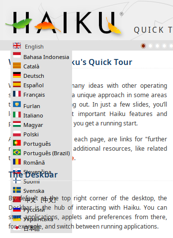
- The language pop-up appears transparently below(?) the slides:
- We should remove the flags and prepend the language code, see #15393.
Note:
See TracTickets
for help on using tickets.