

Opened 5 years ago
Closed 4 years ago
#15430 closed enhancement (fixed)
Layout issues (and more) of the Quick Tour
| Reported by: | humdinger | Owned by: | waddlesplash |
|---|---|---|---|
| Priority: | blocker | Milestone: | R1/beta3 |
| Component: | Documentation | Version: | R1/Development |
| Keywords: | Cc: | ||
| Blocked By: | Blocking: | ||
| Platform: | All |
Description (last modified by )
I'll list them here, but can split into separate ticktes if wanted.
- The contents of the original Quick Tour (QT) is center aligned. IMO it looks better and distinguishes the slideshow character of the QT. There are explicit [br /] in the text to have control over the optics, those would have to be removed in all translations when we have to left-align.
- It may be nice to have the top bar (Haiku icon + navigation dots) fixed and scroll only the contents below it. Gives quick access to the language selector and the topics via the navi-dots (which would have to update while scrolling to show the right "topic-dot", I suppose).
The "Topic" in the navi-bar could be replaced with "Top" or "Index" and scroll to the top.
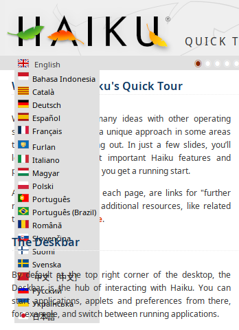
- The navi-bar (navi-dots tooltips and "Topics") are not translatable. As the navi-dor tooltips are similar to the "Index", can we avoid duplicate translations?
- The contents of the "Further reading" bar at the bottom of each slide should be right aligned. fixed The welcome-text in the first slide mentions "At the bottom right of each page". We could make it neutral, but as that would invalidate all translations, so right-aligning would be preferred.
The font-size of the "Further reading" bar should be smaller than the slide contents. fixed
- The first paragraphs ("Welcome to Haiku's Quick Tour") incl. Index should be the 1st slide. The 2nd slide ("The Deskbar") should not be visible yet.
- The language pop-up appears transparently below(?) the slides: fixed
- We should remove the flags and prepend the language code, see #15393. fixed
Attachments (4)
Change History (45)
by , 5 years ago
| Attachment: | transparency.png added |
|---|
comment:1 by , 5 years ago
comment:4 by , 5 years ago
| Milestone: | Unscheduled → R1/beta2 |
|---|
comment:5 by , 5 years ago
The stand alone QuickTour app with a symlink on the Desktop would have been a better option than the current layout implemented in the Beta 2 pre-release IMHO. As it is now, it is clumsy to navigate and appears unfinished. Please reconsider.
comment:7 by , 5 years ago
| Milestone: | → R1/beta3 |
|---|
comment:8 by , 5 years ago
The contents of the "Further reading" bar at the bottom of each slide should be right aligned.
Done.
The font-size of the "Further reading" bar should be smaller than the slide contents.
Done.
follow-up: 11 comment:9 by , 5 years ago
I also removed the extra vertical whitespace so the quick-tour is now at least comfortably scrollable.
I think it may just be a limitation of the userguide translator that we cannot have the navi-dots translated; or if we can, it would be in a way that precludes the top bar from being "sticky."
The next best option may be to add next/prev buttons back to each of the "slides"; however, I'm not sure they really should be slides. At least I personally now prefer the current layout; adding next/prev buttons would be fine, but adding back the white-space and center-aligning would be very different...
Thoughts?
comment:10 by , 5 years ago
If the tool is https://github.com/haiku/userguide-translator/, it would seem that translatable elements have to be declared in translate_tags in inc/config.php. The dots would require html > body > div > div > span > a > acronym there, and probably also acronym > title in relaxed_parsing_attributes. The "topics" text by the dots would need html > body > div > div > span > a in translate_tags (by the way, it points to a non-existent anchor, I'd say you want #index and not #topics), and "Quick Tour" by the logo (should it not be fixed text) html > body > div > div > span. Given that these are all parts of the same chain, I don't know if you'd have to use the most or least specific one, and whether the others would work. Also I don't know php and haven't set up a server to try to install and test the tool, so I may be very wrong here.
If "precludes the top bar from being 'sticky.'" is not about the editing tool but the resulting page, I don't see anything sticky. You may want to change div.nav position to sticky instead of relative. You may even want to add sticky position to div.topic h1 for long slides, but that's probably overkill, and it needs a background and a top value that leaves it below the nav bar.
comment:11 by , 5 years ago
Replying to waddlesplash:
however, I'm not sure they really should be slides. At least I personally now prefer the current layout; adding next/prev buttons would be fine, but adding back the white-space and center-aligning would be very different...
The white-space in the current implementation does feel weird. Mainly because all slides are on one very tall page and you do manual scrolling.
Personally, I always preferred the each-slide-on-one-page version. It's more like a real slide-show instead of one rather long web page. When people see the small scrollbar knob indicating a large amount of text, they don't bother to actually read it, but rather quickly scroll by. A small single page per topic that leads to the next slide OTOH doesn't overwhelm the easily distracted.
comment:12 by , 5 years ago
I don't know, to me anyway clicking a lot of times to view a lot of "slides" is much more "work" than flicking my mouse wheel...
The scroll bar is large but it is due to the screenshots and not so much the text. People generally stop to look at the pretty pictures in such pages; and if they don't, well, I don't know why they would click a dozen or so times :)
comment:13 by , 5 years ago
Clicking the mouse while keeping it on the "Next" button isn't that more taxing than scrubbing the wheel. Having the contents instantly change like a slide, and flicking through page/slide-wise is more comforting to my mind. That's why I much prefer to flip through pages in a real book than scrolling through a large page. Maybe it's a generational thing... :)
Lastly, I feel that many websites etc. also often present the features of their products in short, easily digested slides. There may be something to it marketing/psychological wise...
comment:14 by , 5 years ago
+1 to slides for the quick tour. For people who want to read and scroll around there is already the user guide. Making the quick tour a single scrolling page misses the point.
comment:15 by , 5 years ago
Another vote for slides here. Although long scroll pages are pretty common for general marketing introductions to things, such as most overview-style pages Apple put together, those types of sites tend to be very dynamic with animating elements and text rather than just a set of screenshots.
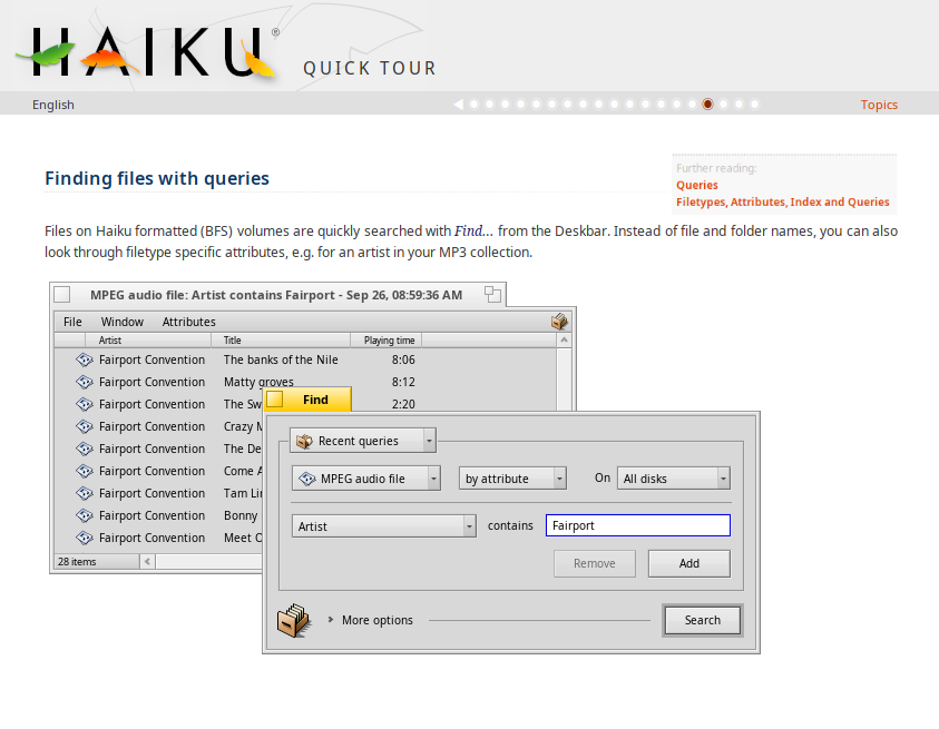
Image galleries for example are almost always presented as slides rather than long scrolling lists. I think there's something about the mental effort required of mapping the "top" and "bottom" of an image that feels much more taxing when they are part of a scrolling document. This is especially the case for screenshots that share many elements in the same placement (eg Deskbar, Desktop Icons etc).
comment:16 by , 5 years ago
OK, I guess I should look into adding some JS to the page to make it turn into actual slides then.
comment:17 by , 5 years ago
Please have a look at http://static.movingborders.es/haiku-welcome/en/quicktour.html [modified files: en/quicktour.html and Haiku-tour.css]
Only for English, inline and unfinished, but will continue with it tomorrow if that's the kind of thing you want.
No UI for it yet, but can be used both as slides and as all-in-one page. Just call toggleFormat() to change.
There's currently a problem in Web+ when scrolling (been working in Linux Firefox), but as that's only to update the navdots in the one-page mode, it can be removed if I don't make it work.
follow-up: 20 comment:18 by , 5 years ago
Looks great! Thanks for working on this!
I think having the footer be all the way at the bottom of the page is kind of hard to notice, though.
comment:19 by , 5 years ago
Turns out I was thinking about the wrong thing... in my defence the ticket didn't have a link to the current version, so I thought the page was something more similar to the screenshot tour at https://www.haiku-os.org/slideshows/haiku-1/ - thanks to madmax for clearing up my confusion!
Still mildly in favour of slides but scrolling on this type of page doesn't feel bad to me either. As humdinger mentioned it might be a generational preference (correlated to having an Instagram account perhaps!)
comment:20 by , 5 years ago
Replying to waddlesplash:
I think having the footer be all the way at the bottom of the page is kind of hard to notice, though.
Not sure what you are after:
- A bit of bottom margin when the slide fits the window
- Keep it by the content even for short slides
- Always show it (except maybe for small displays)
Now with some (small, by the navdots) UI to toggle the view and move to next/previous slide. For some reason WebPositive shows the left triangle (unicode 25C0), but not the right one (unicode 25B6) or the square with quadrant (unicode 25F1). Pe does show the right triangle and FontBoy shows all three characters.
I think all that's left is for someone with taste to choose what to do with the footer, whether one page or slides should be the default and some characters that work (or find a bug in font rendering if that's the problem, or devise a nicer UI).
Files changed: en/quicktour.html (would have to be replicated in other languages), Haiku-tour.css and Haiku-tour.js.
follow-up: 22 comment:21 by , 5 years ago
Thanks very much for working on this, madmax!
Maybe we should abandon the footer and rather move those into a box into the top left corner. Like the Index box at the start page.

by , 5 years ago
| Attachment: | top-box_mockup.png added |
|---|
comment:22 by , 5 years ago
Replying to humdinger:
Maybe we should abandon the footer and rather move those into a box into the top left corner. Like the Index box at the start page.
comment:23 by , 5 years ago
I like it\\ May be even better with non-bold links and a slightly smaller font size?
comment:24 by , 5 years ago
Oh, and could the box look like the Index box of the front page (colour, border), the "Further reading" bold and center?
follow-up: 26 comment:25 by , 5 years ago
Another comment, sorry...
As the "Further reading" box doesn't adapt closely to the width of the contents, i t may look nice to have the contents right-aligned. Worth a try at least.
Can we have big "Previous" and "Next" buttons centered at the bottom? Only visible in slideshow mode, of course.
We need a a bit more spacing between paragraphs.
Hope that's all for now...:)
comment:26 by , 5 years ago
Replying to humdinger:
May be even better with non-bold links and a slightly smaller font size?
Oh, and could the box look like the Index box of the front page (colour, border), the "Further reading" bold and center?
Done, but this changes structure, which may affect the translation tool (said the one who doesn't know how it works). I've gone with a table like the index one, I may clean up and modernize all the document structure someday if I find the will and time to do it.
As the "Further reading" box doesn't adapt closely to the width of the contents, i t may look nice to have the contents right-aligned. Worth a try at least.
That's just because I chose to fix its width to a fourth of the container, so that thin ones (deskbar or twitcher, for example) didn't look like a small splotch and wider ones didn't hoard small windows.
Can we have big "Previous" and "Next" buttons centered at the bottom? Only visible in slideshow mode, of course.
We need a a bit more spacing between paragraphs.
You mean like in "they are crammed in the window management slides but OK in the workspaces one"? That's because the latter is using paragraphs while the other are using line breaks. I've converted a few to paragraphs, but I'm not sure about the intention of all of them.
Please force a reload to avoid the use of a cached copy of css and js.
fit content
fixed width and left alignment
fixed width and right alignment
comment:27 by , 5 years ago
Very nice! Right-aligned looks terrible... :)
I could imagine, the best is what we haven't tried yet: "fixed width and center aligned".
The prev/next buttons look nice, but would be even better with the white left/right unicode triangles (as soon as the right triangle is back from vacation...). This has to be a weird regression, because I remember both triangles working in the original QuickTour.
Maybe we should also name the buttons explicitely, which was discussed for it back then. So: "◀ Previous" and "Next ▶>"
by , 5 years ago
| Attachment: | Haiku-tour.css added |
|---|
comment:28 by , 5 years ago
Could someone with access upload the previous two files? The js is new, and should be placed in the same directory as the css.
I think I have permissions to make the html changes myself. Will ping if that's not the case.
by , 5 years ago
| Attachment: | Haiku-tour.js added |
|---|
comment:30 by , 5 years ago
Added MIT license with copyright attributed to Haiku, Inc.
If for some reason that's not OK, my name is Máximo Castañeda and I'll accept any popular OSI-approved license.
follow-up: 33 comment:32 by , 4 years ago
I get a "403 Forbidden" when I click on the circles on the progress meter.
Also, wouldn't it be nice to wrap this in a window and display upon the first run? Layout seems suitable for this now.
comment:33 by , 4 years ago
Replying to bitigchi:
I get a "403 Forbidden" when I click on the circles on the progress meter.
Also when clicking on the links of the index box, or in other documents in the green up button by the titles. The translation tool doesn't like internal links with anchors, it's nothing quick tour specific.
comment:34 by , 4 years ago
| Description: | modified (diff) |
|---|
Hi!
I have updated the ticket list of tasks to track what has already been done (according to the ticket comments). I'm not sure I understand if Maximo's work has been merged and where the result can be seen.
If someone with better knowledge of our userguide system knows, please help us know exactly what is left to do here?
comment:35 by , 4 years ago
I merged it into the userguide translator, so the Quick Tour as visible there should have all the modifications. We probably should run an export, I suppose...
comment:36 by , 4 years ago
Not exactly a layout issue, but IMO #16111 greatly sticks out. Plus it should automatically load the system locale translation if present.
comment:37 by , 4 years ago
Is this still targeted for B3? I noticed that the Quick Tour still has the issue of the Index links not working after number 9. The URL changes from "quicktour.html#tile" to "quicktour.htm finished".
comment:38 by , 4 years ago
| Priority: | normal → blocker |
|---|
I don't think an export has been done since I merged the new CSS/JS a year ago, it appears.
You can see what the new tour looks like here: https://i18n.haiku-os.org/userguide/export/docs/welcome/en/quicktour.html
A new userguide export should indeed be run before B3. If nobody else has time I can try and find it.
comment:40 by , 4 years ago
A new userguide export should indeed be run before B3. If nobody else has time I can try and find it.
I think that involves more than clicking on "Export Documents" at the online tool... nielx?
comment:41 by , 4 years ago
| Resolution: | → fixed |
|---|---|
| Status: | assigned → closed |
The current guide has been imported as hrev55244 and on the r1beta3 branch.
This is now fixed at least.