

Opened 5 years ago
Closed 5 years ago
#16015 closed bug (fixed)
[Tracker] find window layout seems odd
| Reported by: | diver | Owned by: | PulkoMandy |
|---|---|---|---|
| Priority: | normal | Milestone: | R1/beta2 |
| Component: | Applications/Tracker | Version: | R1/Development |
| Keywords: | Cc: | ||
| Blocked By: | Blocking: | ||
| Platform: | All |
Description (last modified by )
hrev54185 86_64.
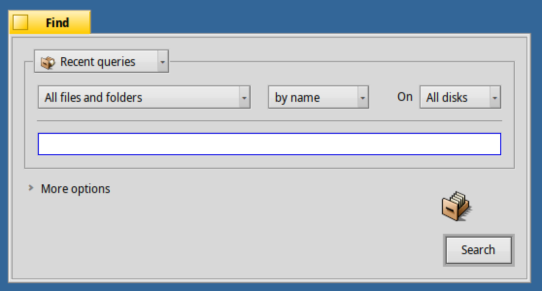
Empty space at the bottom of the window seems odd. Also clicking More options shifts lower part of the window a few pixels down which is unwanted.

Attachments (1)
Change History (8)
by , 5 years ago
| Attachment: | find-window.png added |
|---|
comment:1 by , 5 years ago
| Description: | modified (diff) |
|---|
comment:2 by , 5 years ago
follow-up: 4 comment:3 by , 5 years ago
Maybe we should just remove this "More options" thing and have the extra options always visible?
I think that would be a good idea to have it look less awkward.
Can the d&d icon be moved to the left, in front of the "Query name"? There's a connection between those elements, as the name is used for the created file drop.
For some reason, I have another icon. Mine is a normal folder with a magnifying glass instead of the query icon (using hrev54185). We should stick to the query icon, i think.
comment:4 by , 5 years ago
Replying to humdinger:
Maybe we should just remove this "More options" thing and have the extra options always visible?
I think that would be a good idea to have it look less awkward.
Can the d&d icon be moved to the left, in front of the "Query name"? There's a connection between those elements, as the name is used for the created file drop.
I wanted to make only minimal changes to the window in time for beta2 as the layout of the bottom part was really not that great. I have took notice of your mockups which suggest this, and plan to come back to it at some point, but didn't want to start such a major change weeks before beta2 is released.
Also, I'm a bit unsatisfied by this icon because I feel no one would notice that it can be dragged, and I think even more so if it's too well integrated with other parts of the window - it looks like it was put there just because it looks nice (not that it's something we do, but people coming from other OS would expect such logic). I'm trying to think of something to hint that the icon can be dragged. Maybe change the mouse cursor to the drag one or highlight the icon when the mouse is over it?
For some reason, I have another icon. Mine is a normal folder with a magnifying glass instead of the query icon (using hrev54185). We should stick to the query icon, i think.
You have already opened a bug about this and no one else is seeing that different icon. I suspect something changed the query icon in your filetype preferences?
comment:5 by , 5 years ago
Can the d&d icon be moved to the left, in front of the "Query name"? There's a connection between those elements, as the name is used for the created file drop.
I wanted to make only minimal changes to the window in time for beta2 as the layout of the bottom part was really not that great.
Understood. But the icon was on the left side before these changes. If it stayed threre, I might get away with keeping the old screenshots in the user guide for now...
Maybe change the mouse cursor to the drag one or highlight the icon when the mouse is over it?
Yes. A drag cursor (is there such a thing?), plus a tool tip "Drag'n'drop to save" would indeed be nice.
You have already opened a bug about this and no one else is seeing that different icon. I suspect something changed the query icon in your filetype preferences?
Thanks for helping my failing memory... :) You're most probably right, though I have no idea how that would have happened. Anyway, I'll do a complete from scratch install with the beta2 'release candidates' soon.
comment:6 by , 5 years ago
Fixed in hrev54210 and backported to beta2. Icon back to left side and "More options" removed.
comment:7 by , 5 years ago
| Milestone: | Unscheduled → R1/beta2 |
|---|---|
| Resolution: | → fixed |
| Status: | assigned → closed |
Empty space is there so the window does not change size when opening "More options", the alternative is to have the window resize itself but then the icon and button move down, which looks strange, or stay at the top, which also looks strange.
Maybe we should just remove this "More options" thing and have the extra options always visible?