Opened 5 years ago
Closed 5 years ago
#16481 closed bug
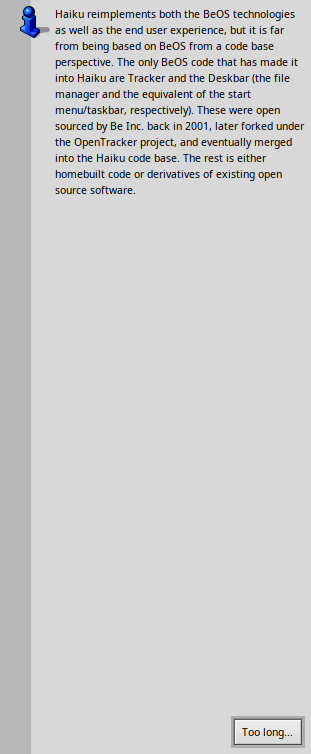
Alerts showing too much vertical 'greyspace'
| Reported by: | humdinger | Owned by: | nobody |
|---|---|---|---|
| Priority: | normal | Milestone: | Unscheduled |
| Component: | Kits/Interface Kit | Version: | R1/Development |
| Keywords: | Cc: | ||
| Blocked By: | Blocking: | ||
| Platform: | All |
Attachments (1)
Change History (4)
by , 5 years ago
| Attachment: | alert_grey_space.png added |
|---|
comment:1 by , 5 years ago
I noticed that too with Sudoku's end of game notice.
Position of text beside the top of the icon also looks weird since it is only one line.
comment:2 by , 5 years ago
Most likely caused by hrev54496. I’m not sure if the bug is in BTextView or BAlert.
Note:
See TracTickets
for help on using tickets.


Too tall an alert