

Opened 4 years ago
Closed 4 years ago
#16832 closed enhancement (invalid)
Make website more responsive to larger, wider screens
| Reported by: | jt15s | Owned by: | waddlesplash |
|---|---|---|---|
| Priority: | normal | Milestone: | Unscheduled |
| Component: | Website/www.haiku-os.org | Version: | R1/beta2 |
| Keywords: | Cc: | ||
| Blocked By: | Blocking: | ||
| Platform: | All |
Description
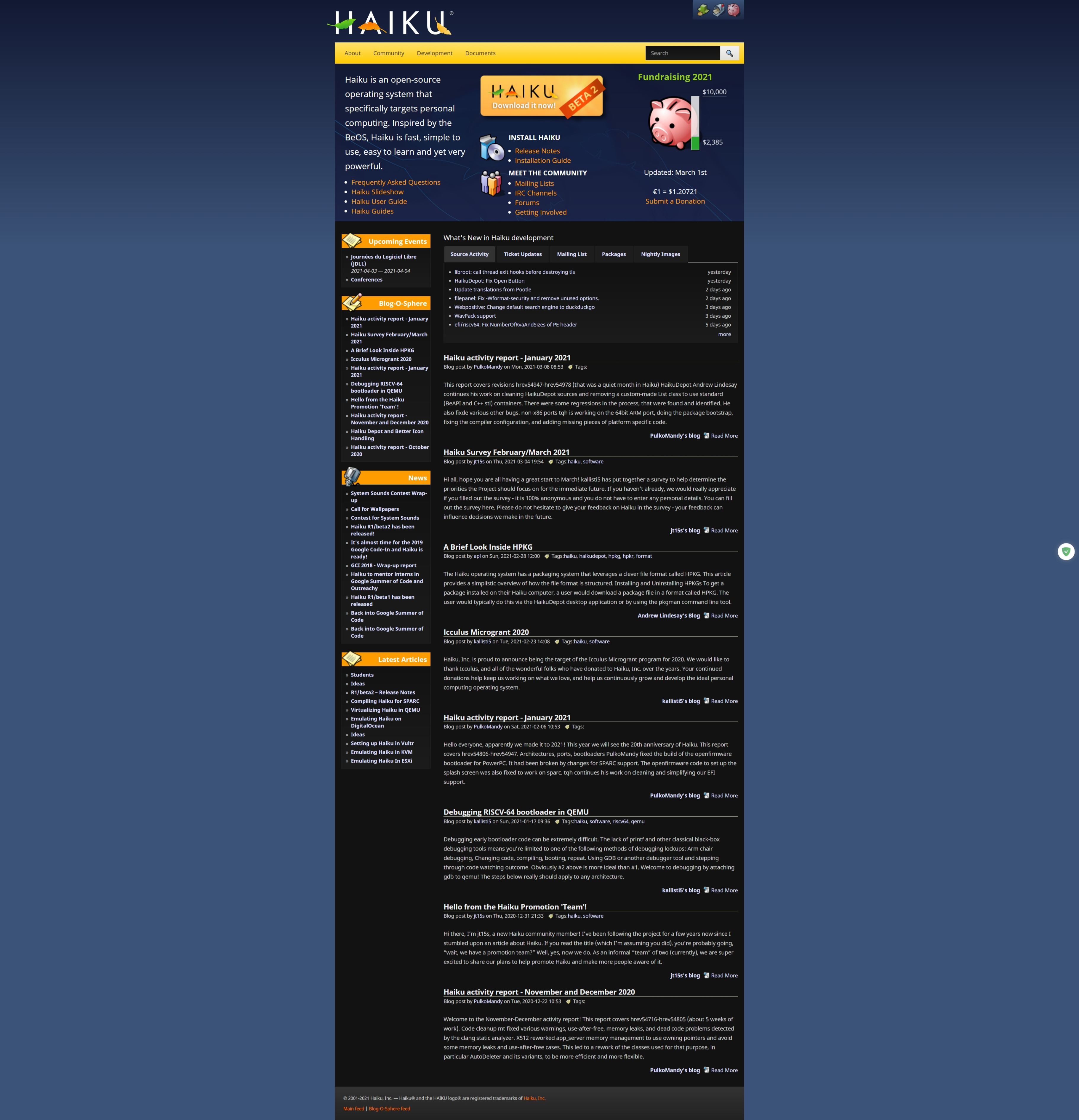
Haiku's website is responsive for the most part, however, on large/wide screens like monitors, the website does not fill the whole screen space, and is surrounded by a dark blue border on both sides. It would be good if the Haiku website is made more responsive to these wider screens to improve the user experience.
Thanks!
Attachments (1)
Change History (3)
by , 4 years ago
| Attachment: | Web capture_8-3-2021_2086_www.haiku-os.org.jpeg added |
|---|
comment:1 by , 4 years ago
It might be a good idea to increase the padding a bit, but to note, websites are not supposed to fill the whole screen, instead it should provide a paper-like experience.
Using browsers full-screen is a common misconception that leads to wasted screen estate.
comment:2 by , 4 years ago
| Resolution: | → invalid |
|---|---|
| Status: | new → closed |
Yes, reading text wrapping across a full screen is not fun at all; the constrained width is very much intentional.
Note:
See TracTickets
for help on using tickets.
A screenshot of what the Haiku website looks like on a large monitor.