

Opened 2 years ago
Closed 2 years ago
#17872 closed bug (fixed)
Appearance font selector text wrapping misbehaves
| Reported by: | waddlesplash | Owned by: | jscipione |
|---|---|---|---|
| Priority: | normal | Milestone: | R1/beta4 |
| Component: | Preferences/Appearance | Version: | R1/beta3 |
| Keywords: | Cc: | ||
| Blocked By: | Blocking: | ||
| Platform: | All |
Description
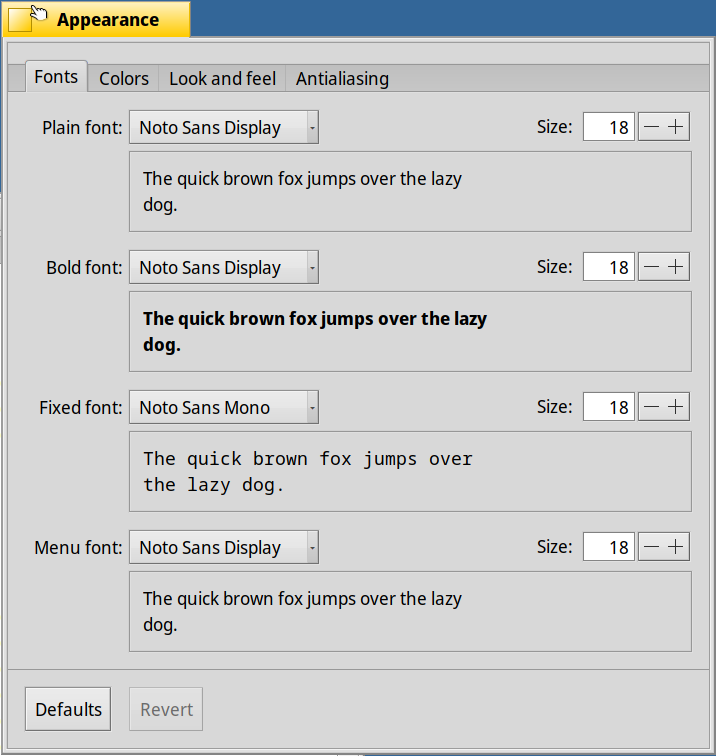
At least on larger font sizes (e.g. 18pt), starting Appearance has the text wrapped at only about 2/3 of the actual width of the text box. This seems unnecessarily wasteful and does not look very appealing.
Attachments (2)
Change History (8)
comment:1 by , 2 years ago
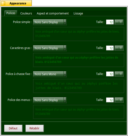
by , 2 years ago
| Attachment: | Appearance.png added |
|---|
comment:2 by , 2 years ago
There's clearly space for the remaining words on the same line, it doesn't need to wrap in this case.
comment:3 by , 2 years ago
Ok that’s not what I was thinking it was, there’s enough room there but it’s clearly messed up. The initial text width calculation is done in a different way because the text wrapping isn’t know at that point. The wrapping should fix itself if you bump the font size up and down but I’m not sure why the initial width calculation is not working in this case.
comment:5 by , 2 years ago
While at it, use document background colour for the preview background or panel text colour for the text preview. Otherwise we may have readability problems.
comment:6 by , 2 years ago
| Milestone: | Unscheduled → R1/beta4 |
|---|---|
| Resolution: | → fixed |
| Status: | assigned → closed |
Fixed in hrev56434.
There’s probably an adjustment that could be made here but that’s how wrapping works, it wraps the whole word. Do we have justified text support? Screenshot please.