

Opened 14 months ago
Closed 9 days ago
#18727 closed enhancement (fixed)
Improve visibility of "on-other-workspace" icon
| Reported by: | humdinger | Owned by: | jscipione |
|---|---|---|---|
| Priority: | normal | Milestone: | Unscheduled |
| Component: | Applications/Deskbar | Version: | R1/beta4 |
| Keywords: | Cc: | ||
| Blocked By: | Blocking: | ||
| Platform: | All |
Description (last modified by )
This is hrev57431, 64bit.
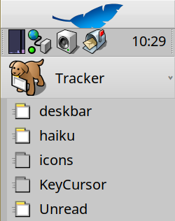
Since the very welcome introduction of vector icons for the window icons in the Deskbar, the swishy lines indicating that a window is on another worspace weren't as visible as before.
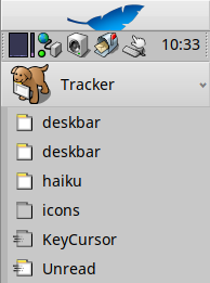
I changed the lines to make it less conspicuous:
Now:


Changed:


If approved, I create a little patch on Gerrit
Attachments (4)
Change History (18)
by , 14 months ago
| Attachment: | screenshot1_old_small.png added |
|---|
comment:1 by , 14 months ago
| Description: | modified (diff) |
|---|
comment:2 by , 14 months ago
Yes that looks good… You can make the icons wider if you’d like something closer to the original. The regular folder icons would have to be made wider and pushed to the right so everything lines up. However I like what you’re done extending the lines into the window, clever.
comment:3 by , 14 months ago
Patch at https://review.haiku-os.org/c/haiku/+/7280
The regular folder icons would have to be made wider and pushed to the right so everything lines up.
You mean the "regular window icons"? No folder icons in Deskbar's window list, I think. The window icons were correctly displayed without moving the icons to the right edge in IOM. I did so anyway, because the lines-icon can then be simply add via "Append..." in IOM.
comment:4 by , 14 months ago
No I know, I’m saying that if you want a rectangular icon that bleeds into the gray area on the left closer to the original that is possible but the non-zoom icons would also have to be made wider in that case. In this case, the regular icons don’t need updating.
comment:5 by , 14 months ago
This is all my fault for being bad at icon design… I did my best, but yes my “zoom” / other workspace icons could use some work.
comment:6 by , 14 months ago
I probably still don't understand completely what you say... :)
I think the current icons look nice, being about square as they are. We couldn't really make them wider, because we need the space at the left for the "swishy" lines. The icons should always look identical, with just the swishy lines being there or not.
Maybe zuMi could improve them further, but it's not super straight forward, because to see them in action, you need to export to RDEF, exchange the data in icon.rdef, compile, stop Deskbar and launch the built one...
comment:7 by , 14 months ago
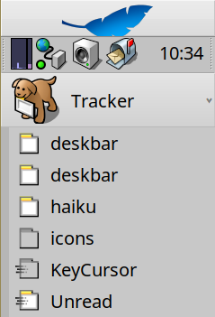
https://www.haiku-os.org/docs/userguide/en/images/deskbar-images/list-of-apps.png
Perhaps seeing the pre-vector version will jog your memory. The icons you made are you fine, but when we switched to vector we lost the bit that extends to the left, perhaps that is not needed or even desired.
comment:8 by , 14 months ago
FWIW your version looks better than the original. I just wanted you to be aware of this.
comment:9 by , 14 months ago
If you’d like to make something closer to the original the zoom lines can be extended a to the left. The non zoom versions would need to be pushed right to match so it all lines up. Or, don’t do thst, it’s fine either way.
comment:10 by , 14 months ago
I kind of like the original pre-vector version, yeah. The new ones do look better though, we might as well merge those as-is.
comment:11 by , 14 months ago
Merged in hrev57487. Leaving this open in case we want to discuss more.
comment:12 by , 14 months ago
The icon-windows are already pushed to the right edge. I now tried making the window taller so it's using all available space. Doesn't look better... Also, the swishy lines refuse to intersect with the darker grey column at the left.
Anyway. I feel my work is done (and merged already, thanks waddlesplash).
comment:13 by , 14 months ago
Making the swishy lines intersect would require changing code in Deskbar, I think.
current