Opened 4 months ago
Closed 3 months ago
#19132 closed enhancement (fixed)
TextControl: MarkAsInvalid()ed is hardly distinguishable
| Reported by: | humdinger | Owned by: | nobody |
|---|---|---|---|
| Priority: | normal | Milestone: | R1/beta6 |
| Component: | Kits/Interface Kit | Version: | R1/beta5 |
| Keywords: | Cc: | ||
| Blocked By: | Blocking: | ||
| Platform: | All |
Description
TextControl's MarkAsInvalid() is to be used to indicate to the user that the inserted value is 'bad'.
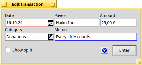
Unfortunately invalid boxes are hardly distinguishable from valid ones, because only their border is drawn in the "Failure" colour (default: red). See:
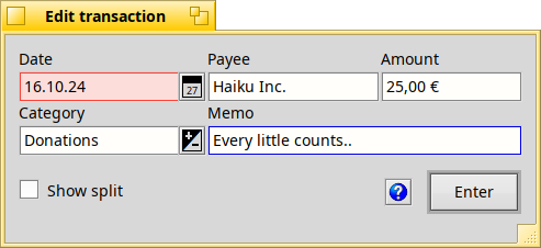
Would it be possible to additionally tint the whole background like this:
Attachments (2)
Change History (6)
by , 4 months ago
| Attachment: | MarkAsInvalid_now.png added |
|---|
by , 4 months ago
| Attachment: | MarkAsInvalid_new.png added |
|---|
comment:1 by , 4 months ago
comment:2 by , 4 months ago
The colour shouldn't be a problem. We know the user uses B_CONTROL_TEXT_COLOR on B_CONTROL_BACKGROUND_COLOR and the Appearance prefs have already demonstrated that colour combinations can be computed. If a user likes "weird" colours they may have to fiddle with their B_FAILURE_COLOR (which is used for marking stuff invalid).
comment:3 by , 4 months ago
As, we can't tell what colour people will pick for text, you can't predict the resulting contrast when you are tinting the background
No, we know what color is used. Tinting the background with a hsl color space operation would not be that difficult.
comment:4 by , 3 months ago
| Milestone: | Unscheduled → R1/beta6 |
|---|---|
| Resolution: | → fixed |
| Status: | new → closed |
Tinting the background with a hsl color space operation would not be that difficult.
We are now tinting the background with hsl :) hrev58285


Here your navigation colour is blue, as we can see bordering 'Memo' case. But I have some colour schemes where it is orange and indeed it can lead to confusion.
The only problem possible with your proposal is the contrast. We need the case content to be readable for the user to understand the mistake and to correct it. As, we can't tell what colour people will pick for text, you can't predict the resulting contrast when you are tinting the background. Perhaps, in addition, text colour will have to be overridden and turned to black (or white depending of failure colour) if content is invalid.
Another solution might be to make failure border larger, 2px instead of 1 px.
Maybe the input of colour-blind people would be interesting.