

Opened 15 years ago
Last modified 8 years ago
#4216 assigned enhancement
Simplify the Move to / Copy to / Create Link context menus — at Version 11
| Reported by: | BePhantom | Owned by: | axeld |
|---|---|---|---|
| Priority: | normal | Milestone: | Unscheduled |
| Component: | Applications/Tracker | Version: | R1/Development |
| Keywords: | Cc: | ||
| Blocked By: | Blocking: | ||
| Platform: | All |
Description (last modified by )
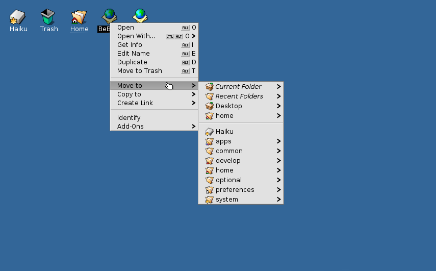
Move to, Copy to, and Create Link sub menus are extremely complex, due to the number of folders and sub folders (before.png).
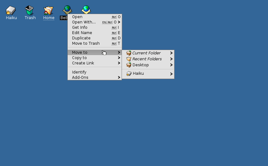
There's much room for improvement, it can be simplified. I made a rough image with gimp so as to show how it could look like (after.png). I think new users would benefit from this, my image is just a suggestion and I hope it will trigger a discussion on how to further improve it.
Change History (13)
by , 15 years ago
| Attachment: | before.png added |
|---|
by , 15 years ago
comment:1 by , 15 years ago
| Component: | User Interface → Applications/Tracker |
|---|---|
| Owner: | changed from to |
follow-up: 6 comment:2 by , 15 years ago
The current behavior is not "complex", it is efficient. If I want to move a folder from /home to /apps it is very easy, one movement. Your suggestion makes it more work, albeit only one level more, but still added mouse movements that are unnecessary and unwarranted. By trying to "simplify" the 'move to' behavior you are actually making it more difficult. It is my opinion that this ticket be marked as 'Invalid'.
comment:3 by , 15 years ago
The Phantom has a point. There are too many submenus but there are also a few missing. Where does a user move/copy stuff? Within his home folder, /boot/common/ and mounted volumes. In fact, these will be the only touchable folders when multiuser rights are enforced.
IMO, in general, the /boot/apps/ folder should be moved to /boot/home/ and /boot/common/. Same for the /boot/preferences/.
So, in anticipation of multiuser limitations, I'd hide the folders you don't have rights to anyway under the "Haiku" entry (which should be navigatable as well as all other mounted volumes.
Like this:
 Current Folder  >
 Recent Folders  >
 Desktop  >
 home  >
 common  >
-------------------
 Haiku  >
 [mounted Volume 1]  >
 [mounted Volume 2]  >
 [mounted Volume 3]  >
comment:4 by , 15 years ago
Not sure I understand what humdinger is talking about wrt permissions (please note that you might not have the rights to write access /boot/home but still /boot/home/humdinger, for example), but I like BePhantoms and his solution better than the status quo - it's not obvious (and helpful?) why that menu shows the root directory of the current volume.
comment:5 by , 15 years ago
I meant, why offering to copy a file to a location you're not supposed to write (e.g. /boot/system). The "home" above is of course your own home folder, which is ATM just /boot/home/.
Note that you still can do so by using the navigational submenu of the boot partition ("Haiku"). It's just not necessary to show it all, when you in most case just need your home folder, the shared common folder and mounted volumes.
comment:6 by , 15 years ago
Things I don't like about the menus:
- showing mostly folders I don't care about
- the use of italics
- not showing "Current folder" by its real name
- the "parent folder" item
- haphazard mix of real/unreal folders
I think these menus were originally meant to start at top-level items (e.g. Home, Desktop, Volumes) and be traversed in a single-direction only.
I don't think these menus have to be the optimal way to accomplish every possible move/copy/link operation. (Say, parent's parent in a deep hierarchy.) It's more important that the menus make sense. And by that I mean easy recognition and immediate understanding. So that the menus get used.
Replying to Disreali:
The current behavior is not "complex", it is efficient.
If there is to remain a speed dial (the folders below the separator) it would make more sense to use that area for Favorite and/or Recent folders. (see BFilePanel's menu)
comment:7 by , 15 years ago
One could of course make it configurable, but that would not make it any less important choosing a good default configuration.
[x] Desktop        [o] submenu [ ] expanded  (up) (down) (insert separator)
[x] Volumes        [ ] submenu [o] expanded  (up) (down) (insert separator)
[ ] Recent         [o] submenu [ ] expanded  (up) (down) (insert separator)
[x] Favorites      [ ] submenu [o] expanded  (up) (down) (insert separator)
[ ] Current Folder [o] submenu [ ] expanded  (up) (down) (insert separator)
comment:8 by , 15 years ago
I would like to avoid a configuration panel.
In your above list, I would just add a submenued "Recent Folder" and I would also submenu the Favorites. Maybe the Desktop and Home folder could be added to the Favorites by default.
comment:9 by , 15 years ago
So many comments :)I agree with what jonas.kirilla said, menus should make sense. Sometimes "efficiency" kills the whole experience. On a side note I think the "home" folder should be cleaned up, there shouldn't be a visible "config" folder inside, it should be hidden or moved somewhere else. It would be nice to have Pictures, Music, Documents, etc. sub folders by default inside home.
comment:10 by , 15 years ago
After a day to think about what everyone else has contributed to the discussion, I now see my initial comment as a "knee-jerk" reaction to change.
I now see there is merit to BePhantom's suggestion. I like humdinger's proposed menu setup in comment 3, although I would remove /common and make /Haiku and other mounted volumes navigable.
 Current Folder  >
 Recent Folders  >
 Desktop  >
 home  >
 Haiku  >
-------------------
 [mounted Volume 1]  >
 [mounted Volume 2]  >
 [mounted Volume 3]  >
Though Jonas's suggested configuration panel would allow more choice for users, I agree with Humdinger on that matter. It would add more complexity for little benefit. I would suggest any config functionality be done after R1 is released.
Replying to jonas.kirilla:
I think these menus were originally meant to start at top-level items (e.g. Home, Desktop, Volumes) and be traversed in a single-direction only.
That was the original behaviour but when OpenTracker replace Tracker, axel and other added more functionality for which I am greatful. I especially like the 'Current/Parent Folder' and 'Recent Folder' options.
If there is to remain a speed dial (the folders below the separator) it would make more sense to use that area for Favorite and/or Recent folders. (see BFilePanel's menu)
I would not move the 'Recent Folder' option there as its current location is easier for many including myself. However, I do not have any other reasons to keep it at the second spot other than habit.
comment:11 by , 14 years ago
| Description: | modified (diff) |
|---|---|
| Summary: | Move to / Copy to → Simplify the Move to / Copy to / Create Link context menus |
| Version: | R1/pre-alpha1 → R1/Development |
Guessing this belongs as a "Tracker" enhancement