

#4799 closed enhancement (fixed)
Slightly tinted window entries in expanded Deskbar
| Reported by: | humdinger | Owned by: | axeld |
|---|---|---|---|
| Priority: | normal | Milestone: | R1 |
| Component: | Applications/Deskbar | Version: | R1/Development |
| Keywords: | Cc: | ||
| Blocked By: | Blocking: | ||
| Platform: | All |
Description
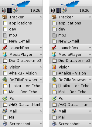
I have a small suggestion to make it more visible what's a running app and what are its windows when using Deskbar's expanding mode.

Attachments (1)
Change History (10)
by , 15 years ago
| Attachment: | deskbar.png added |
|---|
comment:1 by , 15 years ago
| Resolution: | → fixed |
|---|---|
| Status: | new → closed |
Implemented in hrev33629. Thanks for the suggestion!
follow-up: 4 comment:3 by , 15 years ago
Now that I've used this for a few days, I must say I actually liked the previous version better, at least the distinction between apps and windows was already pretty clear before. Maybe using only a slightly darker background?
comment:4 by , 15 years ago
Replying to axeld:
Maybe using only a slightly darker background?
I thought that slightly darker background *was* all the change. No?
comment:5 by , 15 years ago
Duh, a slightly darker background than that of the original menus - the current color looks too dark IMO :-)
comment:6 by , 15 years ago
A matter of taste. Go over to stippi and fiddle and tune until it's right. Stippi has a good eye for these things. :)
comment:7 by , 15 years ago
I am with Axel here. The original subtle but clearly distinguishable difference is perfectly effective, and fits much better in the overall color scheme. This change seems more like a solution looking for a problem.
follow-up: 9 comment:8 by , 15 years ago
I don't agree. IMO it makes sense to have the windows of an app visually lower (= a bit in the shadow). Maybe a candidate for the Appearance panel.
comment:9 by , 15 years ago
Replying to humdinger:
I don't agree. IMO it makes sense to have the windows of an app visually lower (= a bit in the shadow). Maybe a candidate for the Appearance panel.
The visual clues to distinguish between the app entry and its windows are very clear (gradient vs. solid color + the colored indentation). So unless you are looking at this in the context of visually impaired user, this change adds no improvement and the modified color definitely looks out of whack with the default Haiku color scheme.
tinted window entries in expanding Deskbar mode