Opened 15 years ago
Closed 10 years ago
#5125 closed enhancement (fixed)
Screen preflet layout enhancement
| Reported by: | humdinger | Owned by: | axeld |
|---|---|---|---|
| Priority: | normal | Milestone: | R1 |
| Component: | Preferences/Screen | Version: | R1/Development |
| Keywords: | mockup | Cc: | |
| Blocked By: | Blocking: | ||
| Platform: | All |
Description
This is hrev43660.
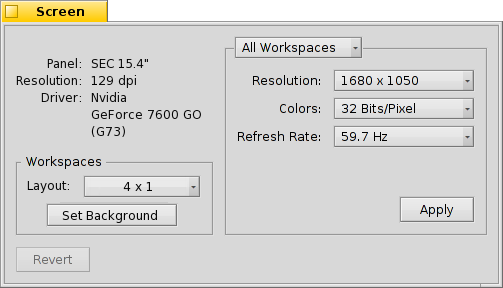
After seeing ticket #5112, I wondered, where to provide this EDID and driver information. While the current monitor representation is nice and all, it's not really providing vital information.
In my mockup, I therefore removed it and replaced it with simple text. Maybe there's more to show, but this is all information I currently get.
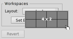
I'd also be nice to have a more intuitive way to set the workspaces layout. The idea is to use something like a when inserting spreadsheet-table in a word-processor. Clicking the "4 x 1" pop-up menu will show a representation of the current workspace layout. Tracking the mouse, the user chooses rows and columns.
Like this, for a 4 x 2 setting:
Attachments (2)
Change History (9)
by , 15 years ago
| Attachment: | Screen_pref.png added |
|---|
comment:1 by , 15 years ago
I kind of like the second suggestion. However, while the monitor view is not that useful right now, this will change once we support multiple screens.
At that point, the Screen interface needs to be rethought anyway, though.
comment:2 by , 15 years ago
Ah, yes, forgot about multi-monitor again...
Maybe above the monitor(s) representation, there could be a "More information" (or "Technical info" or whatever) with an expander. Expanding will replace the monitor(s) with all the info like in the mockup. Collapsing will show the monitor(s) again.
Maybe that's even better, since this technical information isn't relevant to the normal user.
follow-up: 4 comment:3 by , 15 years ago
Actually, I really like the simplicity of configuring the workspace layout. I would not change that again. It is perfectly flexible and allows any configuration without bending backwards with the GUI.
comment:4 by , 15 years ago
Replying to stippi:
Actually, I really like the simplicity of configuring the workspace layout. I would not change that again. It is perfectly flexible and allows any configuration without bending backwards with the GUI.
I'd have to agree here, I really don't see a problem with the way it works now.
comment:5 by , 15 years ago
Just clarify: I wouldn't implement this suggestion either, I kind of like it, though :-)
As a general rule, one should always only use standard interface elements for the UI if possible - and the current solution works pretty well, so there is no reasoning to develop a custom UI element just for this.
comment:6 by , 15 years ago
Shame. It would have been very clean, saving labels, text boxes, buttons and quite a few clicks. And it's its own preview.
comment:7 by , 10 years ago
| Resolution: | → fixed |
|---|---|
| Status: | new → closed |
Implemented the relevant part (showing the video card name) in hrev48416. I think it's better to not do the other changes for now.


Screen preferences mockup