Opened 14 years ago
Closed 7 years ago
#6914 closed bug (fixed)
[PowerStatus] replicant icons overlap others
| Reported by: | diver | Owned by: | nobody |
|---|---|---|---|
| Priority: | normal | Milestone: | R1 |
| Component: | Applications/PowerStatus | Version: | R1/Development |
| Keywords: | Cc: | ||
| Blocked By: | Blocking: | #11333 | |
| Platform: | All |
Description
This is hrev39623 gcc4hybrid.

Attachments (2)
Change History (9)
by , 14 years ago
| Attachment: | powerstatus.png added |
|---|
comment:2 by , 14 years ago
Is this not more of a general problem when having text next to the icon in the launch area? (can't remeber if it's called launch area)
comment:3 by , 10 years ago
| Blocking: | 11333 added |
|---|
comment:4 by , 8 years ago
is still valid? I tested in recent gcc2 hybrid (hrev50668) and there isn't any overlap. Please see attachment.
by , 8 years ago
| Attachment: | ReplicantItems_hrev50668.png added |
|---|
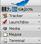
hrev50668 (not pay attention to the 0% indicator... I just removed the battery :-)
comment:5 by , 8 years ago
It depends how many icons you have and how they are laid out. The DeskBar gives each replicant a 16x16 pixel space. This one can use more. Sometimes it works, if there is extra space in the line. But sometimes it doesn't.
comment:6 by , 8 years ago
| Owner: | changed from to |
|---|---|
| Status: | new → assigned |
comment:7 by , 7 years ago
| Resolution: | → fixed |
|---|---|
| Status: | assigned → closed |
Fixed in hrev51524 When powerstatus width changes to show or hide battery percentage it now sends a message to Deskbar informing it to realign its replicants


I can confirm as well, using a GCC2 hybrid of hrev39567. For me, PowerStatus seems to overlap over the time. Right now it shows 76% and then PM, hence blocking out the time entirely. Sometimes it shows part of the time though, and the percentage charged disappears. Regardless, it certainly isn't desired behavior.