Opened 13 years ago
Closed 12 years ago
#8566 closed bug (fixed)
[notification_server] use close button from Web+
| Reported by: | diver | Owned by: | leavengood |
|---|---|---|---|
| Priority: | normal | Milestone: | R1 |
| Component: | Servers/notification_server | Version: | R1/Development |
| Keywords: | Cc: | ||
| Blocked By: | Blocking: | ||
| Platform: | All |
Attachments (3)
Change History (12)
comment:2 by , 12 years ago
Done in hrev44765.
Using a rectangle does not make it clear that it is a "close" button, so I'd rather avoid it ?
comment:3 by , 12 years ago
| Resolution: | → fixed |
|---|---|
| Status: | new → closed |
comment:4 by , 12 years ago
| Resolution: | fixed |
|---|---|
| Status: | closed → reopened |
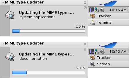
There is a regression, though: Label in AppGroupView appears 2 pixels higher than before:
While I'm at it I'd like to propose some improvements:
- Move label 2 pixels lower as it was before
- Add pressed state to close widget.
- Don't show 2 close buttons in case of a single notification.
- Change AppGroupView height to match Deskbar leaf button height
by , 12 years ago
| Attachment: | notification.png added |
|---|
by , 12 years ago
| Attachment: | notification_mockup.png added |
|---|
by , 12 years ago
| Attachment: | notification_changes.png added |
|---|
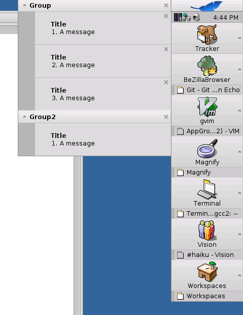
A real screenshot of experimental changes
comment:7 by , 12 years ago
comment:9 by , 12 years ago
| Resolution: | → fixed |
|---|---|
| Status: | in-progress → closed |
OK, this has been committed in hrev45349.
Note:
See TracTickets
for help on using tickets.


I think that remove close button in all cases is a better solution :) Cross for Windows and rectangle for Haiku. See BeZilla.