Opened 13 years ago
Closed 7 years ago
#8641 closed bug (fixed)
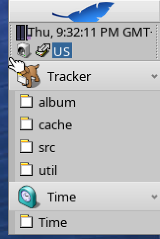
[Deskbar] TimeView overlaps other replicants
| Reported by: | diver | Owned by: | jscipione |
|---|---|---|---|
| Priority: | normal | Milestone: | R1 |
| Component: | Applications/Deskbar | Version: | R1/Development |
| Keywords: | Cc: | Diger | |
| Blocked By: | Blocking: | #9103, #9745, #9828 | |
| Platform: | All |
Description
This is hrev44242.
- Open Deskbar preferences
- Check Auto-hide
- Check Show seconds
- Move cursor to the upper right corner to show Deskbar
Attachments (4)
Change History (21)
by , 13 years ago
| Attachment: | Deskbar.png added |
|---|
comment:1 by , 12 years ago
| Blocking: | 9103 added |
|---|
comment:2 by , 12 years ago
comment:3 by , 12 years ago
| Blocking: | 9745 added |
|---|
comment:4 by , 12 years ago
| Blocking: | 9828 added |
|---|
comment:5 by , 8 years ago
| Owner: | changed from to |
|---|---|
| Status: | new → assigned |
Can't reproduce anymore. Was it fixed in the meantime?
comment:6 by , 8 years ago
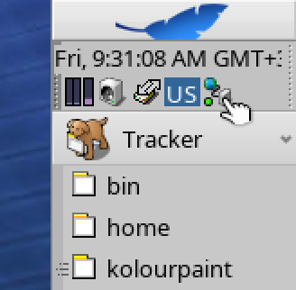
This issue is still not fixed, but, may be harder to reproduce. I've done some work in my various Deskbar branches to mitigate this bug, but I've seen it pop up occasionally still. One easy way to reproduce it is to load the battery replicant and turn on "Show text label" and the battery percentage will overrun the clock.
comment:7 by , 7 years ago
Clock replicant behavior improved in hrev51524, diver please check and see if this one can be closed.
by , 7 years ago
| Attachment: | Deskbar_hrev51536.png added |
|---|
comment:8 by , 7 years ago
| patch: | 0 → 1 |
|---|
comment:10 by , 7 years ago
The above issues has been addressed in hrev51554 which was caused by a bad assumption on my part that the first icon would always fit on the first line... if you have a width enough clock it doesn't.
comment:11 by , 7 years ago
There is still an issue where when the clock changes from 3 digit time (9:59) to 4 digit time (10:00) it doesn't realign the replicants
by , 7 years ago
| Attachment: | Deskbar_hrev51555.png added |
|---|
comment:12 by , 7 years ago
comment:14 by , 7 years ago
I see the problem. This is caused by time view's maximum width being too wide. A quick fix would be to lower the maximum clock width so that it fits again. Unfortunately this is maximum is currently set 1 time in the constructor so if you expand the window you won't get any additional room for a wide clock. A better approach would be to calculate the max clock based on current window width instead.
by , 7 years ago
| Attachment: | deskbar.png added |
|---|
comment:15 by , 7 years ago
comment:16 by , 7 years ago
| patch: | 1 → 0 |
|---|


Still here in hrev45313.