#9780 closed enhancement (fixed)
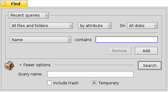
Tweaked Find panel layout
| Reported by: | humdinger | Owned by: | nobody |
|---|---|---|---|
| Priority: | normal | Milestone: | R1/beta2 |
| Component: | Applications/Tracker | Version: | R1/Development |
| Keywords: | GUI, layout management | Cc: | |
| Blocked By: | Blocking: | ||
| Platform: | All |
Description 
This is hrev45646.
The Find panel has recently been updated to use layout management. Great[[BR]] I have three little beefs with it:
- Switching the expando label between "More options" / "Fewer options" feels awkward. I'd rather go with simply "Options". IMO the GUI should be as steady and unchanging as possible.
- The expando label and widget is moving when expanding/collapsing. It should stay in the same place, so the user can quickly see what additional options there are and re-hide them without moving the mouse.
- The moving icon and "Search" button when expanding/collapsing are distracting as well. How about keeping those in their "collapsed position"? Like this:
Change History (11)
by , 12 years ago
| Attachment: | find-panel.png added |
|---|
comment:1 by , 12 years ago
And while someone is at it, it would also be nice to get rid of at least some of those lines and borders. It looks crowded without actually being so. Oh, and the space above the "Search" button is too small, and looks odd.
follow-up: 3 comment:2 by , 12 years ago
I don't know who the Find Panel czar is around here, but, since I'm the last person to touch this component I'll put my 2¢ in.
It seems that your complaints center around the dialog pane control at the bottom. I'll admit that the control is a bit awkward. While your suggestions improve the situation marginally I'd like to brainstorm some alternatives that would present the options better.
The fact that these options are hidden away in a collapsible pane means we're not proud of them, why are we hiding options we're not proud of? Either they're useful options and so should be shown front and center, or, they're not so they should be presented in a more appropriate time and place.
Here's an idea, we could move the 2 check box options into a right-click context menu and that would leave us only with the Query name option which we could always show, removing the need for the more/fewer options control.
I'm not even sure we need the Query name option since you can always save the query from the recent queries menu. And if you do that the Temporary check box becomes superfluous too. Then you're just left with Include Trash which again could be presented without needing for the more/fewer options control.
comment:3 by , 12 years ago
Replying to jscipione:
The fact that these options are hidden away in a collapsible pane means we're not proud of them, why are we hiding options we're not proud of?
I don't think we're embarassed to show those options (I love them like all my options...), they are just not needed often and are collapsed to avoid additional complexity in the GUI.
Here's an idea, we could move the 2 check box options into a right-click context menu...
I'd prefer to make the find panel a "regular window", i.e. with a menu bar. In that menu bar we could have a menu "Query" with the items "Recent queries" (with the according submenu-entries), a "Save query as...", "Save query template as...", "Quit".
That would remove the "Recent queries" pop-up menu from the window.
I'd also suggest to remove the "by name/attribute/formula" pop-up menu. What's "by name" other than by attribute which defaults to the attribute "Name"? As "by formula" is sometimes useful for power users and when constructing a query for a script, that could move into the "Query" menu as checkable "Formula mode".
A second menu "Settings" in the bar would hold the "Include Trash" and "Temporary" checkable menu items. As we're less space constrained in the menu now, the "Temporary" could be renamed "Self-destruct in two weeks".
You're right, we don't need a text box for the optional query name. Saving the query from the menu lets you input a name and after drag&droppping the icon you can rename it like any other file. I suggest sensible default names according to the search criteria.
comment:5 by , 12 years ago
I'm all with humdinger here, I think his mockup at #9781 would look great with the changes I mentioned in that ticket.
comment:6 by , 10 years ago
| Milestone: | R1 → Unscheduled |
|---|
comment:7 by , 8 years ago
| Owner: | changed from to |
|---|---|
| Status: | new → assigned |
comment:9 by , 5 years ago
Assign tickets with status=closed and resolution=fixed within the R1/beta2 development window to the R1/beta2 Milestone
comment:10 by , 5 years ago
| Milestone: | Unscheduled → R1/beta2 |
|---|


mock-up