Opened 11 years ago
Closed 13 months ago
#10475 closed bug (fixed)
[MediaPlayer] checkbox layout in Settings window (easy)
| Reported by: | diver | Owned by: | nobody |
|---|---|---|---|
| Priority: | normal | Milestone: | R1/beta5 |
| Component: | Applications/MediaPlayer | Version: | R1/Development |
| Keywords: | Cc: | ||
| Blocked By: | Blocking: | ||
| Platform: | All |
Description (last modified by )
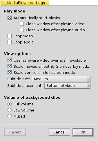
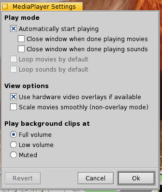
The 2nd and the 3rd checkbox from the top look misaligned. Possibly related commit: http://cgit.haiku-os.org/haiku/commit/?id=3007aa
Compare
to
Attachments (2)
Change History (12)
by , 11 years ago
| Attachment: | MediaPlayer.png added |
|---|
comment:1 by , 11 years ago
| Description: | modified (diff) |
|---|
comment:2 by , 11 years ago
comment:3 by , 11 years ago
Perhaps it's time to look on this and chnage video and audio to a common setting (both loop and close)
comment:4 by , 10 years ago
| Owner: | changed from to |
|---|---|
| Status: | new → assigned |
by , 5 years ago
| Attachment: | mediaplayer_alpha1.png added |
|---|
comment:5 by , 5 years ago
| Description: | modified (diff) |
|---|
comment:6 by , 5 years ago
| Summary: | [MediaPlayer] checkbox layout in Settings window → [MediaPlayer] checkbox layout in Settings window (easy) |
|---|
comment:7 by , 5 years ago
| Milestone: | R1 → R1.1 |
|---|
comment:8 by , 13 months ago
The two checkbox have a stronger indentation, because they are both depending on the setting of the first checkbox. At least they should (they both are still enabled when you uncheck the first checkbox).
In either case: has anyone ever used these? Can't we just remove them both?
comment:9 by , 13 months ago
I think the "bug" in this ticket was just saying that they are indented a lot, whereas in alpha 1 they were indented just a small amount (as in the second screenshot, from before this was converted to the layout kit).
I won't fight for keeping these around, but it's a bit annoying that whenever a new contributor tries to fix one of the "easy" tickets that has been open for a few years with no one looking into it, we suddenly decide to handle it in a completely different way... Not very nice for the new contributors :)
comment:10 by , 13 months ago
| Milestone: | R1.1 → R1/beta5 |
|---|---|
| Resolution: | → fixed |
| Status: | assigned → closed |
Fix merged in hrev57614.


Look like it's like that from the start, Think BeOS hade it like that as well.
http://cgit.haiku-os.org/haiku/commit/src/apps/mediaplayer/settings/SettingsWindow.cpp?id=26e9cdb72cc4f788f60ca38dc3309e62b8c6247b