Opened 11 years ago
Last modified 9 months ago
#10475 closed bug
[MediaPlayer] checkbox layout in Settings window — at Version 5
| Reported by: | diver | Owned by: | nobody |
|---|---|---|---|
| Priority: | normal | Milestone: | R1/beta5 |
| Component: | Applications/MediaPlayer | Version: | R1/Development |
| Keywords: | Cc: | ||
| Blocked By: | Blocking: | ||
| Platform: | All |
Description (last modified by )
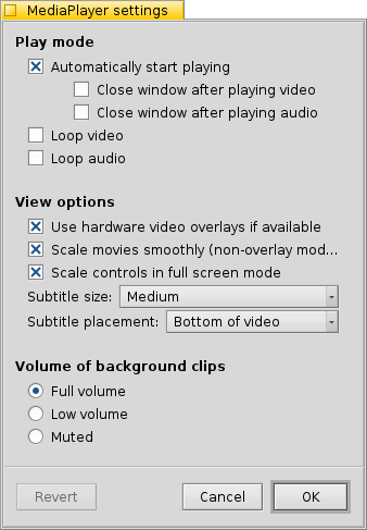
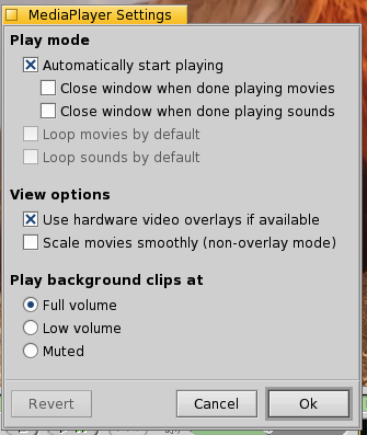
The 2nd and the 3rd checkbox from the top look misaligned. Possibly related commit: http://cgit.haiku-os.org/haiku/commit/?id=3007aa
Compare
to
Change History (7)
by , 11 years ago
| Attachment: | MediaPlayer.png added |
|---|
comment:1 by , 11 years ago
| Description: | modified (diff) |
|---|
comment:2 by , 11 years ago
comment:3 by , 11 years ago
Perhaps it's time to look on this and chnage video and audio to a common setting (both loop and close)
comment:4 by , 10 years ago
| Owner: | changed from to |
|---|---|
| Status: | new → assigned |
by , 5 years ago
| Attachment: | mediaplayer_alpha1.png added |
|---|
comment:5 by , 5 years ago
| Description: | modified (diff) |
|---|
Note:
See TracTickets
for help on using tickets.


Look like it's like that from the start, Think BeOS hade it like that as well.
http://cgit.haiku-os.org/haiku/commit/src/apps/mediaplayer/settings/SettingsWindow.cpp?id=26e9cdb72cc4f788f60ca38dc3309e62b8c6247b