#12273 closed enhancement (fixed)
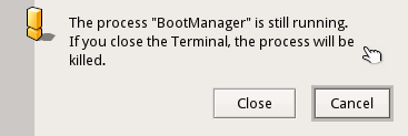
[Interface Kit] alert windows are too wide
| Reported by: | diver | Owned by: | axeld |
|---|---|---|---|
| Priority: | high | Milestone: | R1/beta1 |
| Component: | Kits/Interface Kit | Version: | R1/Development |
| Keywords: | Cc: | ||
| Blocked By: | Blocking: | ||
| Platform: | All |
Description (last modified by )
Attachments (2)
Change History (9)
by , 10 years ago
| Attachment: | alert_old.png added |
|---|
by , 10 years ago
| Attachment: | alert_new.png added |
|---|
comment:1 by , 10 years ago
| Description: | modified (diff) |
|---|
comment:2 by , 10 years ago
| Milestone: | Unscheduled → R1/beta1 |
|---|---|
| Priority: | normal → high |
comment:3 by , 10 years ago
comment:5 by , 10 years ago
I don't agree with this, actually. This is why I made it the way it was. Why should it use different spacing than what is used everywhere else?
Alerts are very small anyway, so there is no reason to make them that crowded. I'd like to see that reverted or at least come up with an argument why it should use that spacing other than "that is how it used to look".
comment:6 by , 10 years ago
It would be nice though to give the buttons an identical width again, which looks nicer IMO. Having them generally a bit wider is not bad as well (like in the old version), it makes them easier click targets.
comment:7 by , 10 years ago
Keeping the text top-aligned with the icon as in the "old" look looks better to me. I don't mind some extra spacing, however.


Is this really a high prio beta-blocker?