

Opened 7 years ago
Closed 7 years ago
#13860 closed enhancement (fixed)
Improved GUI/behaviour of HaikuDepot
| Reported by: | humdinger | Owned by: | stippi |
|---|---|---|---|
| Priority: | normal | Milestone: | Unscheduled |
| Component: | Applications/HaikuDepot | Version: | R1/Development |
| Keywords: | Cc: | ||
| Blocked By: | Blocking: | ||
| Platform: | All |
Description (last modified by )
HaikuDepot isn't as easy to use as it should be. The changes when showing only "featured" packages (big icons) and all packages (small icons) when searching is a bit confusing (to the newly arrived at least).
Here's a suggestion to improve things without a complete re-write and totally new behaviour.
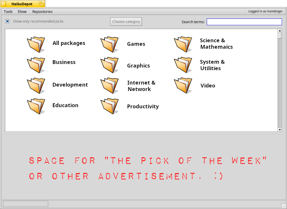
Mock up first:

- HaikuDepot should always start with this window.
- Instead of a Category" pop-up menu, we show big folder icons (add nice overlays per category).
- The "Repository" pop-up moves into the menu bar, as it's not needed that often.
- The "Only featured packages" moves out of the Show menu and becomes a checkbox "Show only recommended picks". There will be no more automatic enabling/disabling of this filtering when searching etc. as it is now. It does exactly what it says, always.
- The "Choose category" button (might be replaced with an icon button or better label...) brings you back to the start window, when you're in a category.
- Entering a search term in the start window will search through all packages, when in a category only in that category.
Otherwise, the display of packages is as it's now. When "Show only recommended picks"is active show the big icons list, when not the small icons list.
The icon size could be configurable from the "Show" menu with a new item "Recommended picks icon size" (who can come up with a shorter label?) and a submenu with 16-128 pixels. The icon size might fit better into a new "View" menu, but maybe adding another menu with just one item isn't great either...
Attachments (3)
Change History (20)
by , 7 years ago
| Attachment: | HaikuDepot_startwindow.png added |
|---|
comment:1 by , 7 years ago
| patch: | 0 → 1 |
|---|
comment:2 by , 7 years ago
| patch: | 1 → 0 |
|---|
comment:3 by , 7 years ago
| Description: | modified (diff) |
|---|
comment:4 by , 7 years ago
| Description: | modified (diff) |
|---|
comment:5 by , 7 years ago
I'm not yet convinced. Let's try to separate the problems from the proposed solutions and also from entirely new ideas. (Right now the ticket has it all mixed up. That's a result from thinking about it and comming up with a new concept, but sometimes better solutions emerge when discussing problems only first and then pros and cons of various solutions.)
Problems:
1) The alternating package list view (big icons for featured packages versus small list items) is confusing. I don't quite understand why, I'll explain more below.
2) The uncontrolled behavior of when showing only "featured" packages.
3) The repository selection is too prominent versus how often it is needed.
4) (Implicit) The category filter needs to be much more prominent. (?)
Some thoughts:
The original idea with the "featured packages" was to provide a start page. It was supposed to show only a few packages, and it wasn't actually meant to stay as a list view but was to become a row layout where each featured package is like a rectangle and a number of them fit on the same row and then flow onto the next row. But Haiku has no row layout, yet.
At the core, the featured packages mode is just an alternative way to show packages. I could imagine making this a "view mode setting". However, the idea was also that there should be a start page, so HaikuDepot never drops right into a detailled list view on start.
Basically, the UI is all about controlling a bunch of filters for which packages are listed. The "Show" menu is just another filter, as is the search text box. The reason why different filters are located at different places is only that some are more important or more likely to be needed. In that sense, if you think the repository filter is not as important, I have no problem with moving it into a menu.
The category folders are both an alternative idea for a start page, and a change to how the category filter is applied. In terms of the usability of the category filter, I think it is arguably worse. To change the category, you have to first go back to the start page, then pick another category. I would also argue that the popup makes it easier to find a particular category. It's just much quicker to parse for a human.
comment:6 by , 7 years ago
I think you're largely right. Having those big folders to choose a category as the start window and the button on top wasn't the best idea (and would create work needlessly).
Let's put the category pop-up back into the top of the window. Maybe add the current category + search term to the window title, in the hopes it helps the user's orientation.
I still think, putting the "Show only featured packages" (or "recommended picks/packages", not sure yet what's the best term...) checkbox to the right of the category popup would be nice, because it's easily accessed there and may be used frequently.
And I still think putting in a search term should not change that setting (i.e. switch to small-icon list view and show all packages). Just treat it as a filter setting like the others: if a search term is inserted and the checkbox active, only search in the current category's featured packages. Remove the checkbox and it'll search through all packages.
We should make sure that every category has at least a few featured packages. It may also be usefull to show the number of "featured/all available" packages after the checkbox, e.g. "(5 of 40)"; as an indicator that those featured packages are not all that there are.
One 'issue' remains: What to show on launch if the "featured" checkbox is unticked? Should checkbox just be always ticked on startup, in order to always show the featured packages?
Otherwise, once unticked the user wouldn't see those featured packages on start-up and may be unware how to get it back... (?).
Personally, I think we shouldn't under-estimate the user and just respect and remember the setting.
Shall I upload an updated mock-up? I think the proposed changes are minimal and therefore a mock-up not needed.
comment:8 by , 7 years ago
Even without a mock-up, I'm completely onboard with the new proposals in comment:6.
comment:9 by , 7 years ago
Oh, and I'd propose a view-mode settings for alternating the two display modes, list view and what is currently used for featured packages.
comment:10 by , 7 years ago
Nice that we're on the same page. :)
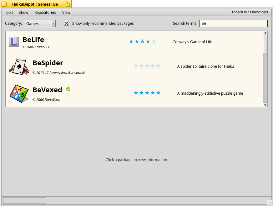
Here's the updated mockup:

I added the "View" menu for Stephan's "view-mode settings for alternating the two display modes, list view and what is currently used for featured packages."
I'm not entirely sure what those are, though. Just user-settable icon sizes for "Recommended package mode" and "Normal mode"?
If so, maybe those could be added to the "Show" menu, but it doesn't quite fit into the filter settings that are found there...
Maybe those menu items could be named "Large icon mode" and "Mini icon mode" each with a submenu for sizes between 16 and 128 pixels? Or does the "Mini icon mode" even need a setting, i.e. should that list mode even have a settable icon size? Anyway, we can rack our brains on the exact wording later...
by , 7 years ago
| Attachment: | 0001-Changes-to-HaikuDepot-GUI.patch added |
|---|
Patch for the changes (comment:6)
comment:12 by , 7 years ago
| patch: | 0 → 1 |
|---|
comment:13 by , 7 years ago
I attached my attempt at making the discussed changes. I'm not completely sure I understood all the underlying workings, so a review is much appreciated.
In particular, when moving the "Repository" pop-up into the menu bar, I just moved the depot-related part of FilterView:AdoptModel() into a new MainWindow::_UpdateAvailableRepositories() that is called where needed. Is that right? Is the naming OK?
comment:14 by , 7 years ago
I should add that I'm totally fine if someone took that patch as a basis and develop/fix it further, instead of trying to get into my thick skull what has to change and how... :)
comment:16 by , 7 years ago
| patch: | 1 → 0 |
|---|
comment:17 by , 7 years ago
| Resolution: | → fixed |
|---|---|
| Status: | new → closed |
The change on Gerrit had +2 from Julian and myself; Humdinger created the patch and so approves, Stephan approved here, and Janus seems "OK" with it although wants further changes. Submitted as hrev51822 even despite Adrien's -1; if it really turns out as annoying as he finds it, we can either revert or improve.
Mockup start window