#15688 closed enhancement (fixed)
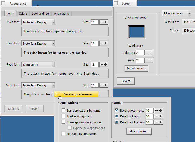
Number edit fields look bad, with no padding
| Reported by: | leavengood | Owned by: | nobody |
|---|---|---|---|
| Priority: | normal | Milestone: | R1/beta3 |
| Component: | Kits/Interface Kit | Version: | R1/Development |
| Keywords: | ui | Cc: | |
| Blocked By: | Blocking: | ||
| Platform: | All |
Description
The number edit fields, such as those in the Appearance, Deskbar and Screen preferences look bad with the numbers all the way to the right, with no padding at all.
They should probably be centered, or at least padded slightly on the left.
Attachments (1)
Change History (5)
by , 5 years ago
| Attachment: | no_padding_number_editor.png added |
|---|
comment:2 by , 4 years ago
| Milestone: | Unscheduled → R1/beta3 |
|---|---|
| Resolution: | → fixed |
| Status: | new → closed |
Fixed in hrev54496.
comment:4 by , 4 years ago
Note:
See TracTickets
for help on using tickets.


Various preflets with this UI element