Opened 5 years ago
Last modified 5 years ago
#15697 new bug
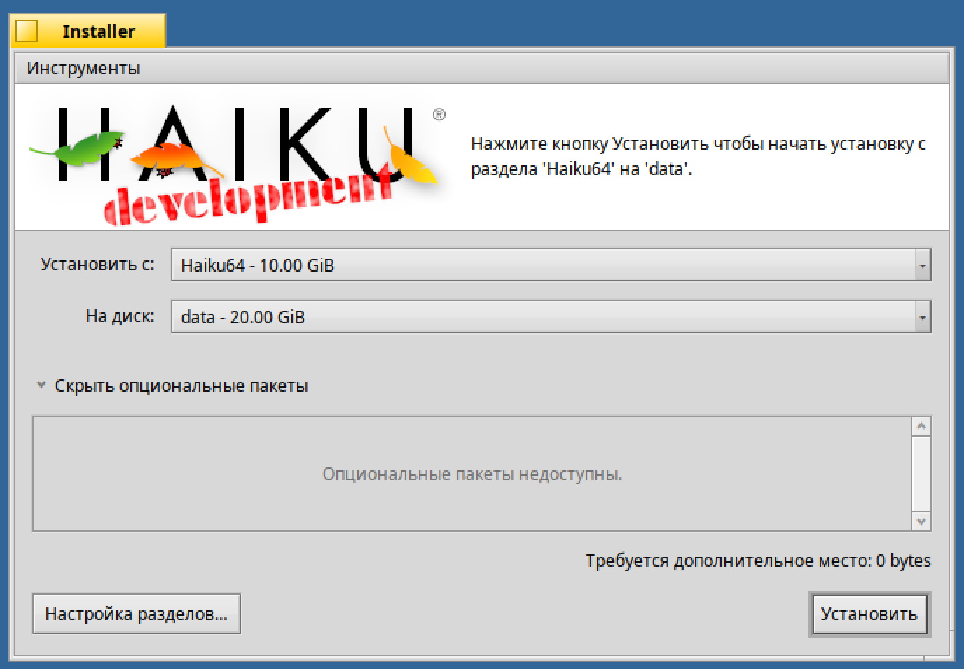
[Interface Kit] reduce BMenu width
| Reported by: | diver | Owned by: | nobody |
|---|---|---|---|
| Priority: | normal | Milestone: | Unscheduled |
| Component: | Kits/Interface Kit | Version: | R1/Development |
| Keywords: | Cc: | ||
| Blocked By: | Blocking: | ||
| Platform: | All |
Description (last modified by )
Attachments (2)
Change History (6)
by , 5 years ago
| Attachment: | installer.png added |
|---|
comment:1 by , 5 years ago
| Description: | modified (diff) |
|---|
comment:2 by , 5 years ago
comment:3 by , 5 years ago
BMenu works as designed and uses the space allocated to it by the layout. Shrinking ot the text sounds like a good idea at first, but you can't be sure what text will be put there (it could be dynamically generated by the app).
If you tell the layout kit to allow the menu to not be full width (by adding glue or an extra column or...) it will be doing that just fine, too.
I'll make the change to Installer.
Note:
See TracTickets
for help on using tickets.


Does the text view to the right of the logo actually provide useful information? IMO the GUI is very simple and self-explanatory. If we could get rid of it, it could look like this mockup:
Let's add a status bar at the bottom for error messages etc.