Opened 4 years ago
Last modified 3 years ago
#17156 new bug
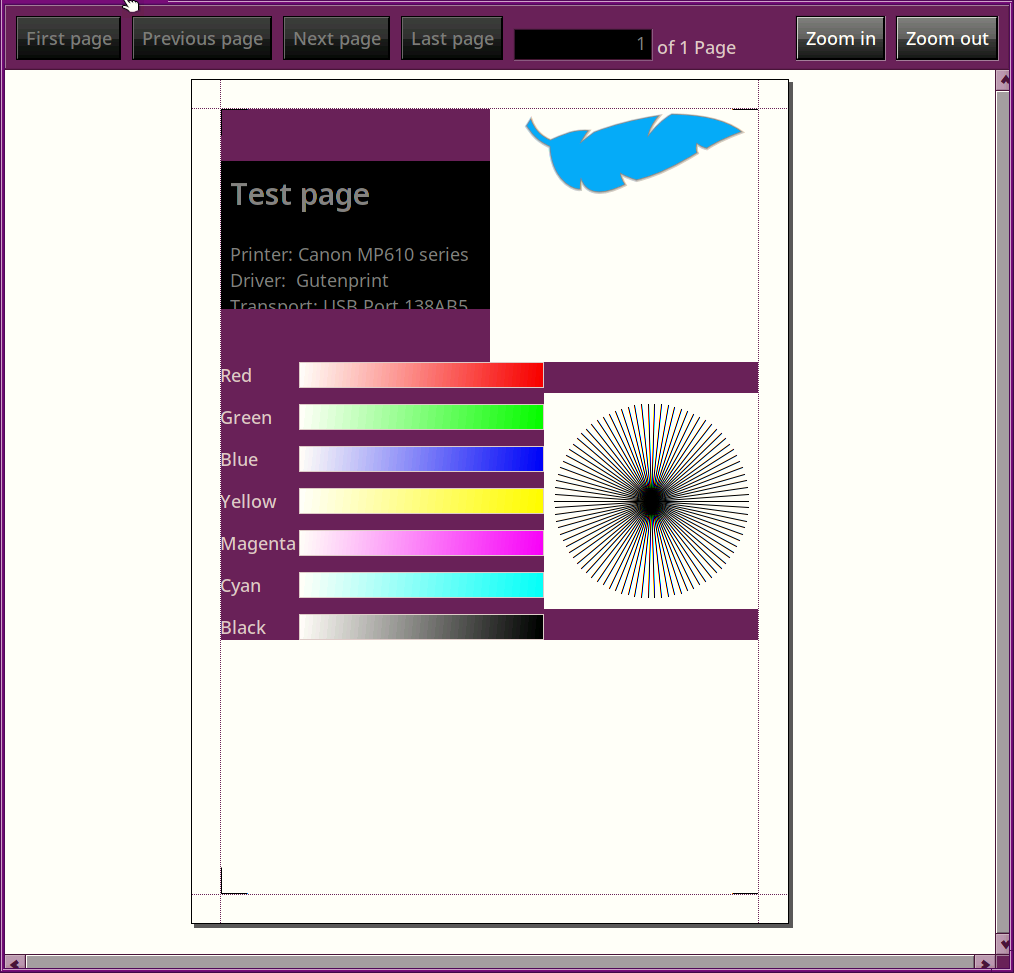
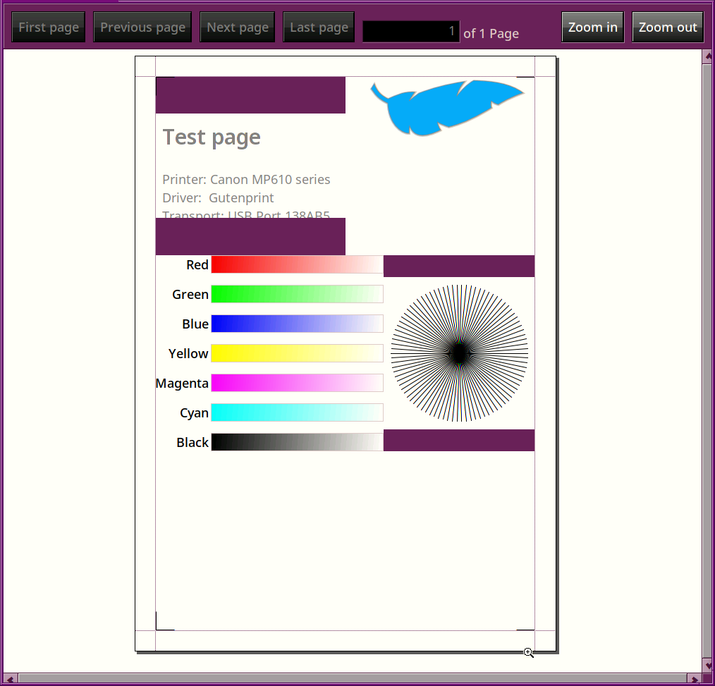
Printer test page incorrectly adopts system colors
| Reported by: | nephele | Owned by: | phoudoin |
|---|---|---|---|
| Priority: | normal | Milestone: | Unscheduled |
| Component: | Preferences/Printers | Version: | R1/Development |
| Keywords: | Cc: | ||
| Blocked By: | Blocking: | ||
| Platform: | All |
Description (last modified by )
Attachments (2)
Change History (6)
by , 4 years ago
| Attachment: | hrev55274.png added |
|---|
comment:1 by , 4 years ago
| Description: | modified (diff) |
|---|
comment:2 by , 4 years ago
I have tried to patch this, but i got stuck at some point, I can't find any aditional calls that attempt to add system colors, but some still appear. could the layout kit be responsible?
This is how far i got:
diff --git a/src/preferences/printers/TestPageView.cpp b/src/preferences/printers/TestPageView.cpp
index 448d04eab8..a325064cbc 100644
--- a/src/preferences/printers/TestPageView.cpp
+++ b/src/preferences/printers/TestPageView.cpp
@@ -221,7 +221,8 @@ ColorGradientView::Draw(BRect updateRect)
 {
        BRect rect(Bounds());

-       BGradientLinear gradient(rect.LeftTop(), rect.RightBottom());
+       // Make the gradient the other way around to match text alignment
+       BGradientLinear gradient(rect.RightBottom(), rect.LeftTop());
        rgb_color white = make_color(255, 255, 255);
        gradient.AddColor(white, 0.0);
        gradient.AddColor(fColor, 255.0);
@@ -275,16 +276,24 @@ TestPageView::AttachedToWindow()
        statusView->GetFont(&font);
        font.SetFace(B_BOLD_FACE);
        font.SetSize(font.Size() * 1.7);
+       const static rgb_color kWhite = {255, 255, 255, 255};
+
+       // Utterly confused by this call, what does it do? doesn't look like it's passing a color?
        statusView->SetFontAndColor(0, strlen(title), &font);
+       statusView->SetViewColor(kWhite);
+       statusView->SetHighColor(0, 0, 0, 255);
+       statusView->SetLowColor(255, 255, 255, 255);

        BGridLayoutBuilder gradients(2.0);
-       gradients.View()->SetViewColor(B_TRANSPARENT_COLOR);
+       gradients.View()->SetViewColor(255, 255, 255); // Fixes gradients BG

        for (int i = 0; i < kNumColorGradients; ++i) {
                BStringView* label = new BStringView(
                        kColorGradients[i].name,
                        B_TRANSLATE(kColorGradients[i].name));
-               // label->SetAlignment(B_ALIGN_RIGHT);
+               label->SetAlignment(B_ALIGN_RIGHT);
+               label->SetLowColor(255, 255, 255, 255); // Fixes gradient text color
+               label->SetHighColor(0, 0, 0, 255);
                gradients.Add(label, 0, i);
                gradients.Add(new ColorGradientView(kColorGradients[i].color), 1, i);
        }
comment:3 by , 3 years ago
I believe this ticket is related to some of the issues here https://dev.haiku-os.org/ticket/16410
comment:4 by , 3 years ago
could the layout kit be responsible?
No, the layout kit does not change colors.
However, if there are multiple views involved, some of them might have some default color, or maybe they just don't draw anything and so the parent window background is still visible?
What seems to happen:
- The text view at the top left is allocated a higher rectangle than it needs, to match with the height of the logo at the right. However, it does not fill that whole space and so there are two empty rectangles above and below. Solution: fix it so that the text view uses all the size?
- Same thing on the bottom: the circle view at the right is made as high as the gradient bar view on the left, but does not fill up all this space.
I think setting the root view of the whole thing to a forced white brackground should fix this specific problem but indeed it would be nice to fix #16410 at the same time by making the text view use up more space.


nightly (No patch)