

Opened 14 months ago
Last modified 14 months ago
#18741 new bug
Webpositive: [x] close button active area is not correct
| Reported by: | jackburton | Owned by: | pulkomandy |
|---|---|---|---|
| Priority: | normal | Milestone: | Unscheduled |
| Component: | Applications/WebPositive | Version: | R1/beta4 |
| Keywords: | Cc: | ||
| Blocked By: | Blocking: | ||
| Platform: | All |
Description
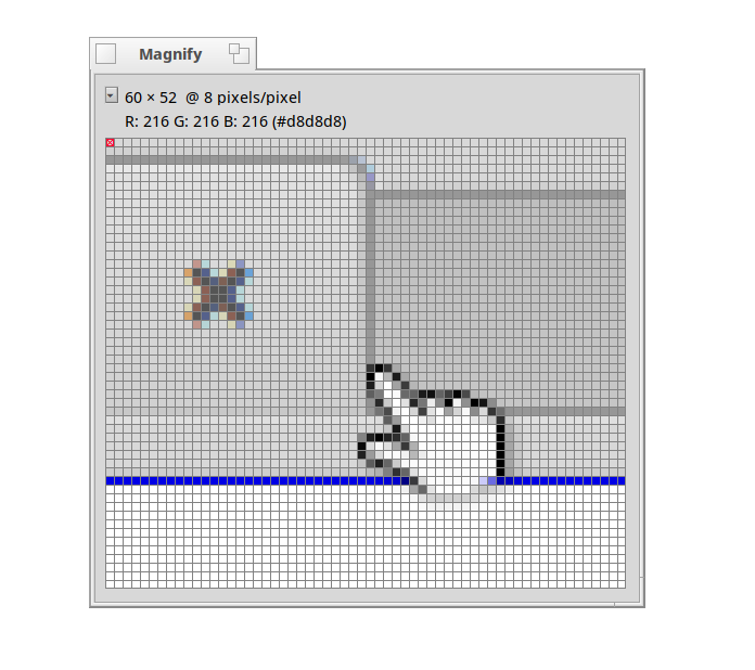
The active area of the close button is not correct. As you can see from the attached screenshot, the "x" is highlighted already when mouse is very far from it.
Attachments (2)
Change History (5)
by , 14 months ago
| Attachment: | screenshot.png added |
|---|
comment:1 by , 14 months ago
by , 14 months ago
| Attachment: | Genio-hover.png added |
|---|
comment:2 by , 14 months ago
That's Ok to have the clickable area larger, but it's not centered. The clickable are is more prominent to the right
comment:3 by , 14 months ago
True. OTOH on the right side of the close widget would otherwise be unused space. I think it's OK to use as clickable area and save the more precious space to the left of the widget for the tab label.
Note:
See TracTickets
for help on using tickets.
I don't mind the clickable area being larger than the widget. Makes it easier to hit with the mouse. If the hover-effect were more pronounced, similar to Genio's - - it'd make easier to spot when you've entered the clickable area.