#5227 closed enhancement (fixed)
more flexible wait time options for bootman
| Reported by: | Kev | Owned by: | laplace |
|---|---|---|---|
| Priority: | normal | Milestone: | R1 |
| Component: | Applications/BootManager | Version: | R1/Development |
| Keywords: | Cc: | ||
| Blocked By: | Blocking: | ||
| Platform: | All |
Description
This is something I've wished for in bootman since the days of BeOS: a 'wait 1 second' option. Almost always I want to boot into the default partition. On the rare occasion I'm not, I'm watching for the boot menu like a hawk anyway. (I never really understood why it was restricted to fixed times instead of just being able to type in a second or millisecond value...)
Attachments (1)
Change History (13)
comment:1 by , 15 years ago
| Component: | - General → Applications/BootManager |
|---|---|
| Owner: | changed from to |
| Version: | R1/alpha1 → R1/Development |
comment:2 by , 15 years ago
follow-up: 4 comment:3 by , 15 years ago
Sorry, I meant to get rid off the "Wait 10 and 15 seconds" options.
follow-up: 7 comment:4 by , 15 years ago
Replying to laplace:
Sorry, I meant to get rid off the "Wait 10 and 15 seconds" options.
Why not just let the user set an arbitrary numeric delay ?
comment:5 by , 15 years ago
I think a list of options has the advantage that you can easily have (and explain) the options "do not wait (you may press 'Alt')", and "wait indefinitely".
I guess I would just do a slider with the positions "do not wait", 1s, 2s, 3s, 5s, 1m, "indefinitely". The slider text could well be used to include additional explanations like the use of the 'Alt' key.
comment:6 by , 15 years ago
I like the idea with the slider. If there are no objections I will implement that.
by , 15 years ago
| Attachment: | DefaultPartition.png added |
|---|
comment:7 by , 15 years ago
Replying to jackburton:
Replying to laplace:
Sorry, I meant to get rid off the "Wait 10 and 15 seconds" options.
Why not just let the user set an arbitrary numeric delay ?
From a usability standpoint only options should be provided that are useful. The problem is how to you determine what the useful options are?
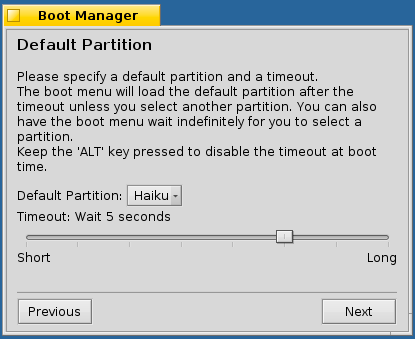
In my current development version I have replaced the radio buttons with a slider. The slider label indicates the currently selected option, "Timeout: <text of selected option>". The min. limit label is "Short" and the max. limit label is "Long".
The description text explains the use of the 'ALT' key.

The options from left to right are: Do not wait, Wait 1, 2, 3, 4, 5 seconds, Wait 1 minute, and Wait indefinitely. While you drag the slider thumb the slider label is updated.
comment:8 by , 15 years ago
I would increase the spacing between the menu field and the slider a bit, and I'm not sure if the "Short" & "Long" labels are really necessary - if you think they are, I would replace them with something like "None" & "Indefinitely", or "0 seconds" & "Indefinitely".
comment:9 by , 15 years ago
Agreed with Axel. But rather than "0 seconds" I propose "No delay".
Also, I would suggest using the default item spacing for the GUI layout, obtainable from ControlLook.h, be_control_look->DefaultItemSpacing(). In almost any GUI I created, I separated the buttons by a separator going all the way from left to right window border. I think this would be nicer here too, combined with more consistent spacing (same horizontal/vertical spacing).
comment:10 by , 15 years ago
Sorry for chiming in late, and thanks for taking up this ticket. I was initially going to argue for having an arbitrary value option--after all, if "1 minute" is an option someone would consider, isn't it possible "30 seconds" might fit their particular needs better? Or 35 or 40?--but now that I see the screenshot and considering the UI goals of Haiku, your solution feels like the best fit.
I really like this whole 'ALT' thing, that's perfect for me, like you said. :)
I second axeld's comments, but I would change the labels to maybe "Immediately" and "Never" and the "Wait" to "After". "None" and "Indefinitely" don't match each other grammatically and "0 seconds", though matching, is less slick-looking (my English teacher always had us spell out numbers below 100, and all numbers of any magnitude if they began a sentence.) That said...styles have changed since I was in that class, and this is an OS configuration dialog, not an essay...but "Zero seconds" is an option too. But this is really bike-shedding it now on my part, so take it with a grain of salt. :)
comment:11 by , 15 years ago
| Resolution: | → fixed |
|---|---|
| Status: | new → closed |
Thanks for your contribution, the merged effort is implemented in hrev35925 :)
@stippi: I did not change to button placing as there is at least another preflet that uses the same left and right alignment for two buttons.


For your use case it would be even better to boot into the default partition without any delay.
After turning on the machine, keeping the ALT key pressed would then open the boot menu. Drawback is you have to remember the key to activate the boot menu. So a "Wait 1 second" option is maybe useful too.
Anyway I would also like to get rid off the "Wait 5 and 10 second" options and replace it with "Wait 1 minute".
My suggestion for the options would be:
BTW suggestions for proper wording of the options is welcome.