Opened 14 years ago
Closed 11 years ago
#6894 closed bug (fixed)
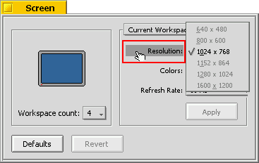
[Interface Kit] it should be possible to open popup menu using attached label
| Reported by: | diver | Owned by: | jscipione |
|---|---|---|---|
| Priority: | normal | Milestone: | R1 |
| Component: | Kits/Interface Kit | Version: | R1/Development |
| Keywords: | Cc: | ||
| Blocked By: | Blocking: | ||
| Platform: | All |
Attachments (4)
Change History (13)
by , 14 years ago
| Attachment: | Screen.png added |
|---|
comment:1 by , 11 years ago
| Owner: | changed from to |
|---|---|
| Status: | new → assigned |
by , 11 years ago
| Attachment: | Screen menu field clicked.png added |
|---|
comment:2 by , 11 years ago
Would it be okay if I were to omit the dark background on the label when the menu is open? See Attachment Screen menu field clicked.png above.
comment:3 by , 11 years ago
My R5 Screen prefs, which is actually R5.0.3 PE Max Ed v4b1 doesn't look like the above screenshot. See Attachment BeOS Screen screenshot.png above. The background on my label only extends to the left margin of the "Resolution:" text whereas in your screenshot it goes all the way to the left edge. Could the above screenshot be from an older version of BeOS such as R4?
by , 11 years ago
| Attachment: | Screen with menu field label highlighted.png added |
|---|
Haiku menu field label highlighted
comment:4 by , 11 years ago
Haiku has departed from the visuals of BeOS in various pleasant ways. In so far, trying to clone the looks from back then isn't necessary IMO. Only highlighting the label is OK, I think it even looks cleaner.
comment:5 by , 11 years ago
According to What_is_new_in_MAX.txt from BeOS5PEMaxEditionV4b1:
- Added OpenBeOS Screen Preferences App (added in MAX Edition V3)
And I remember taking this screenshot (in the description) in BeOS R5 running in VirtualBox.
comment:6 by , 11 years ago
diver: I _just_ managed to confirm the fact that it was indeed a change made from BeOS R5 to Max vb4.
diver and humdinger: would it be okay to simply omit the highlight on the label completely? The menu opening already indicates that it has been clicked on.
follow-up: 8 comment:7 by , 11 years ago
Extending the background all the way to the left edge has an advantage though - in case of Colors: menu you don't have to aim specifically to this relatively short label, but you can click it anywhere (in that raw).
I would prefer if you leave the highlight as in BeOS.
comment:8 by , 11 years ago
Replying to diver:
Extending the background all the way to the left edge has an advantage though - in case of Colors: menu you don't have to aim specifically to this relatively short label, but you can click it anywhere (in that raw).
You click anywhere to the left on the left hand side including the space left of the label to activate the menu whether or not that part gets highlighted.
I would prefer if you leave the highlight as in BeOS.
Okay, noted.
comment:9 by , 11 years ago
| Resolution: | → fixed |
|---|---|
| Status: | assigned → closed |
Fixed in hrev45983. Highlighting works as on BeOS R5 drawing the selected menu color as the label background when the menu is open.


Screen shot showing Screen prefs with menu field open