Opened 14 years ago
Last modified 2 years ago
#7034 assigned enhancement
Found string highlighting colour
| Reported by: | humdinger | Owned by: | leavengood |
|---|---|---|---|
| Priority: | low | Milestone: | Unscheduled |
| Component: | Kits/Web Kit | Version: | R1/Development |
| Keywords: | Cc: | ||
| Blocked By: | Blocking: | ||
| Platform: | All |
Description
This is hrev39847.
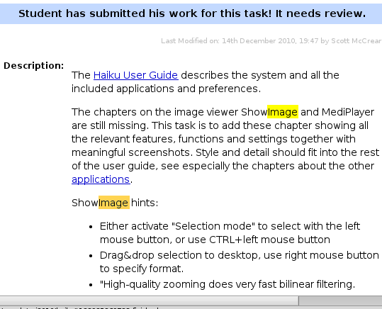
Web+ uses the same highlighting colour for found strings as for selected text. While it's no problem when selecting text (I know roughly where I clicked in the text), for search results, I really have to look closely. If possible, I'd suggest a much brighter colour for highlighting a found string. Also, it'd be nice if all matching strings on a page would be highlighted, a little darker, and only the one at the current position really bright.
This is #FFFF00 and #FFD452:
Attachments (1)
Change History (9)
by , 14 years ago
| Attachment: | Finding-bright.png added |
|---|
comment:1 by , 14 years ago
| Owner: | changed from to |
|---|---|
| Status: | new → assigned |
There is a similar issue logged on the Web+ Trac which I took over so I'll take this ticket too. I may see about mimicking some of Chrome's search and some of Safari's. I say if you are making a new browser you might as well take what you can from the rest.
comment:2 by , 14 years ago
Well I don't know about highlighting all matches, but I did make the selection color a brighter orange in WebPositive r581. Even though there is a "text search highlight color" it seemed the search was using the inactive highlight color, so I made them all the bright orange.
The searching definitely has room for improvement, and maybe the way it is done now was causing the use of the inactive highlight color.
I suppose I could see how the bright yellow looks.
comment:3 by , 10 years ago
| Priority: | normal → low |
|---|
comment:4 by , 10 years ago
| Milestone: | R1 → Unscheduled |
|---|
Moving Web+ enhancements out of R1 milestone.
comment:5 by , 8 years ago
The current bright orange feels a bit out of place, as other apps in Haiku (anything BTextControl based) uses reverse video (usually white text on black background). Also, BTextControl selects the current search result, I think that makes sense and maybe WebKit could do the same.
comment:6 by , 3 years ago
| Component: | Applications/WebPositive → Kits/Web Kit |
|---|
comment:7 by , 2 years ago
The color used for this, which is now grayish. can be defined with the css system colors aswell.
Perhaps we should decide on a niceish dark and light variant to use? I don't think we will easily get reverse video here.
comment:8 by , 2 years ago
With the next version of haikuwebkit this may be a bit better. We now supply our own highlight color
Tell me if this works better, otherwise we will need to change it a bit still.


brightler highlighting colour