#7265 closed enhancement (fixed)
ReadOnlyBootPrompt - Margins makes the appearance ugly
| Reported by: | deejam | Owned by: | stippi |
|---|---|---|---|
| Priority: | normal | Milestone: | R1 |
| Component: | Applications/FirstBootPrompt | Version: | R1/Development |
| Keywords: | Cc: | ||
| Blocked By: | Blocking: | ||
| Platform: | All |
Description
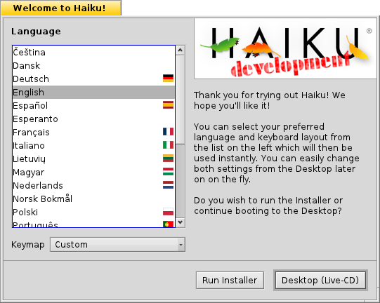
The text margins in ReadOnlyBootPrompt are to small which makes the appearance ugly and harder to read. The margins should be the same as the lists below and the upper margin should be a little bit larger. Usually the Golden Section (http://en.wikipedia.org/wiki/Golden_section) is preferred.
Attached are 3 images;
- Installer_wo_golden_section.png
The current state. Look at the left, right and upper margin of the text-field.
-Installer_expected.png Margins corrected (in Photoshop).
-Installer_expected_w_golden_section.png Margins corrected and the golden section displayed. Note that the upper margin is a little bit larger than left/right margins.
GCC2 Hybrid hrev40624.
Attachments (5)
Change History (14)
by , 14 years ago
| Attachment: | Installer_wo_golden_section.png added |
|---|
by , 14 years ago
| Attachment: | Installer_expected.png added |
|---|
by , 14 years ago
| Attachment: | Installer_expected_w_golden_section.png added |
|---|
follow-up: 2 comment:1 by , 14 years ago
comment:2 by , 14 years ago
comment:3 by , 14 years ago
has this been fixed with the recent changes Axel made? If not can it still be fixed in time for Alpha3?
comment:4 by , 14 years ago
by , 14 years ago
| Attachment: | ReadOnlyBootPrompt_r41542.png added |
|---|
comment:5 by , 14 years ago
The upper margin on the redesigned ReadOnlyBootPrompt is still to small. I'm not going to create another redesign-ReadOnlyBootPrompt discussion, but this is the first window the users sees when booting the installation CD. Therefor I would like the Haiku Logo to be in this window.
How about just adding the Haiku Logo in the upper-right corner? And maybe making "Thank you for trying out Haiku! We hope you'll like it!" bold?
Note that the space between the logo-image and the text is larger than the left and right margins.
by , 14 years ago
| Attachment: | ReadOnlyBootPrompt-logo-right-top.png added |
|---|
comment:6 by , 14 years ago
The current version just uses the same (BControlLook::DefaultItemSpacing()) spacing everywhere; while it may look visually more pleasant if the text uses a larger vertical margin, I also think it's far from ugly, and just follows our usual UI design.
I've thought about putting the logo in there, too, but since you just saw the boot loader's nice Haiku logo, and Installer will show you the next, I don't think it's that urgently needed (either it should be moved from the Installer to ReadOnlyBootPrompt, or left as is IMO). Furthermore, I don't like the solution you suggest above at all.
Therefore, I'm inclined to close this ticket as fixed.
comment:7 by , 14 years ago
I've learned that my vote isn't worth anything, so I'll just shut up. You can close this ticket.
comment:8 by , 14 years ago
| Resolution: | → fixed |
|---|---|
| Status: | new → closed |
Your vote or rather voice is worth the same as any other. If you like to convince people, it's always a good idea to have good arguments around beyond stating just your opinion. It also costs time to implement something, and if nobody cares, it happens that even good ideas never get implemented.
comment:9 by , 12 years ago
| Component: | Applications/ReadOnlyBootPrompt → Applications/FirstBootPrompt |
|---|
Modifying ticket to reflect the renaming of ReadOnlyBootPrompt to FirstBootPrompt.


The look of the current ReadOnlyBootPrompt is only a work in progress, but you're right, anyway :-)