Opened 14 years ago
Closed 7 years ago
#7330 closed enhancement (fixed)
[PowerStatus] Extended battery info window mockup
| Reported by: | diver | Owned by: | KapiX |
|---|---|---|---|
| Priority: | normal | Milestone: | R1 |
| Component: | Applications/PowerStatus | Version: | R1/Development |
| Keywords: | Cc: | modeenf | |
| Blocked By: | #13673 | Blocking: | |
| Platform: | All |
Attachments (11)
Change History (43)
by , 14 years ago
| Attachment: | PowerStatus_current.png added |
|---|
by , 14 years ago
| Attachment: | PowerStatus_mockup.png added |
|---|
comment:1 by , 14 years ago
| Type: | bug → enhancement |
|---|
comment:2 by , 14 years ago
| Cc: | added |
|---|
comment:3 by , 12 years ago
comment:4 by , 12 years ago
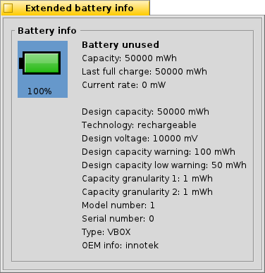
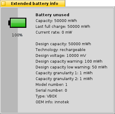
Personally I'd put the battery percentage inside the battery icon. It "straddling" the two grays doesn't look as nice. But overall I like the mock-up.
comment:5 by , 12 years ago
The blue rectangle isn't there accidentally, though -- there can be more than one battery in the system, and then you can select each of them to get their details.
comment:6 by , 10 years ago
| Summary: | [PowerStatus] Extended battery info window mockup → [PowerStatus] Extended battery info window mockup (easy) |
|---|
by , 8 years ago
| Attachment: | powerstatus_list.png added |
|---|
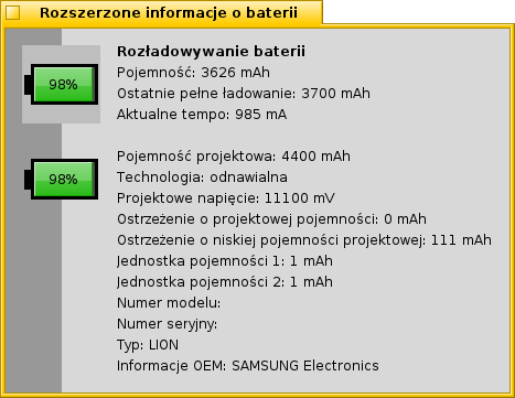
Battery selection with B_LIST_SELECTED_BACKGROUND_COLOR
by , 8 years ago
| Attachment: | powerstatus_menu.png added |
|---|
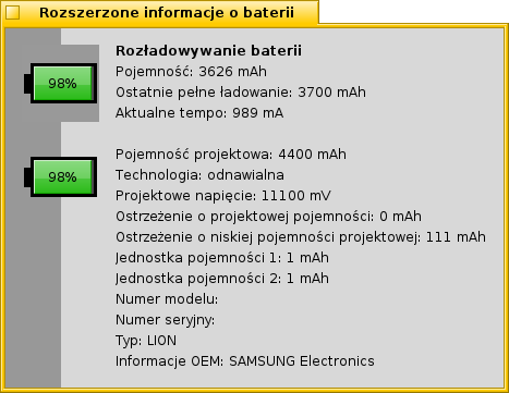
Battery selection with B_MENU_SELECTED_BACKGROUND_COLOR
comment:9 by , 8 years ago
comment:10 by , 8 years ago
I'm not sure the selection on top of the dark sidebar works very well. If you really want to keep it, it should be a bit wider (so it circles the icon completely, not leaving an enmpty side on the right), and I'd consider the previously used blue color.
But, such a selection inside a list without border doesn't look very good, anyway. I'd consider maybe highlighting the icon (so a brigher green/yellow/red) for the active battery, or a less saturated one for the inactive ones. Maybe drawing inactive batteries with some transparency would work too.
comment:11 by , 8 years ago
I have tried using new Layer APIs (BeginLayer and EndLayer), but be_control_look methods seem "resistant" to them (they are 100% visible, even if I set layer alpha to 10). Should I file a bug for this?
comment:12 by , 8 years ago
I think you need to set the drawing mode to B_OP_ALPHA for layers to work as expected. If that doesn't work, then yes, I'd consider filing a bugreport (or maybe check with Jua who introduced these first, on mailing lists or IRC).
by , 8 years ago
| Attachment: | 0001-PowerStatus-New-Extended-info-window-s-layout.patch added |
|---|
comment:15 by , 8 years ago
| patch: | 0 → 1 |
|---|
comment:16 by , 8 years ago
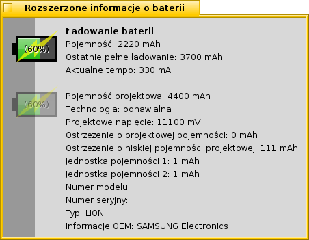
Now that I see the screenshot, I have to change my mind again :/
It looks like the second battery is "disabled". I would have no idea that I can click on it to select it. I considered using a vertical BTabView-like look. Here is a quick mockup (please ignore the rotated battery icons).
comment:17 by , 8 years ago
Having more than one battery would be the exception, right?
Therefore I think it would be best to have the most common situation look like it does now: one battery icon, like KapiX latest screenshot (without the transparent second battery).
If there are more than one battery in the system, put each into a regular tab view with "Battery 1", "Battery 2", ... "Battery n" as the tab title.
comment:18 by , 8 years ago
It is nice to be able to see the status of all batteries with a quick look at the window, when there are multiple ones. If using normal small tabs at the top, this would require clicking all the tabs to see them.
The extra batteries are only visible when there are more batteries, of course. It's also reasonably easy to not draw tabs (or selection mark, etc) in that case.
comment:19 by , 8 years ago
Although I don't really like the idea of two different layouts depending on batteries count in the system, I don't have a better idea so I started working on implementing TabView look.
Unfortunately, be_control_look's Draw(Ina|A)ctiveTab do not support tab orientations other than the default.
I tried to do the rotation with BAffineTransform but not only it is cumbersome, but also the final result is blurry.
This means I will have to implement the missing features in be_control_look.
I will probably need to define some new orientation constants which could be used with flags parameter of mentioned methods.
Another option is adding a new parameter and using B_*_BORDER for that purpose.
Do you have any suggestions (e.g. naming) or pitfalls I should keep in mind?
follow-up: 21 comment:20 by , 8 years ago
For other controls that support an orientation (BProgressBar, BScrollBar, ...), there is a separate "orientation" parameter, with values B_HORIZONTAL and B_VERTICAL. BControlLook already uses this convention, and I would do the same for the tabs.
comment:21 by , 8 years ago
Replying to pulkomandy:
For other controls that support an orientation (BProgressBar, BScrollBar, ...), there is a separate "orientation" parameter, with values B_HORIZONTAL and B_VERTICAL. BControlLook already uses this convention, and I would do the same for the tabs.
You can have tabs above or below the view, and for both of those cases it would be B_HORIZONTAL, so that is not really an option.
by , 8 years ago
| Attachment: | screenshot7.png added |
|---|
by , 8 years ago
| Attachment: | ControlLook_patch.diff added |
|---|
comment:22 by , 8 years ago
comment:23 by , 8 years ago
The code looks ok to me. You will need an enum for the orientations, either use an existing one (B_*_BORDER or B_FOLLOW_* maybe?), or extend one (BOrientation has only B_HORIZONTAL and B_VERTICAL, but could get two more values - also useful for scrollbars?) or create a new one.
The result looks mostly good, I'm undecided about the way the gradient and light/dark edges do not rotate with the tab (edge of bottom and left tabs does not blend well with the tab content). However, this is a minor issue, we can merge the patch and experiment with the exact look once we have some apps making use of the tabs.
I mark the patch as obsolete since it is not to be merged as is.
comment:24 by , 8 years ago
OK, I will clean up the patch today and upload something that can be committed.
I'd go with B_*_BORDER flags, but change the name of the parameter (orientation is not describing very well what it does). Maybe "side" would be OK?
PowerStatus patch: it is a bit more work to implement tabs. The way code is organized now causes some invalidation issues (I solved it for now by invalidating the whole view, but it stinks).
comment:25 by , 8 years ago
Yes, "side" sounds fine.
I have already another use case for vertical tabs (would be nice in Web+), so I will merge that part first and we can see later about PowerStatus. Does that sound ok?
Also, should we update BTabView to also allow switching to different sides there?
by , 8 years ago
| Attachment: | 0001-ControlLook-Fix-drawing-of-right-bottom-tab-corner.patch added |
|---|
by , 8 years ago
| Attachment: | 0002-ControlLook-Add-side-parameter-to-tab-drawing-functi.patch added |
|---|
comment:26 by , 8 years ago
Cleaned up patches attached.
I think we should modify BTabView and also allow to use views as tab "title". That way we could draw icons, and maybe get rid of custom TabView from Web+.
comment:27 by , 8 years ago
Applied in hrev50893. Marking the patches as obsolete.
In Web+, the tab view does a lot more than just adding icons (which is possible even with standard tabs). It also adds scrolling, and a dropdown menu with the tabs that don't fit.
comment:28 by , 8 years ago
| patch: | 1 → 0 |
|---|
comment:29 by , 8 years ago
| Owner: | changed from to |
|---|---|
| Status: | new → assigned |
comment:30 by , 7 years ago
| Blocked By: | 13673 added |
|---|
comment:31 by , 7 years ago
| Owner: | changed from to |
|---|---|
| Summary: | [PowerStatus] Extended battery info window mockup (easy) → [PowerStatus] Extended battery info window mockup |
comment:32 by , 7 years ago
| Resolution: | → fixed |
|---|---|
| Status: | assigned → closed |
Fixed in hrev51577.
It converts PowerStatus to BTabView. There is no differentiation in layouts depending on how many batteries are present.



+1