#7333 closed enhancement (invalid)
Screen preflet – Wrong placement of Apply button
| Reported by: | deejam | Owned by: | axeld |
|---|---|---|---|
| Priority: | normal | Milestone: | R1 |
| Component: | Preferences/Screen | Version: | R1/Development |
| Keywords: | Cc: | ||
| Blocked By: | Blocking: | ||
| Platform: | All |
Description
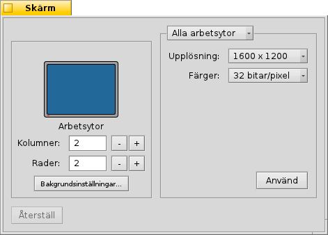
The Apply button in the Screen preflet is located inside the right fieldset, but it is also used for the left fieldset. Therefor it should be moved out of the right fieldset.
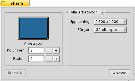
It should be moved down, as in this mockup.
GCC2 Hybrid, hrev40735.
Attachments (2)
Change History (6)
by , 14 years ago
| Attachment: | Screen_preflet_apply_button.png added |
|---|
by , 14 years ago
| Attachment: | Screen_preflet_mockup.png added |
|---|
follow-up: 2 comment:1 by , 14 years ago
| Resolution: | → invalid |
|---|---|
| Status: | new → closed |
comment:2 by , 14 years ago
Replying to axeld:
But you are wrong, too: the "apply" button is only for the right side, the left side's changes are instant.
You are right. I got it wrong while testing.
comment:3 by , 14 years ago
I gave this a thought. Wouldn't it be better to have the Apply button at the bottom of the window? That way the user knows that Apply/Revert/Defaults are always in the bottom.
If changes are made to the left, the Apply button would still be disabled. If changes are made to the right, the button would be enabled.
comment:4 by , 14 years ago
I would find that very irritating, and I think the current implementation makes much more sense, even if it might not be ideal.


Please use English for mockups if you want everyone to understand what you are doing.
But you are wrong, too: the "apply" button is only for the right side, the left side's changes are instant.