Opened 14 years ago
Closed 11 years ago
#7332 closed bug (fixed)
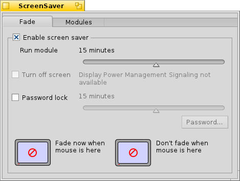
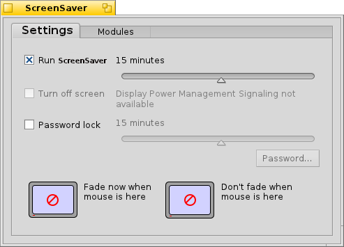
[ScreenSaver] increase window margins
| Reported by: | diver | Owned by: | jscipione |
|---|---|---|---|
| Priority: | normal | Milestone: | R1 |
| Component: | Preferences/ScreenSaver | Version: | R1/Development |
| Keywords: | Cc: | mdisreali@… | |
| Blocked By: | Blocking: | ||
| Platform: | All |
Attachments (8)
Change History (26)
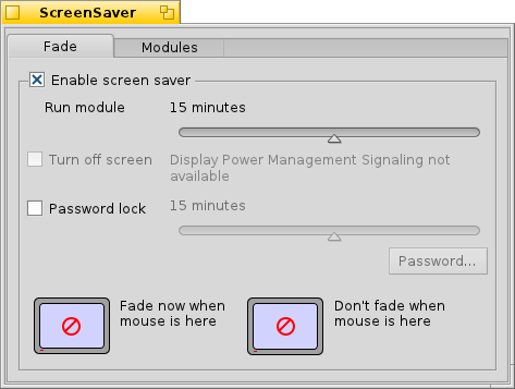
by , 14 years ago
| Attachment: | screensaver_current.png added |
|---|
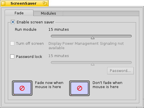
by , 14 years ago
| Attachment: | screensaver_mockup.png added |
|---|
comment:1 by , 14 years ago
follow-ups: 4 15 comment:2 by , 14 years ago
Looks great, diver! I wish I knew how to do mockups (I've tried).
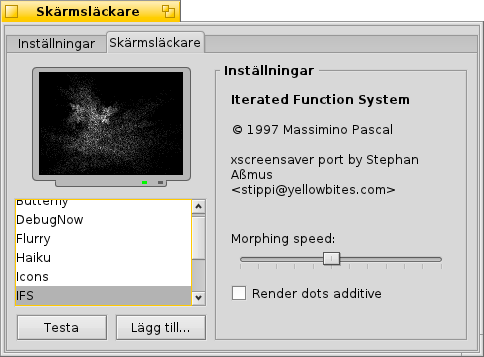
I noted that the tab width is not wide enough in some translations, for example in Swedish. As displayed in the image below, the margins becomes to small.
The same applies to the list of available screensavers, it needs left and right margins.
comment:4 by , 14 years ago
Replying to deejam:
Looks great, diver! I wish I knew how to do mockups (I've tried).
I use KolourPaint in KDE for this, It's a bit sad that I don't know how to do it in WonderBrush.
I noted that the tab width is not wide enough in some translations, for example in Swedish. As displayed in the image below, the margins becomes to small.
The same applies to the list of available screensavers, it needs left and right margins.
AFAIK these are known issues and are not related to this preflet only.
by , 14 years ago
| Attachment: | screensaver_mockup_2.png added |
|---|
follow-ups: 6 7 comment:5 by , 14 years ago
The alternative mockup obviously leaves out functionality. I like the original version better, though, anyway. To improve its looks, I would rather remove the outer border completely.
comment:6 by , 14 years ago
Replying to axeld:
The alternative mockup obviously leaves out functionality.
I can't see that it leaves out any functionality (about screensaver_mockup_2.png). What are you referring to?
comment:7 by , 14 years ago
Replying to axeld:
The alternative mockup obviously leaves out functionality. I like the original version better, though, anyway. To improve its looks, I would rather remove the outer border completely.
By original do you mean current gui?
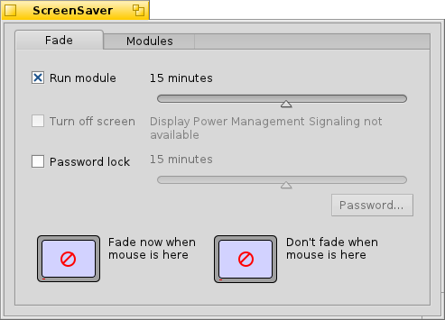
by , 14 years ago
| Attachment: | screensaver_mockup_3.png added |
|---|
follow-up: 10 comment:9 by , 14 years ago
That's pretty much what I was thinking about, yes.
To deejam: the checkbox before "Run module" doesn't carry the meaning of the removed "Enable screen saver". Now that I'm looking, "Run module" isn't really the best description either; while technically correct, it's unnecessarily complicated.
comment:10 by , 14 years ago
| Cc: | added |
|---|
Replying to axeld:
That's pretty much what I was thinking about, yes.
To deejam: the checkbox before "Run module" doesn't carry the meaning of the removed "Enable screen saver". Now that I'm looking, "Run module" isn't really the best description either; while technically correct, it's unnecessarily complicated.
I would use the second mockup and replace the "Run Module" text with "Enable Screen Saver" or better yet "Run Screen Saver" That way, it should be obvious to the user that the screen saver will start after whatever the user set the time delay.
I would also suggest changing the "Fade" tab title to "Setting".
by , 14 years ago
| Attachment: | screensaver_mockup_4.png added |
|---|
comment:12 by , 14 years ago
One could also just call it "Delay" and have the slider value start and end with "Off", disabling the "Turn off screen" and "Password lock" options.
follow-up: 14 comment:13 by , 14 years ago
There are cases when you temporarily want to turn off the screen saver, for example, during a presentation. It would be quite annoying to manually restore the previous settings then each time; the checkbox there just makes sense, and shouldn't be spared.
To disraeli: as I already said to diver's effort: I don't like removing the "enable screen saver" box, the functionality is much clearer presented as it is now (disregarding the labels, maybe).
comment:14 by , 14 years ago
Replying to axeld:
There are cases when you temporarily want to turn off the screen saver, for example, during a presentation. It would be quite annoying to manually restore the previous settings then each time; the checkbox there just makes sense, and shouldn't be spared.
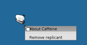
I think it would be great to have a Desktop applet for that which enables/disables the screensaver with a single click.
This is my mockup. If Display Power Management is supported, a slider will be shown for that in the same way.
by , 14 years ago
| Attachment: | ScreenSaver_caffeine_mockup.png added |
|---|
by , 14 years ago
| Attachment: | ScreenSaver_mockup_5.png added |
|---|
comment:15 by , 11 years ago
Replying to deejam:
I noted that the tab width is not wide enough in some translations, for example in Swedish. As displayed in the image below, the margins becomes to small.
The same applies to the list of available screensavers, it needs left and right margins.
I've converted the Screen Saver preflet to use the layout APIs in hrev46010 and made a number of subtle improvements. Although, I haven't fundamentally change the design as this ticket proposes to do, the layout APIs make it much easier to make these kinds of changes now if desired.
I just wanted to mention that I have made the tabs width variable so that it will adjust your Swedish translations and the screensaver list should also adjust to fit as well. Also, I made the tabs flush with the edge rather than being inset by a pixel like in screensaver mockup 3.
I also tested with font sizes from 8pt to 18pt and made many adjustments so that it would look nice at non-standard font-sizes. I even spent some time fixing up the Password popup window to layout responsively.
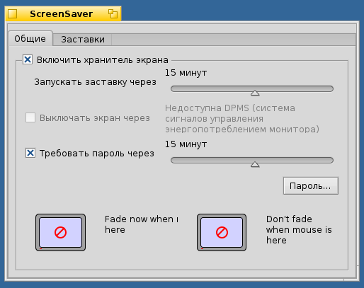
Here's an example screenshot I took in the Russian Locale while testing.
by , 11 years ago
| Attachment: | Screen_Saver_Russian_Layout.png added |
|---|
Screenshot showing Russian translations after layout API conversion
comment:17 by , 11 years ago
There is a small amount of space to the left of the left-most tab, but, that is done purposely by the tab view control. So, the tabs are as flush to the windows' edge as can be. The rest of the changes proposed in this ticket such as removing the enable screen saver check box probably should get their own enhancement ticket. Maybe we can have a wiki page dedicated to screensaver UI improvements. Although, since screensaver basically works it is probably a low priority task.
comment:18 by , 11 years ago
| Resolution: | → fixed |
|---|---|
| Status: | assigned → closed |
closing this ticket as the problem described by ticket is solved.



BTW, same thing should be done for JPEGTranslator and JPEG2000Translator.