

#7370 closed enhancement (fixed)
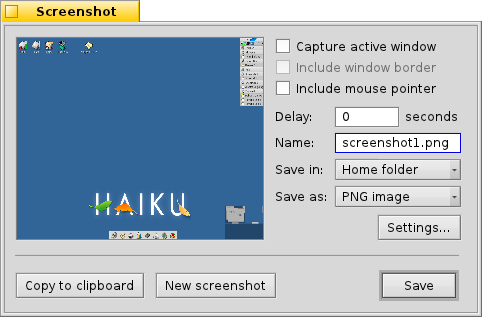
[Screenshot] relocate Settings button
| Reported by: | diver | Owned by: | nobody |
|---|---|---|---|
| Priority: | normal | Milestone: | R1 |
| Component: | Applications/Screenshot | Version: | R1/Development |
| Keywords: | Cc: | ||
| Blocked By: | Blocking: | ||
| Platform: | All |
Description
There is no need to clutter UI to include an option one would use rarely.
DataTranslation serves exactly this purpose.

Attachments (4)
Change History (18)
by , 14 years ago
| Attachment: | Screenshot_mockup.png added |
|---|
comment:1 by , 14 years ago
| Resolution: | → invalid |
|---|---|
| Status: | new → closed |
comment:3 by , 14 years ago
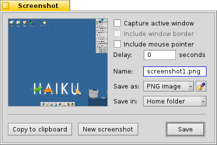
Independently of positioning the "Settings..." button to the right, or below the format popup, I think it would look nicer to have the format setting below the "Save in" setting.

by , 14 years ago
| Attachment: | Screenshot_mockup_2.png added |
|---|

by , 14 years ago
| Attachment: | Screenshot_mockup_3.png added |
|---|
comment:7 by , 14 years ago
I'm not a fan of putting unusual icons in the user interface, so I would prefer the mockup from comment:4 - it also looks better than the current interface IMO.
comment:8 by , 14 years ago
| Resolution: | invalid |
|---|---|
| Status: | closed → reopened |
| Summary: | [Screenshot] remove Settings button → [Screenshot] relocate Settings button |
| Type: | bug → enhancement |
Ok, then I'll reopen this ticket if you don't mind ;-)
comment:10 by , 14 years ago
I attached a patch that does pretty much what comment:4 suggested. There's less spacing between the settings button and format menu as that shows the two belong together. Having a bit of space between the textfield and "seconds" would be nice, but short of increasing all column spacing, which would also increase the label distance from their control, I'm not sure how... I also renamed two variables for clarity.
Keep in mind that I'm a newbie and not really familiar with the layout system... :)
comment:11 by , 14 years ago
| patch: | 0 → 1 |
|---|
comment:12 by , 14 years ago
| Resolution: | → fixed |
|---|---|
| Status: | reopened → closed |
Accidentally committed the patch in hrev41184. Just as well... Closing as fixed.
comment:13 by , 14 years ago
I think that current aspect ratio of preview is wrong. Also some space before "seconds" label wouldn't hurt.
comment:14 by , 14 years ago
I think I got the space in front of "seconds" right with hrev41185. The preview thing seems to be beyond me for the time being. It should go into another ticket anyway. The resizing when switching from full screen to window capture is a bit funny...
In case you haven't noticed yet: pretty much every application using the translation kit to save something usually has a "Settings" button to override the defaults you set via DataTranslations. Most of the time, this can be found in the file panel, but since there isn't one here, the settings button is just there.
DataTranslations just serve to specify the defaults, it's still more than just convenient to allow for overriding those settings when actually saving a file.